Banta
Premium comic energy for tradies
A bold marketing website that turned a niche SaaS concept into a sharp, memorable brand experience.

Webflow
Banta needed a website that could do two things at once: create instant visual impact and explain a layered product offer in plain language. The client wanted an unusual aesthetic with comicinspired attitude, but the final result still had to feel premium, credible, and conversion-oriented. Our job was to turn that tension into a coherent marketing experience — one that could stand out in a crowded category without losing clarity.

Explain a complex software offer without losing energy or clarity.
Build the site around strong narrative, typography, and premium comic-inspired art direction.
A multi-page marketing website with bold branding, clearer structure, and memorable differentiation.
A launch-ready website that feels distinct, fast to grasp, and hard to forget.
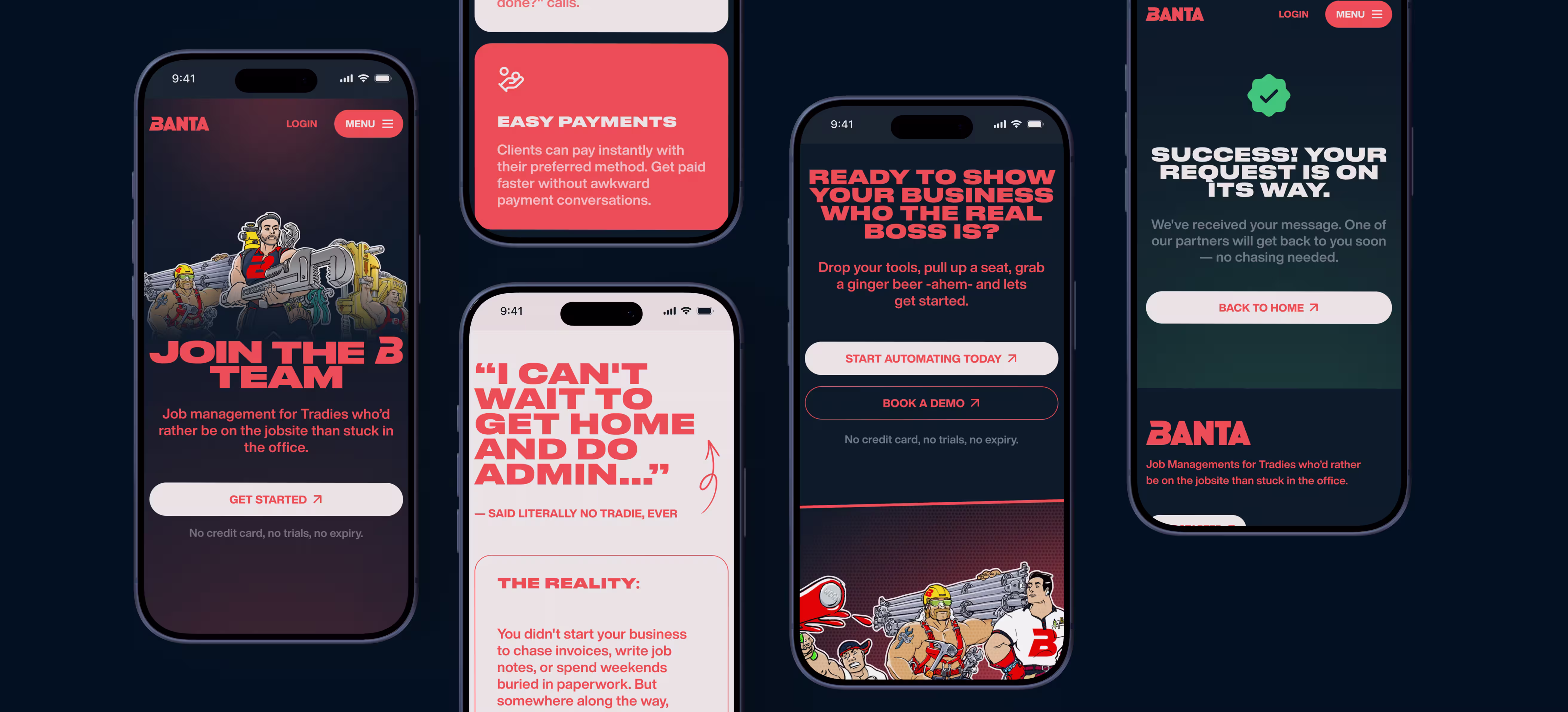
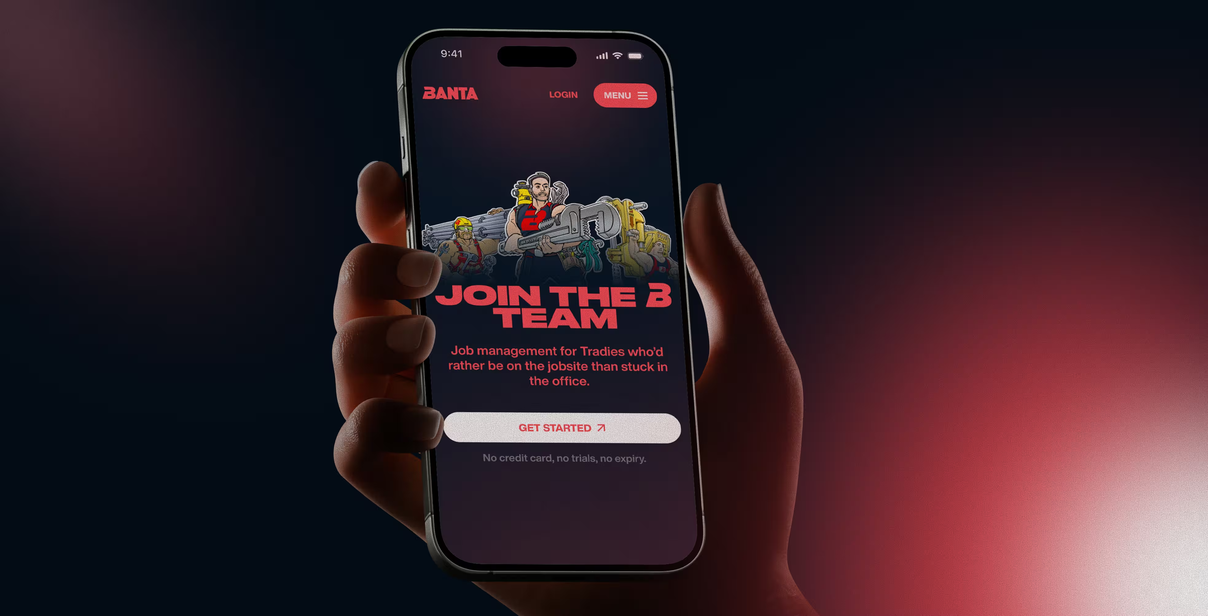
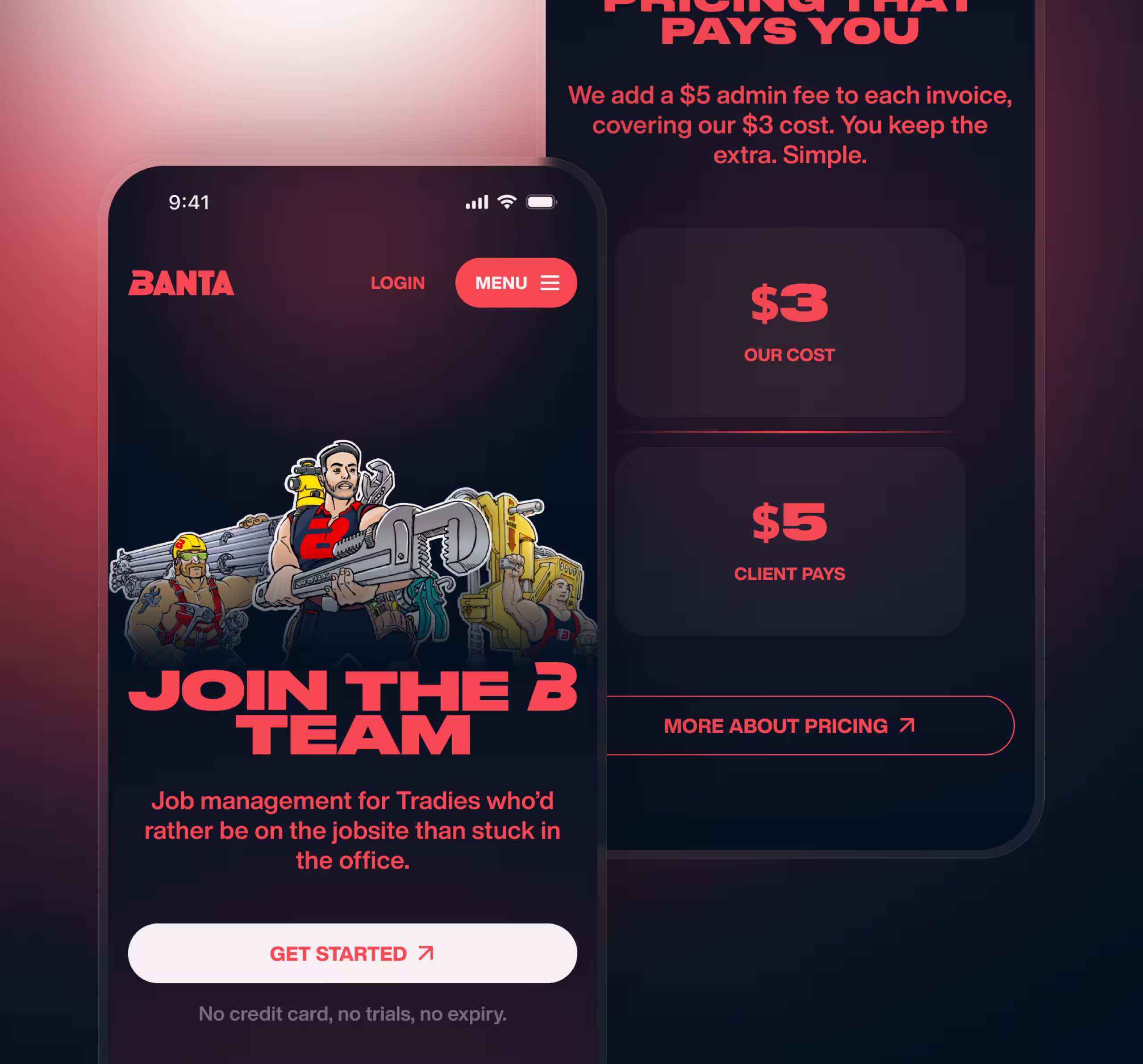
Banta is built for tradies who spend their day on jobsites, not behind desks. The product helps trade businesses stay on top of admin, invoicing, client communication, and day-to-day workflow without turning every evening into paperwork. The website had to make that reality feel immediate and familiar. It needed to speak to people finishing physical work, chasing cashflow, and trying to keep the business side under control without losing momentum.
The biggest challenge was not only visual. Banta had a strong point of view, but the message was easy to overcomplicate. The website had to explain a layered offer, keep the humour intact, and still feel premium enough to build trust. Without that balance, the brand risked looking either too generic or not serious enough.
We approached the project as a brand-first marketing website, not as a feature dump. The goal was to create a site that felt visually unexpected, but still clear enough to explain the product in simple terms. That meant using typography, page rhythm, and character-driven branding as the main storytelling tools.
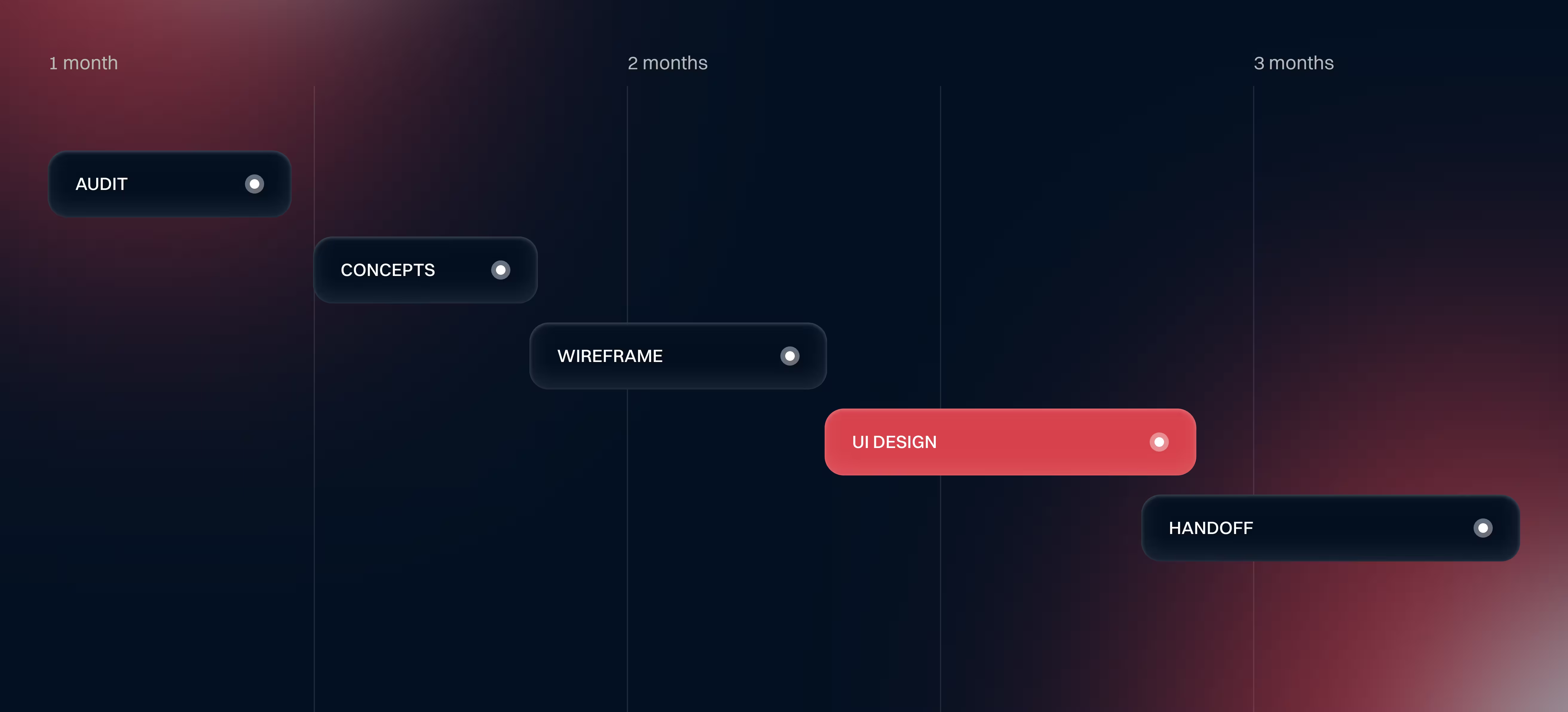
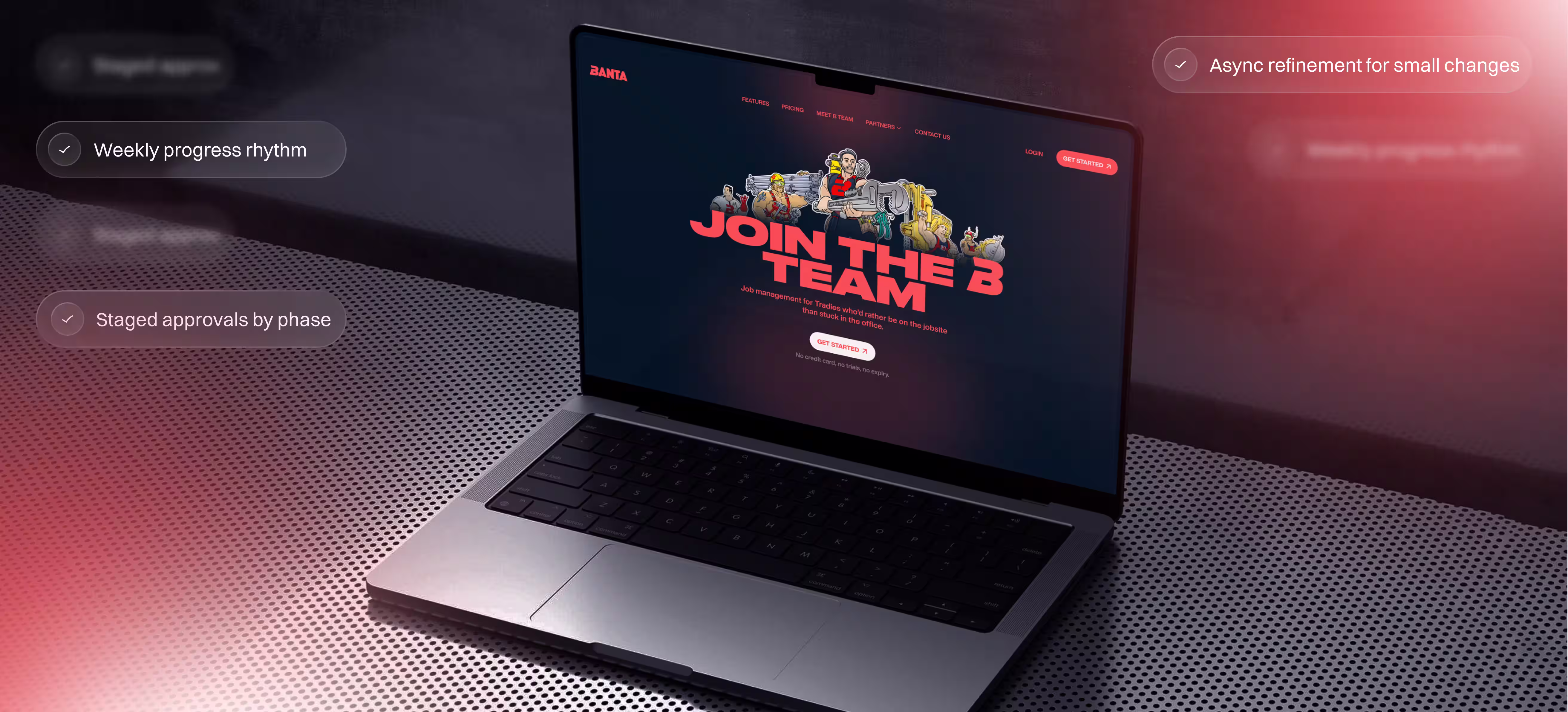
The process stayed structured throughout the project. Weekly updates kept momentum visible, staged approvals helped lock each phase before moving forward, and smaller refinements were handled asynchronously to keep delivery fast without losing control.
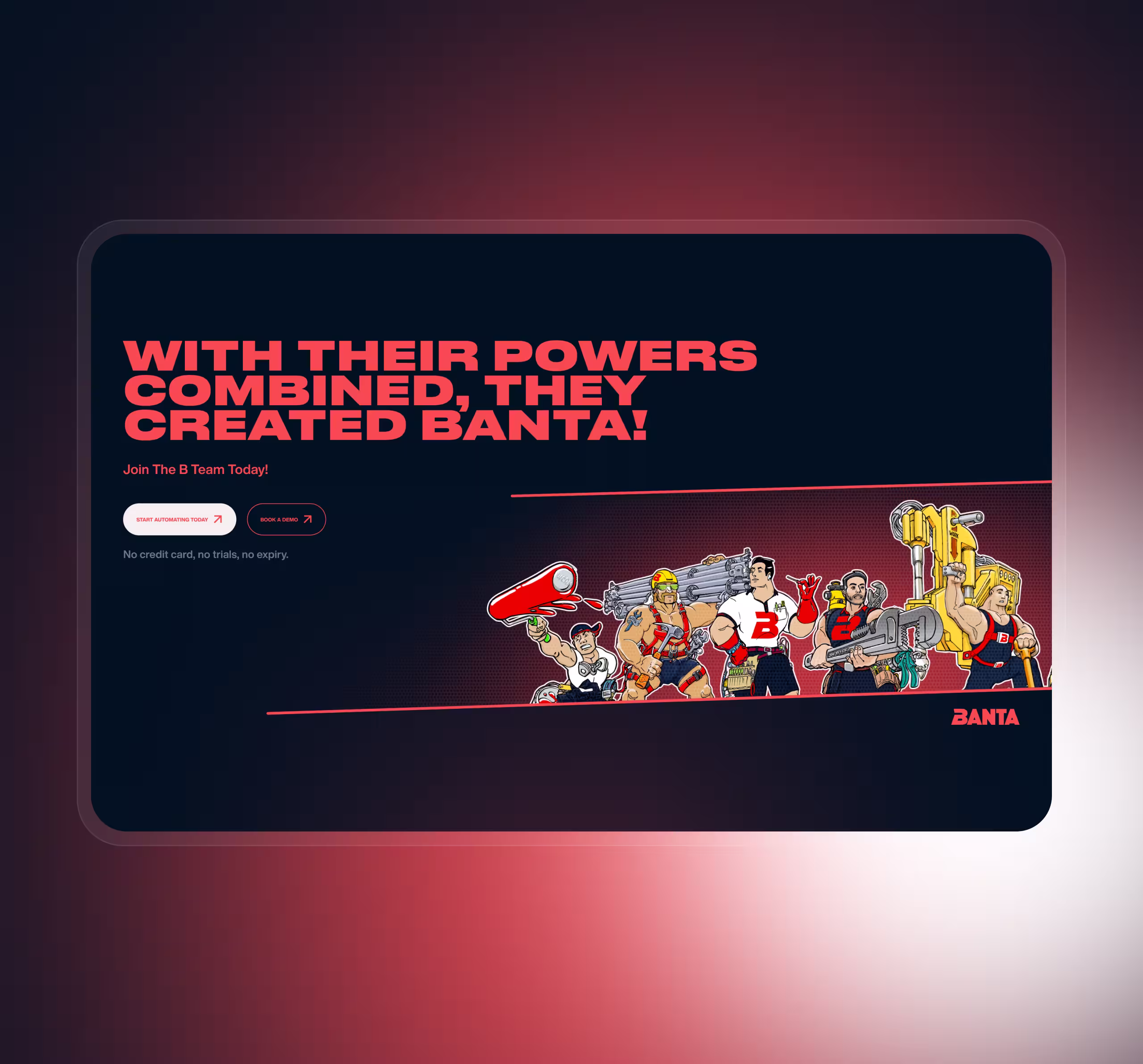
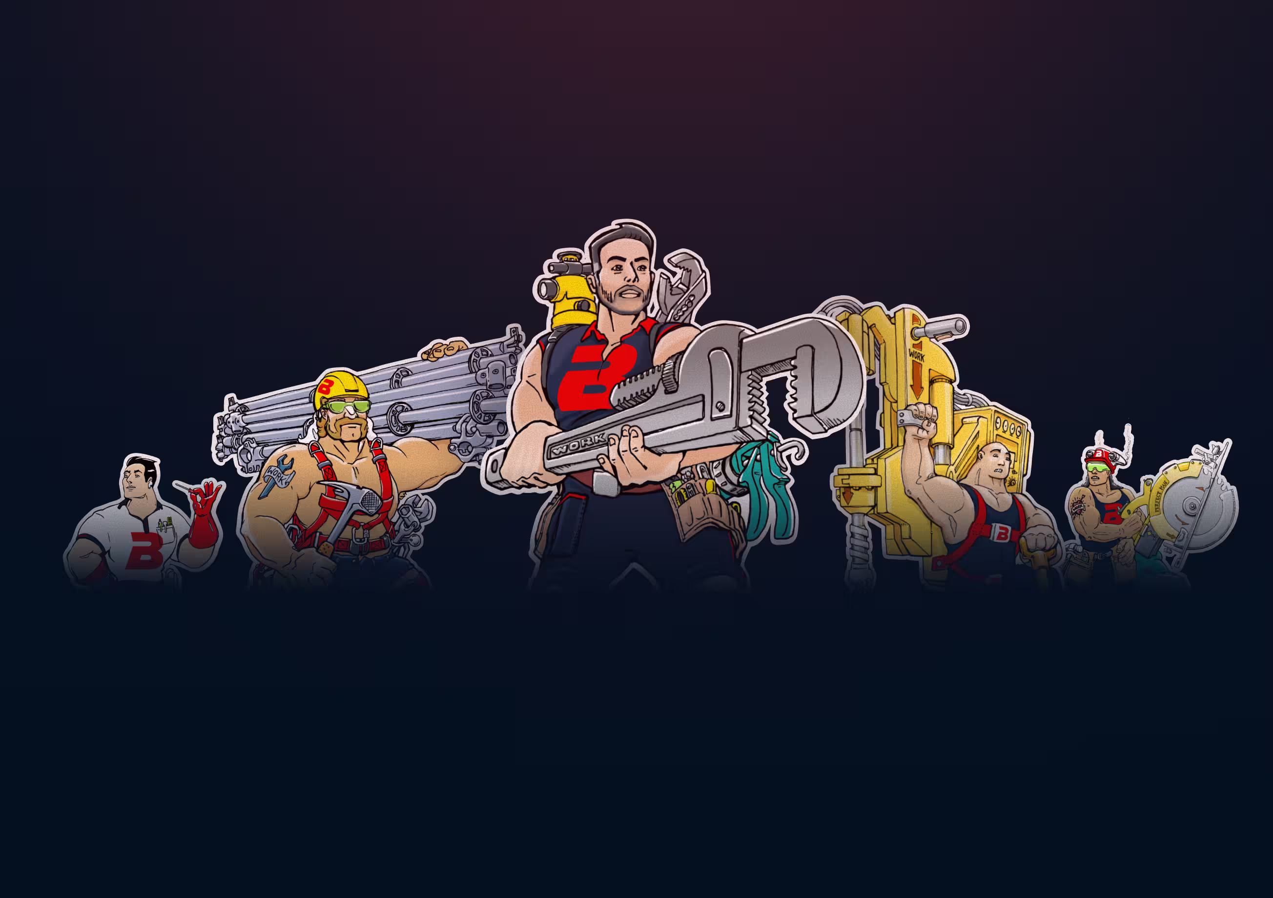
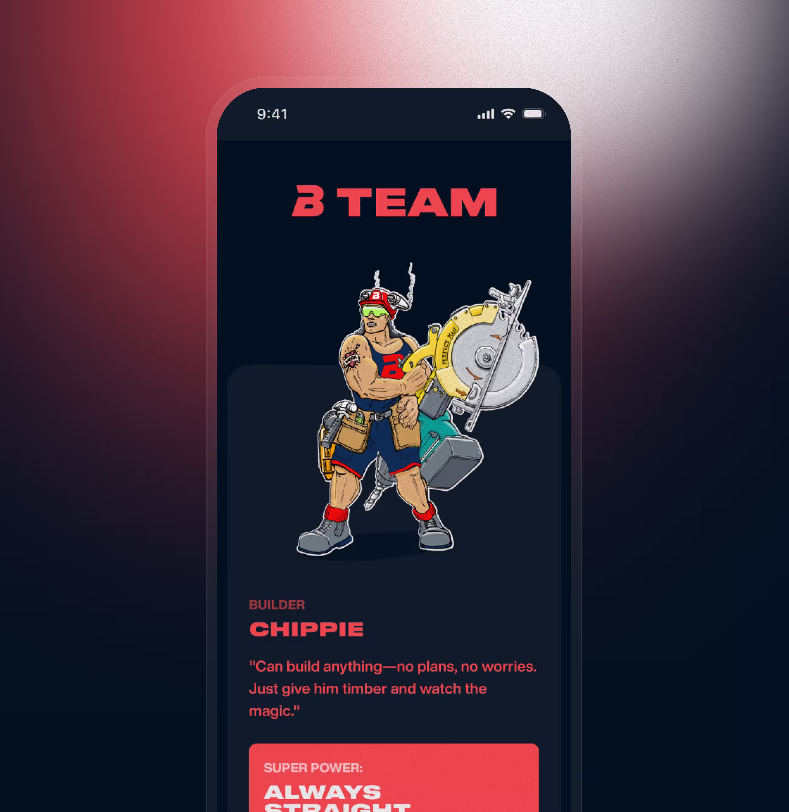
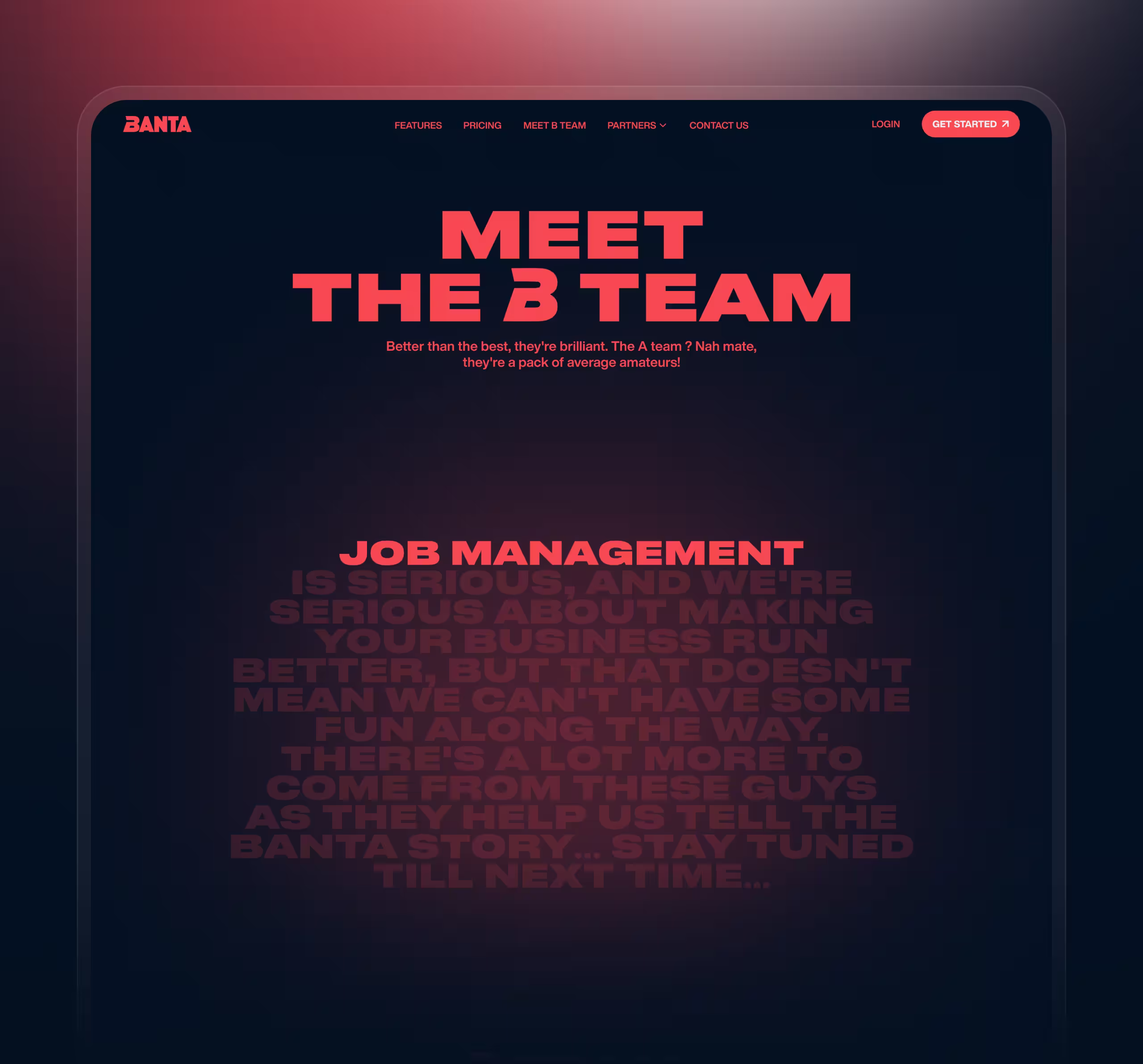
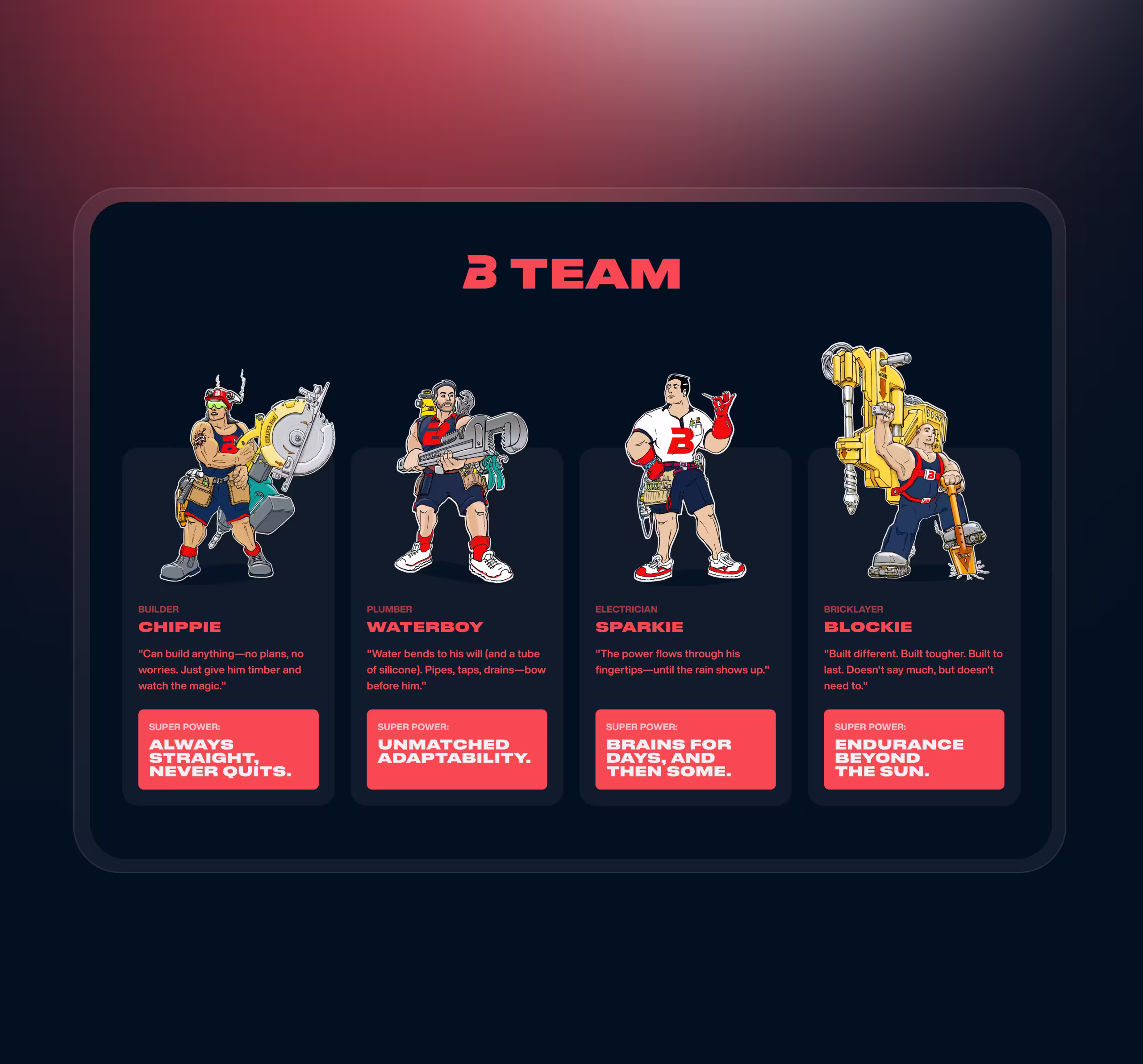
The brand already had the Team B idea, but on its own it risked feeling like a one-note joke. It needed to become a real positioning device.
We treated Team B as the core narrative anchor of the entire website. Instead of using it as decoration, we built the visual and verbal identity around it, giving the humour a clearer role inside a serious brand system. The result felt playful, but still controlled and commercially useful.
The brand became far more distinctive without losing credibility.
A conventional SaaS layout would not have matched the client’s ambition or the audience’s tone. The site needed more force from the first screen.
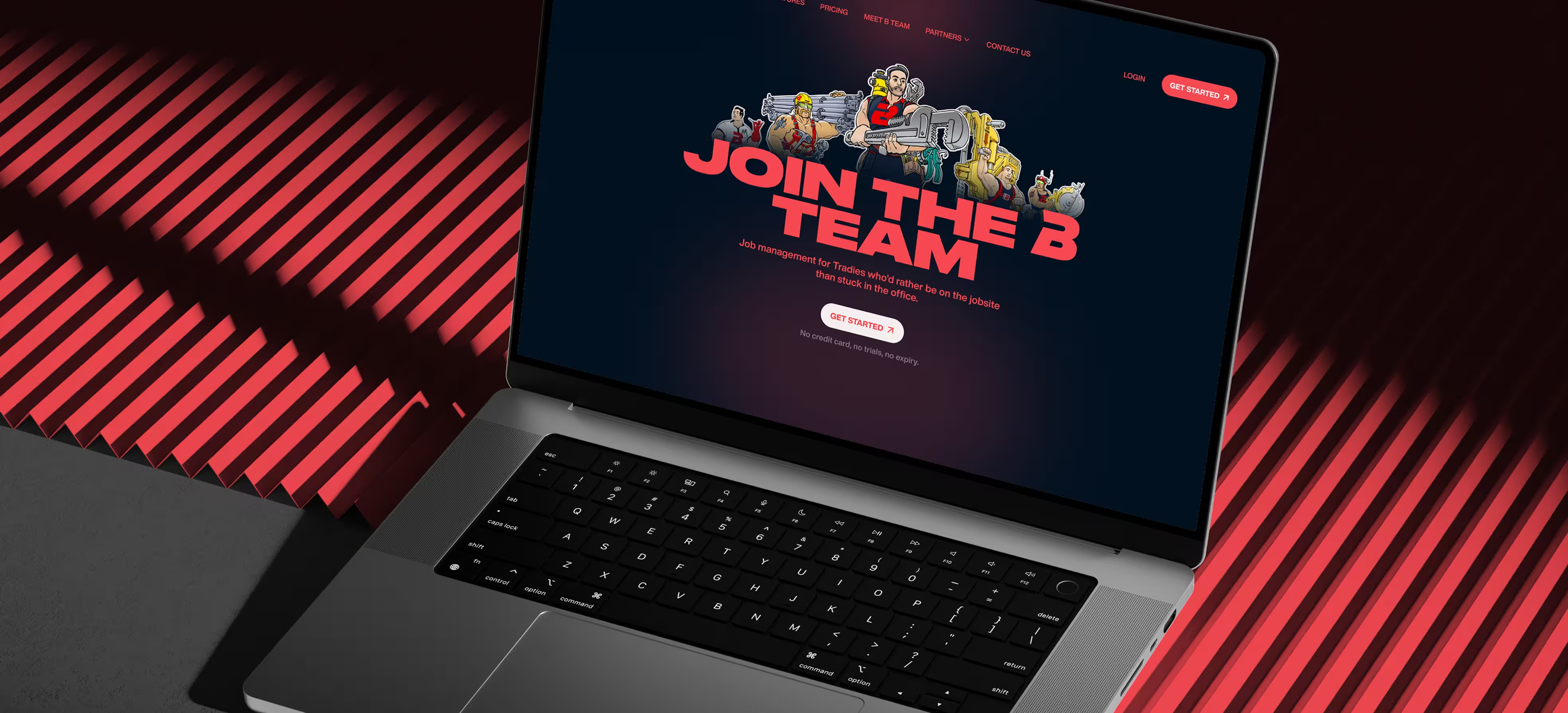
We used oversized typography, bold contrast, compressed wording, and high-impact headlines to make the website feel physical and immediate. This gave the pages a stronger sense of presence and helped each section land faster.
The website achieved a stronger wow effect while keeping the message readable.
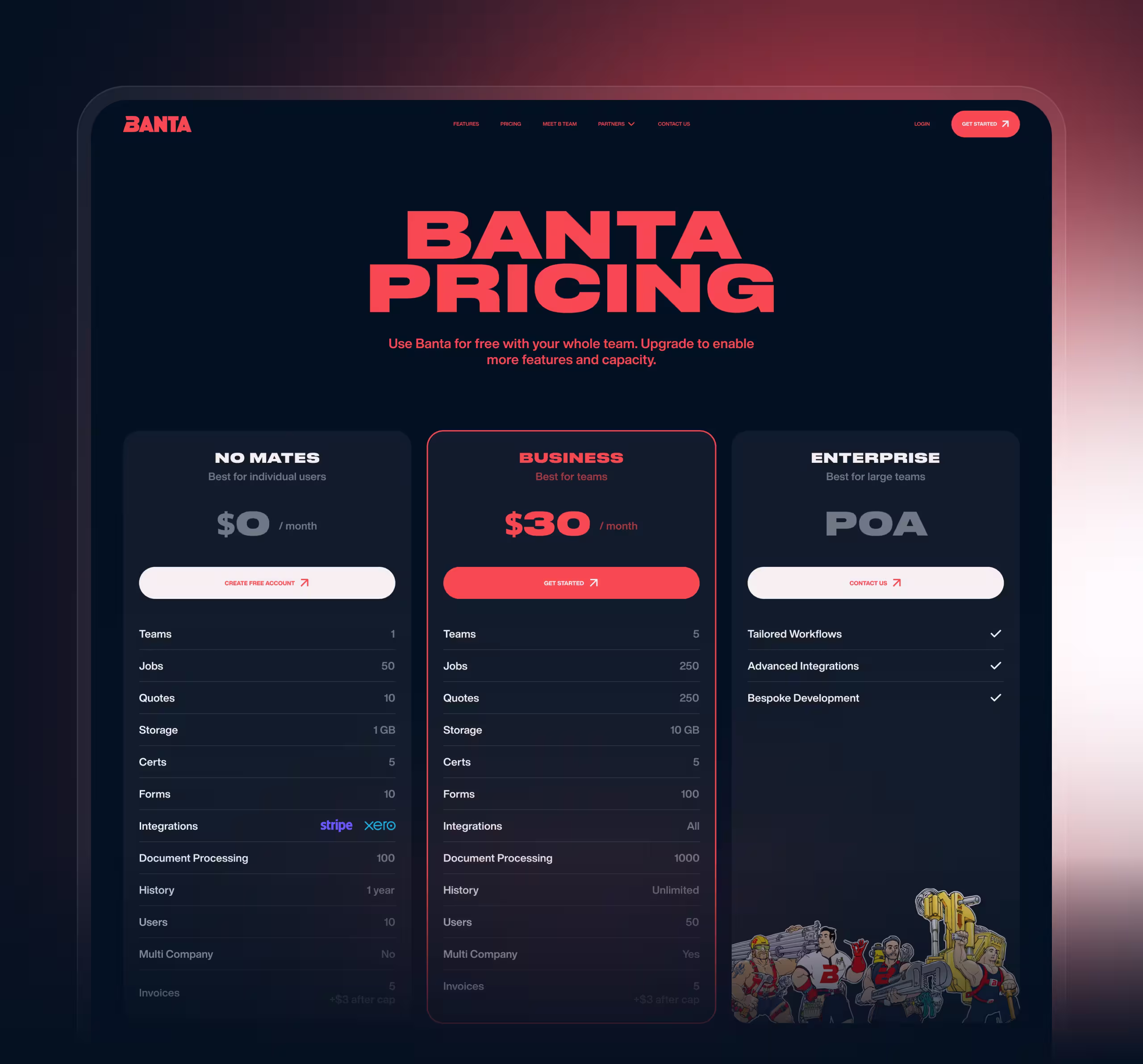
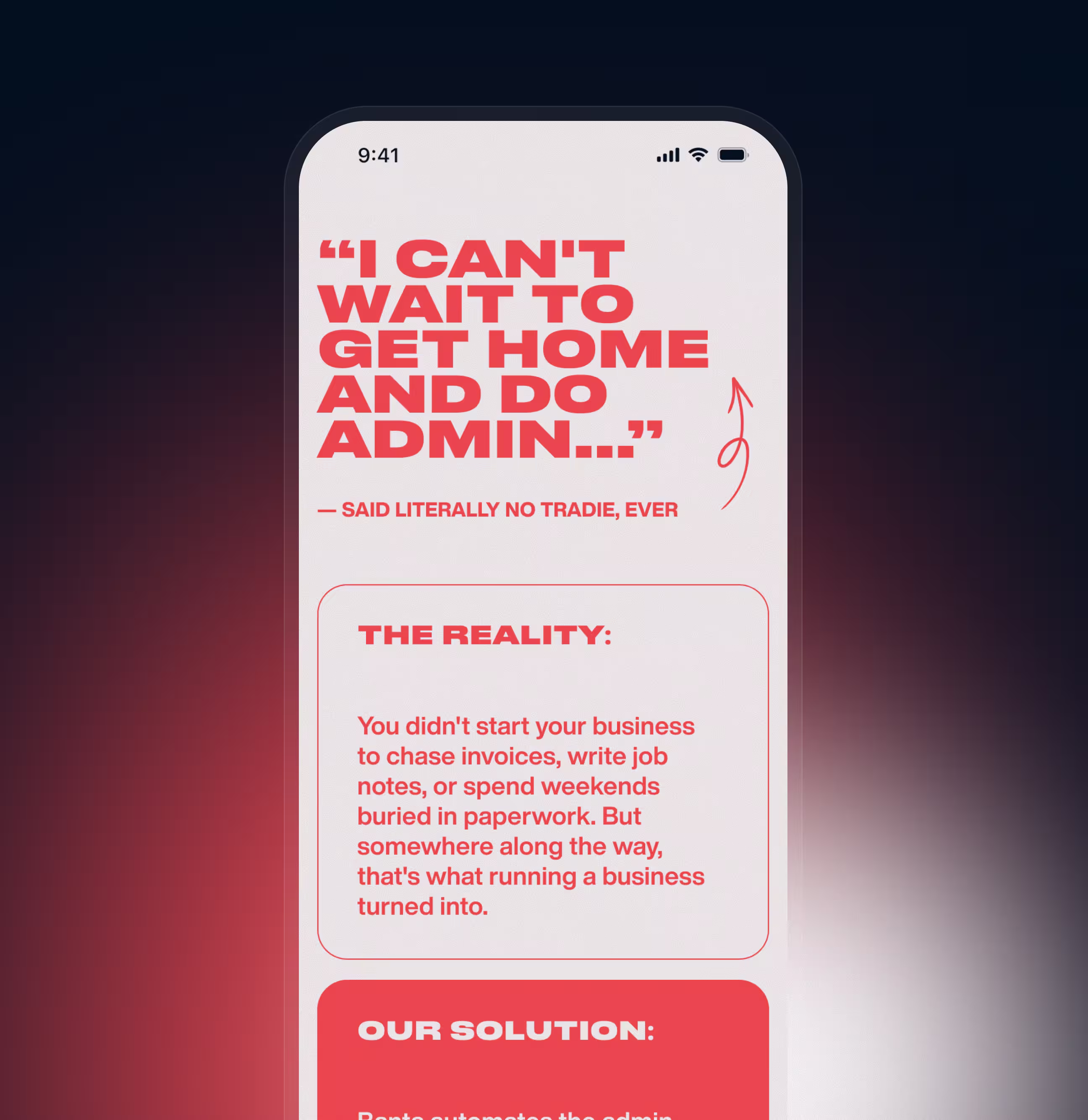
Banta’s product logic is valuable, but not instantly simple. Without careful packaging, the story could feel too layered for a first-time visitor.
We restructured the content flow to explain the offer through clear thematic sections: pain, solution, workflow logic, pricing, and partner support. The copy moved away from abstract software language and leaned into practical trade-world framing.
The product story became easier to understand on a quick scan.
The client wanted a Marvel-like tone, but a literal comic treatment could have made the site feel cheap or gimmicky.
We translated that reference into a more premium visual system: bold character presence, cinematic contrast, high-control colour use, and strong geometric typography. The comic influence stayed visible, but the final result felt polished rather than novelty-driven.
The visual identity became memorable, stylized, and premium at the same time.
The project needed to move quickly and still end in a usable, implementation-ready marketing asset.
We developed the site as a full multi-page system with responsive design, a UI kit, and Webflow front-end implementation. That kept the work grounded in real delivery rather than presentation-only design.
The team finished with a launch-ready marketing website, not just a visual concept.
The strongest idea in the project was not a single interface block, but the way Team B became the website’s emotional hook. It gave the brand a voice, a visual system, and a memorable point of entry into a complex offer. That one idea helped the site feel entertaining on first contact, then credible once the product story unfolded.
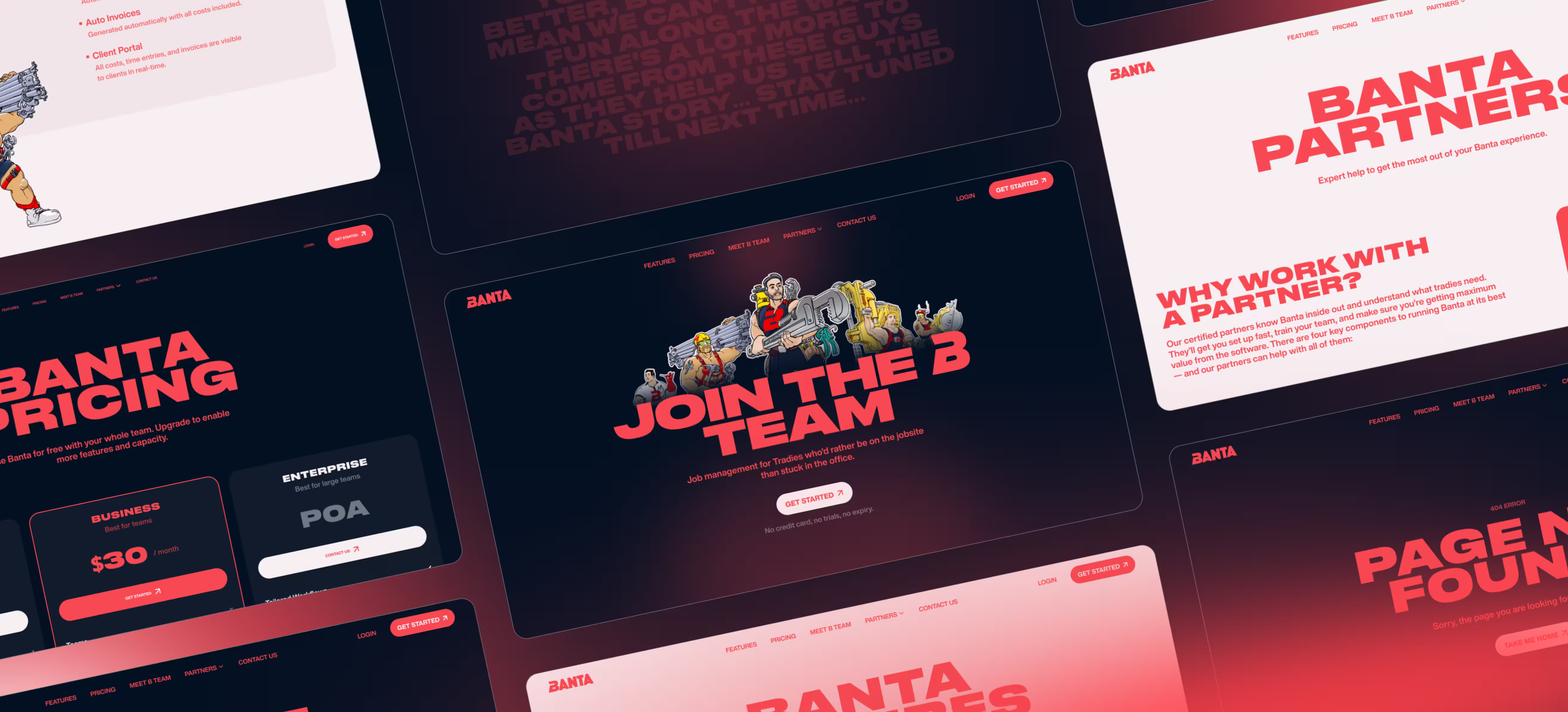
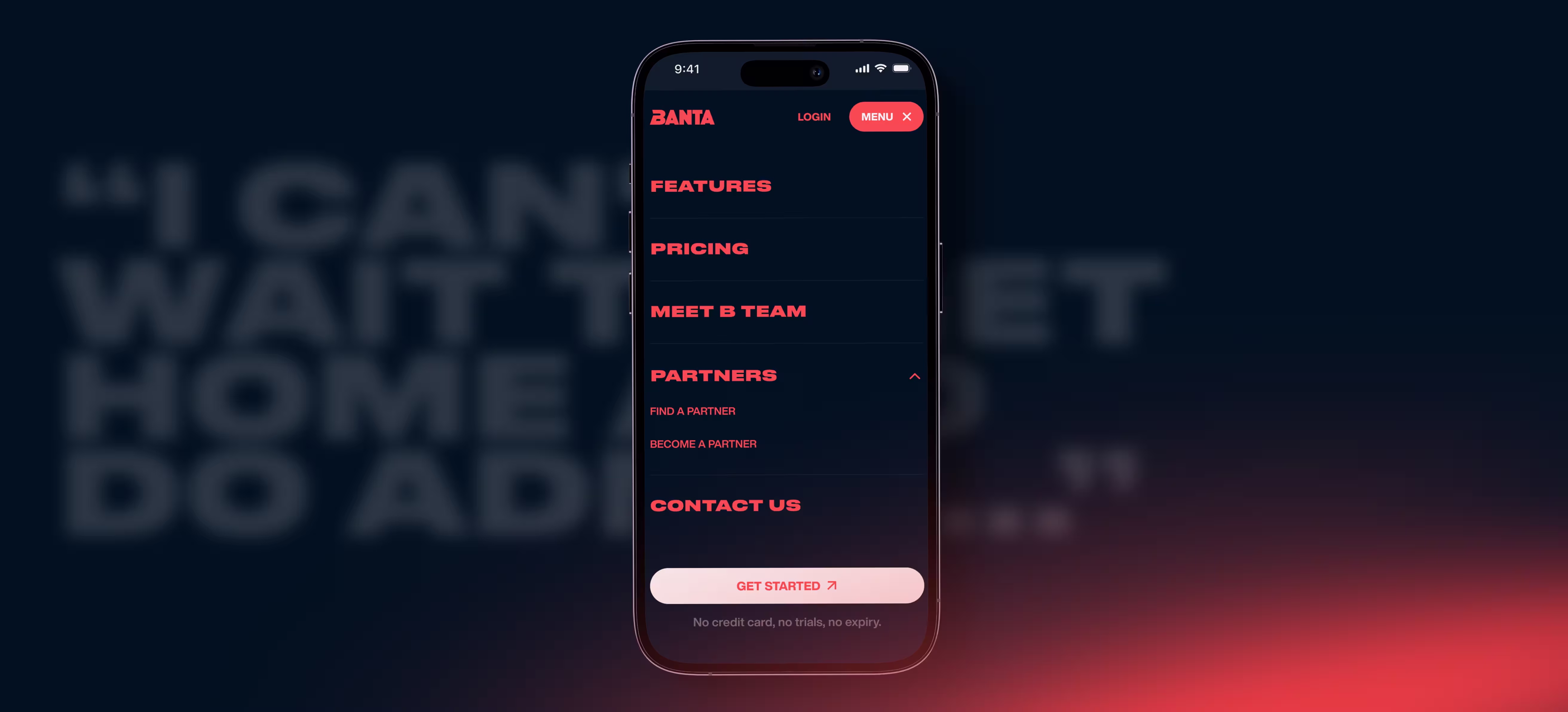
The site structure was designed to make Banta feel easier to understand page by page. Instead of relying on one long generic sales flow, the content was split into clearer destinations such as features, pricing, partner logic, and brand storytelling. That helped users move between product understanding and conversion without losing the bigger narrative. The structure also gave the brand room to expand later without breaking the system.
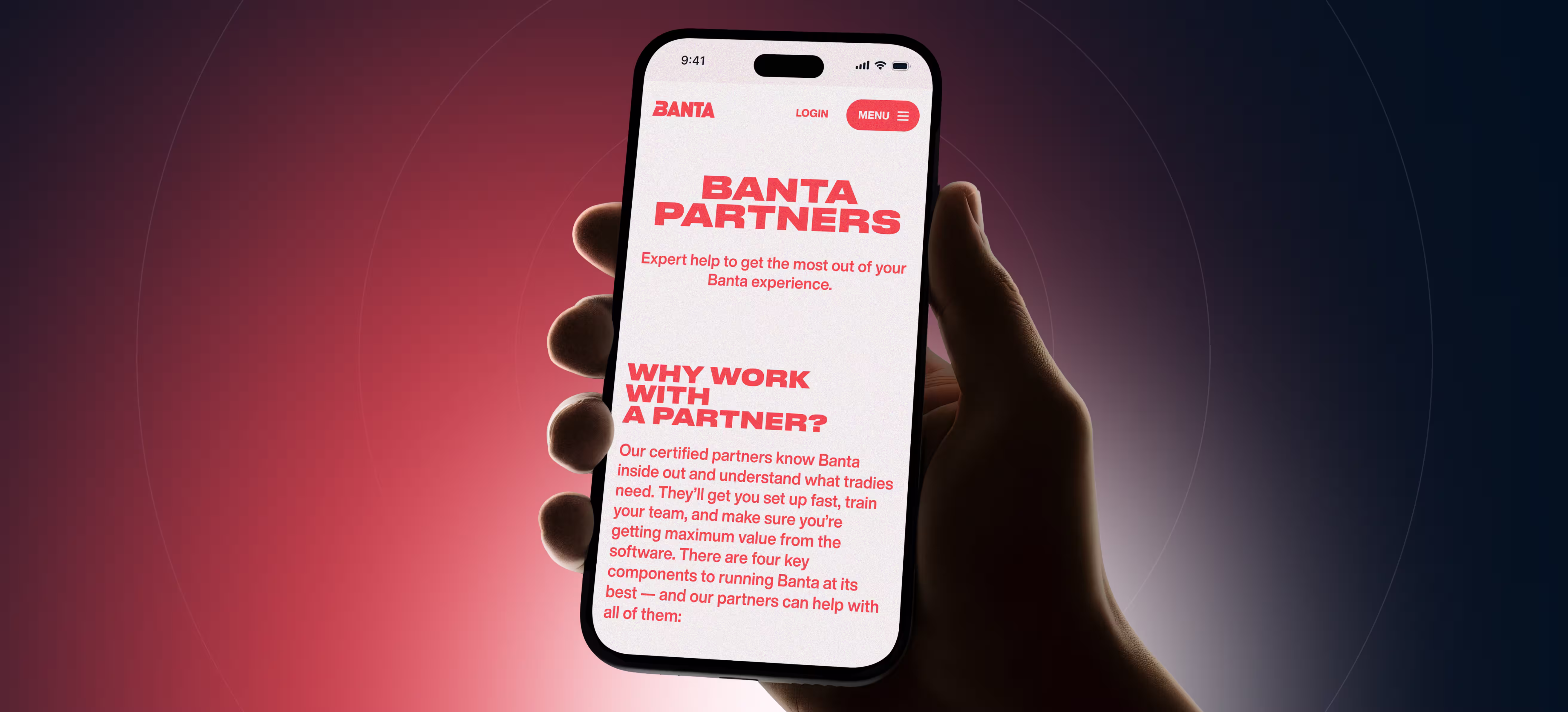
In the current scope, the most relevant operational logic lived inside the marketing website itself. The project had to support a multi-page structure, responsive behavior, conversion points, and future content growth while keeping the experience clean. The partner section was especially important because it served two audiences at once: tradies looking for support and potential partners considering collaboration.
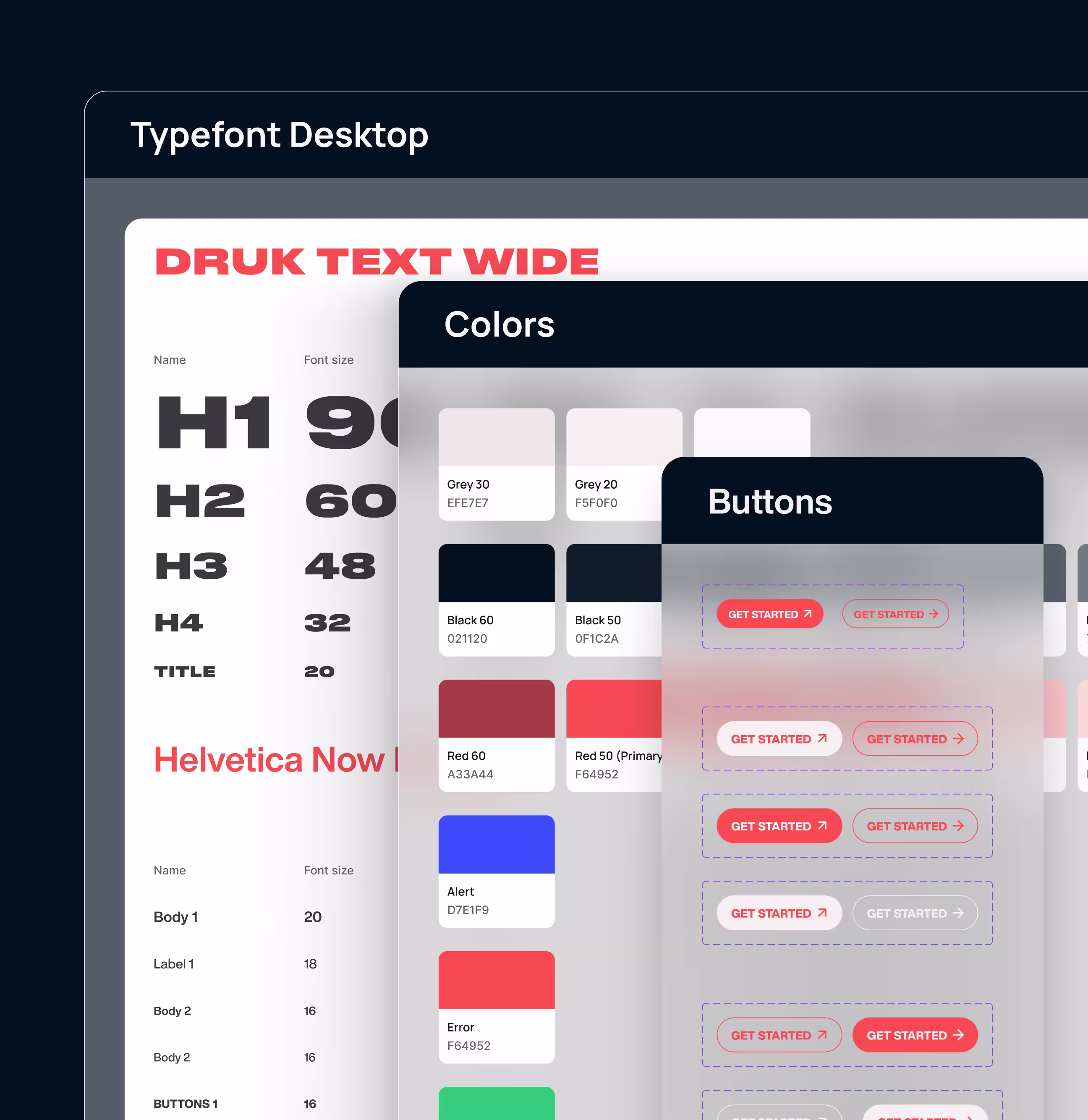
Although the result feels expressive, the website was supported by a clear system underneath. The visual language was not treated as a collection of one-off moments, but as a reusable framework covering typography, cards, contrast, responsive layouts, and page-level consistency. That system thinking made the site easier to scale and easier to implement without losing its identity.
The project reduced risk through structured review rather than formal user testing. Weekly updates kept progress visible, phased approvals prevented late-stage drift, and smaller changes were resolved asynchronously to maintain speed. This made it possible to develop an unusual visual direction without losing alignment or predictability.
The final delivery was prepared for real use, not just presentation. Alongside the Figma design files, the team delivered a UI kit, responsive versions, and a completed Webflow front-end implementation. This reduced ambiguity at handoff and kept the project moving smoothly from design into launch preparation.

Basic text &
blocks animation

Loom Video / Call where we tell you how to use Webflow & manage the site yourself

SEO optimization (basic)

Edits on the work done & support of the site within 30 days after the delivery

The brand moved from niche idea to memorable market presence.
The website explained a layered offer with more clarity.
The visual style became a differentiator, not just decoration.
The project ended as a launch-ready marketing asset.