GoReminders
Redesigning GoReminders — a scheduling and reminder platform used daily by service-based businesses.
Redesigning GoReminders — a scheduling and reminder platform used daily by service-based businesses.
GoReminders is a scheduling and client communication platform built for appointment-based businesses. The product combines a calendar workflow with automated reminders and follow-ups, helping teams keep schedules accurate and clients informed. The agency delivered a UX/UI redesign focused on navigation, key settings, and the appointment creation flow—supported by a scalable component system for consistent growth.
Navigation and scheduling slowed as modules and data density grew.
Audit workflows, rebuild IA, design reusable components and states.
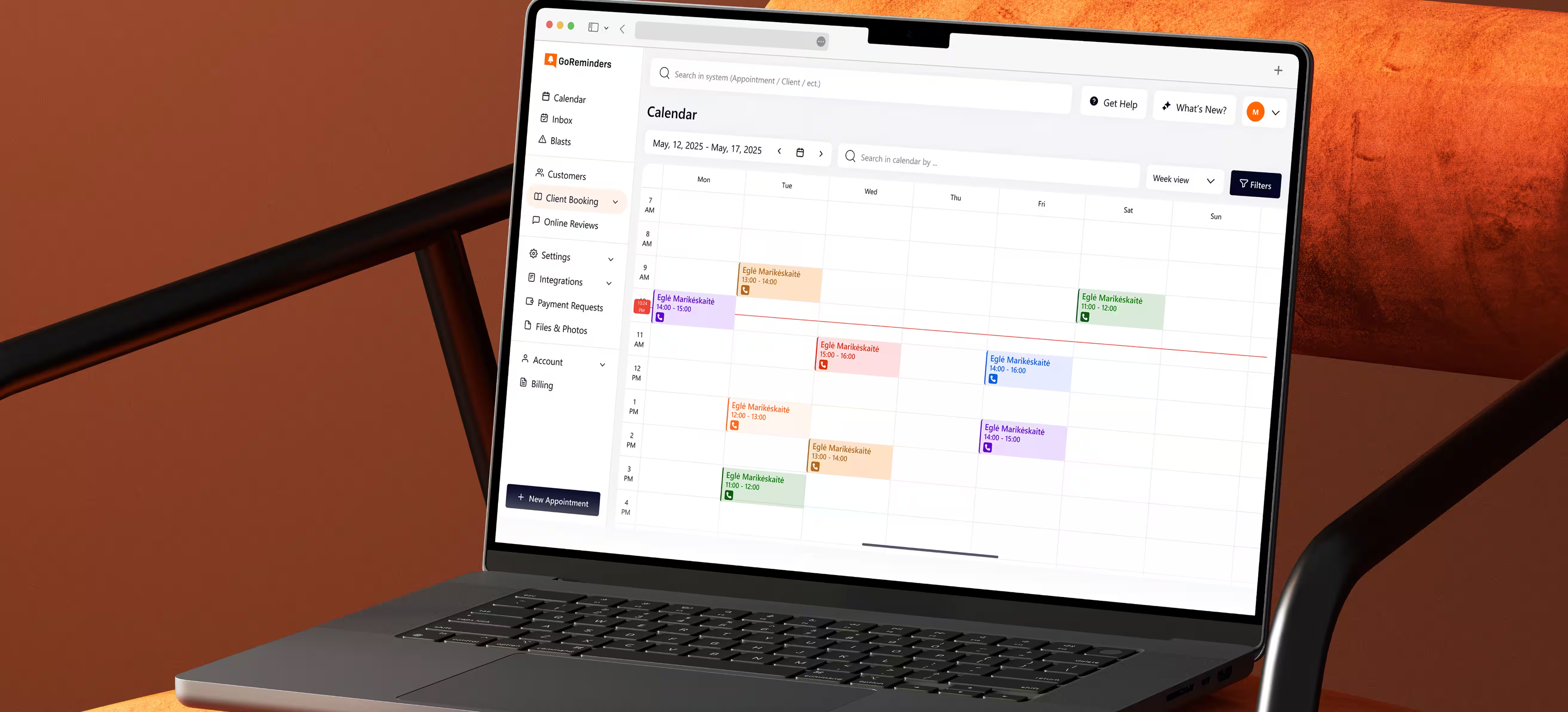
Sidebar navigation, calendar-centric scheduling, consistent patterns across modules.
Faster core tasks measured by time,
clicks, errors, and adoption.
GoReminders expanded across scheduling, customers, booking, and messaging. The original structure became harder to scan and slower for daily operations. The redesign had to keep dense calendar work readable while making high-frequency actions feel instant. A scalable UI foundation was required to prevent pattern drift as the platform grows
Reduce click depth to Calendar, Customers, and Settings (tracked via navigation events).
Reduce time-to-create appointments (Quick flow vs Full flow timestamps).
Reduce validation errors per appointment attempt (form error logs).
Keep calendar usable under dense schedules (view/filter sequences and backtracking).
Increase consistent module usage (adoption of filters, panels, and templates).
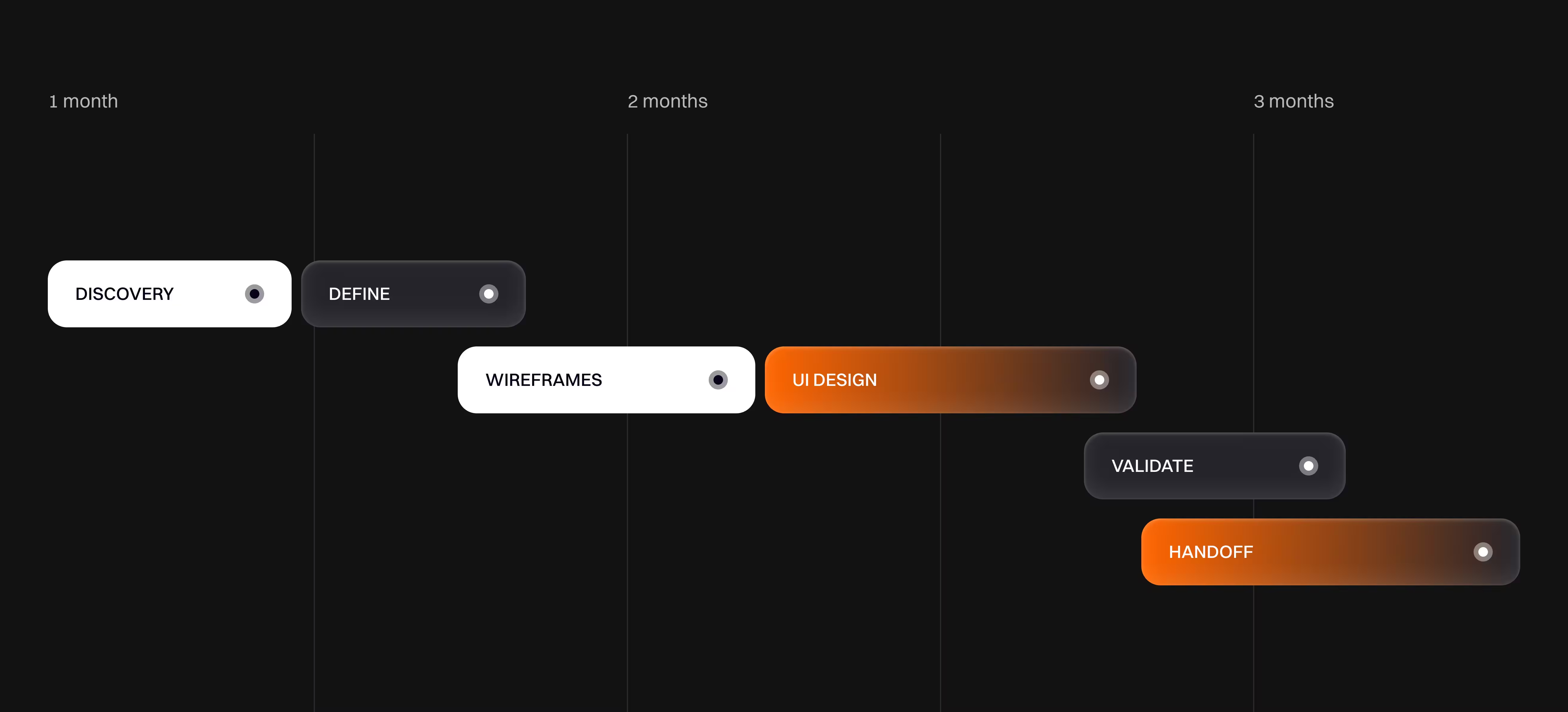
Regular design reviews with async checkpoints. Each iteration ends with a shippable UI slice and clear decisions.
Audit notes, IA structure updates, wireframes, hi-fi UI, and a component library with states.
A lightweight decision log captured the problem, chosen pattern, and acceptance criteria.
Design/specs and implementation alignment stayed close through handoff walkthroughs and QA.
We audited navigation, scheduling, and settings across key roles. We also reviewed calendar usage under dense, real-world data states.
We mapped the scheduling flow from calendar to appointment detail and follow-ups. We also mapped supporting flows for customers, groups, imports, and booking requests.
High-frequency actions should be contextual panels, not page trips. Consistent component states were required to scale modules without regressions.
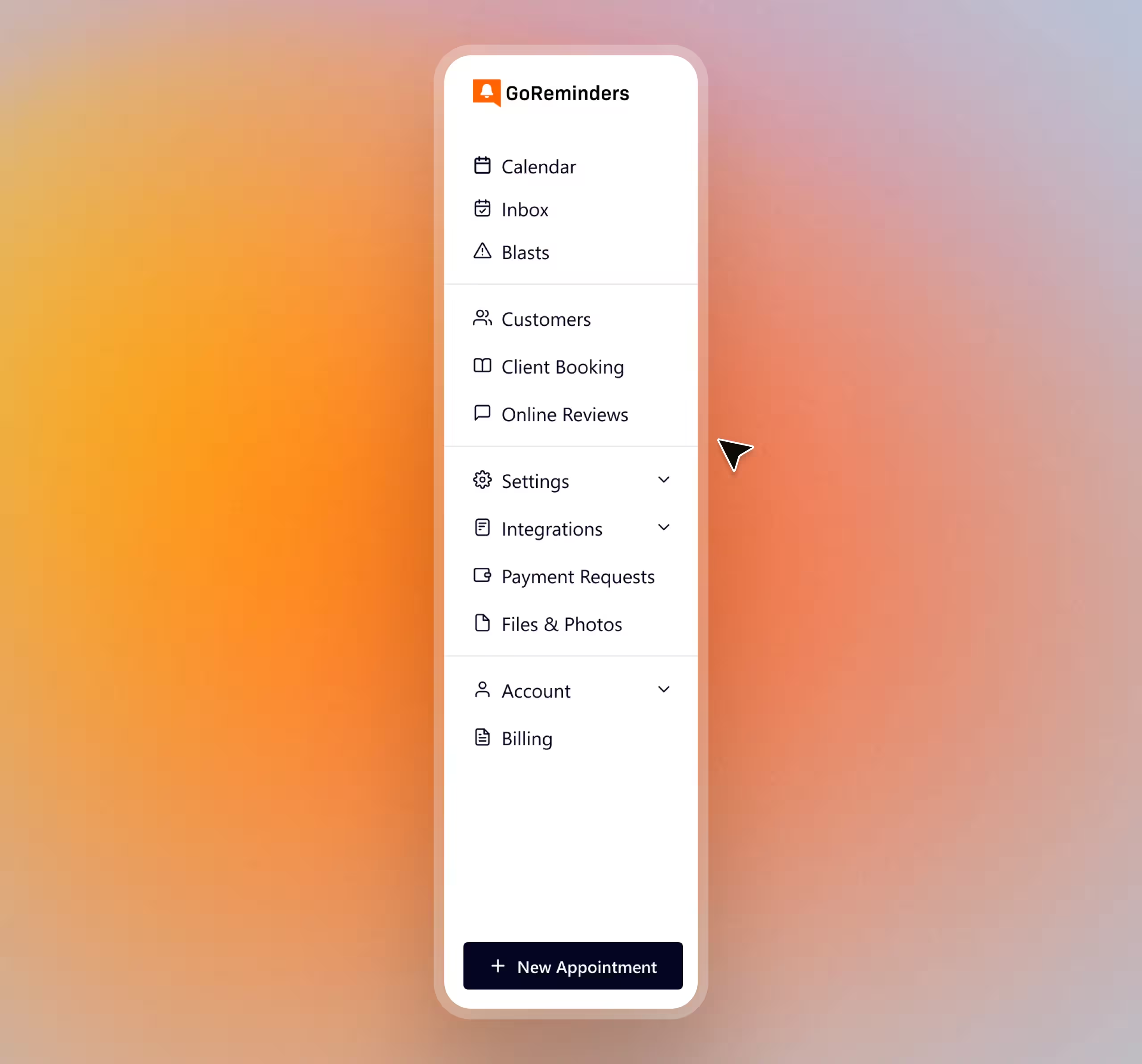
Module growth increased scanning time
and click depth for daily tasks.
Shift to left sidebar IA with clear clusters
and predictable entry points.
Group modules by job-to-be-done, standardize icons, and keep global search visible. Collapsible sections reduce visual noise while preserving depth.
Fewer clicks to reach Calendar, Customers, and Settings
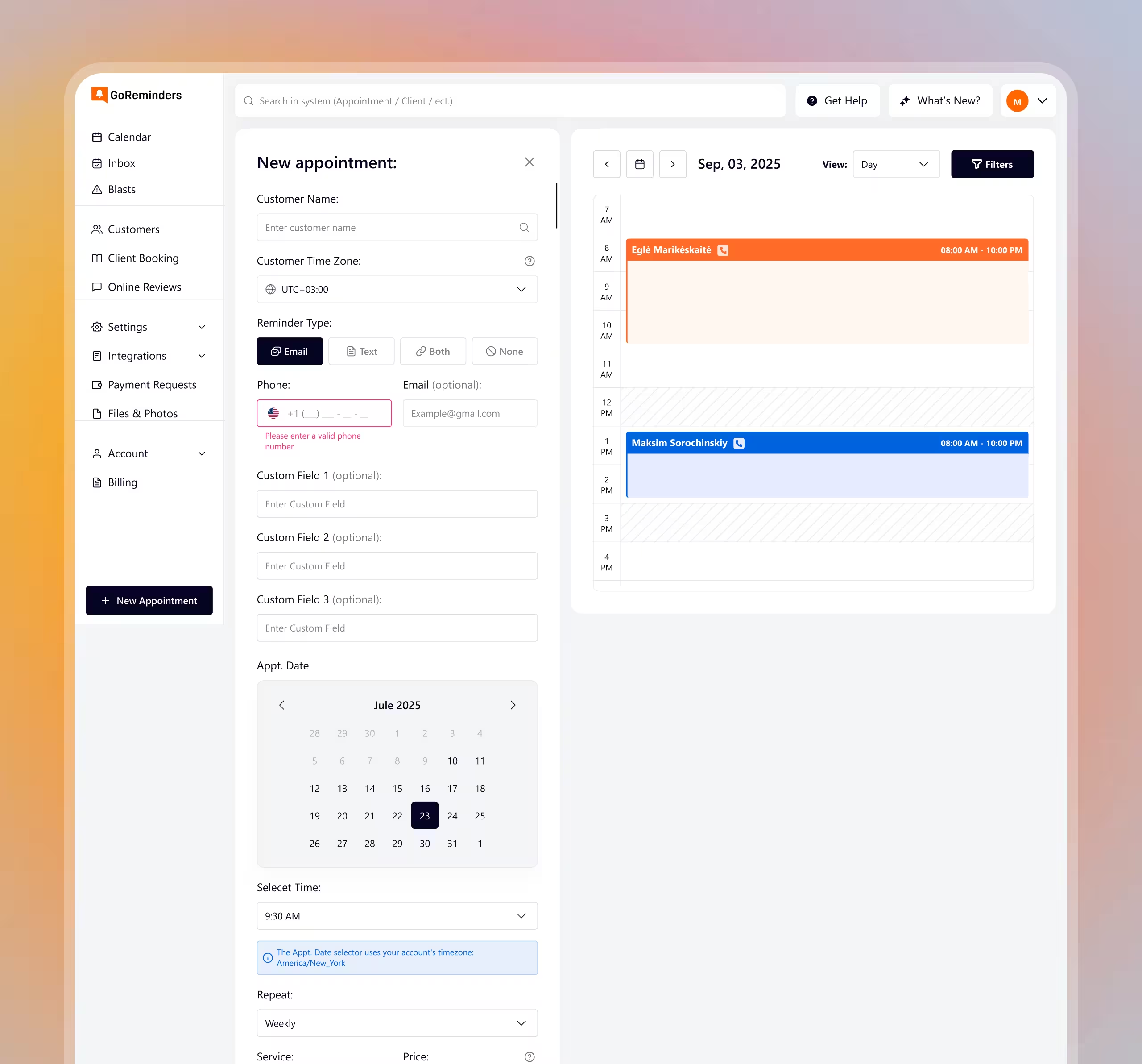
Full-page appointment creation felt heavy and
increased drop-off on optional details.
Make scheduling a contextual action with progressive disclosure.
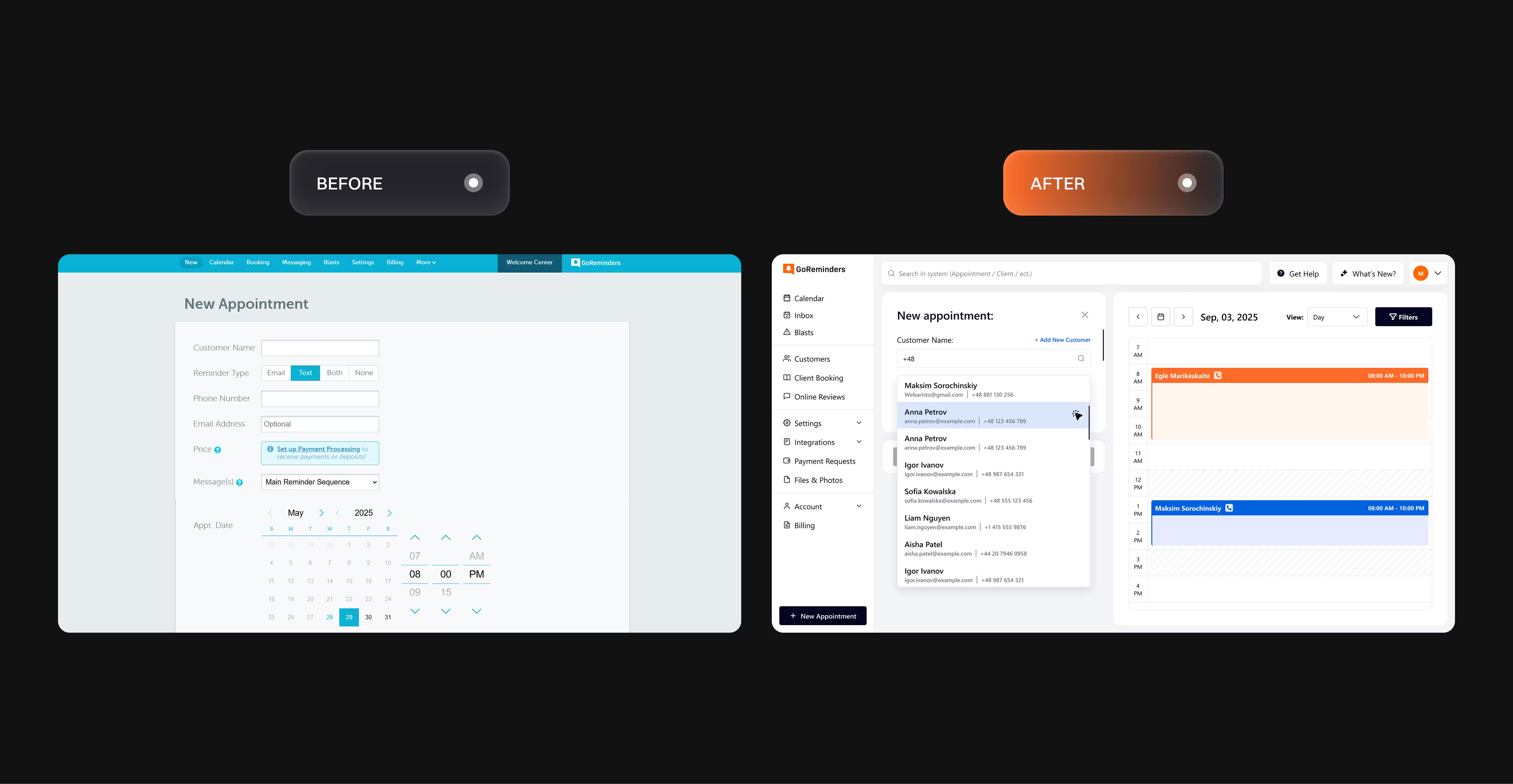
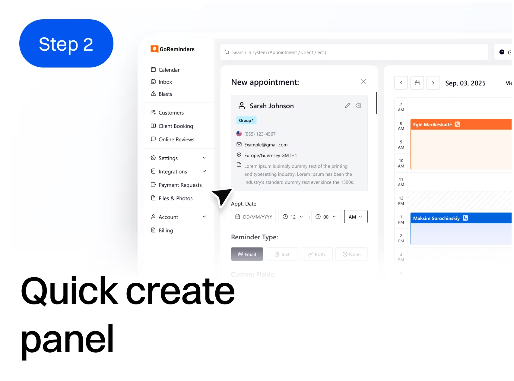
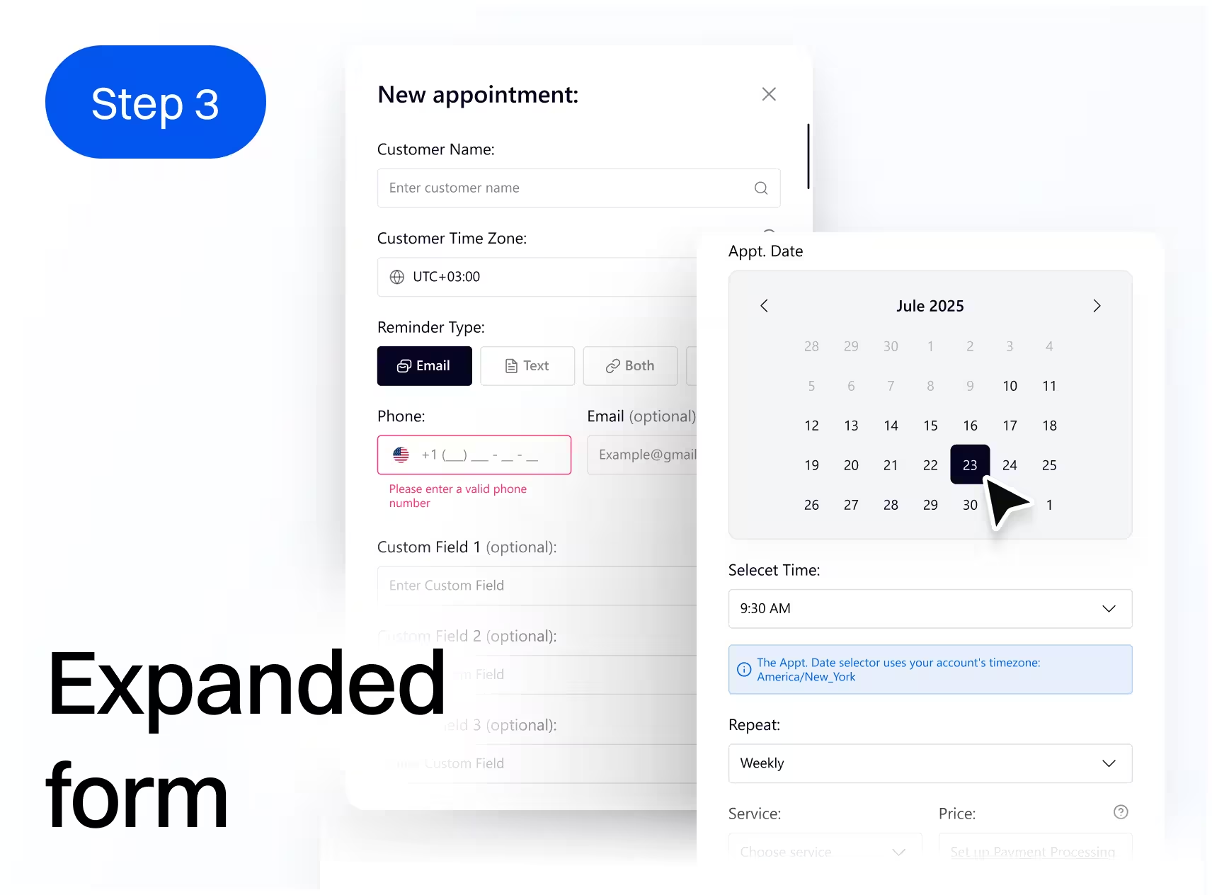
Quick create captures essentials (customer + time), then expands into full details only when needed. Validation and field grouping prevent avoidable errors.
Lower time-to-create, measured by quick vs full flow timing.
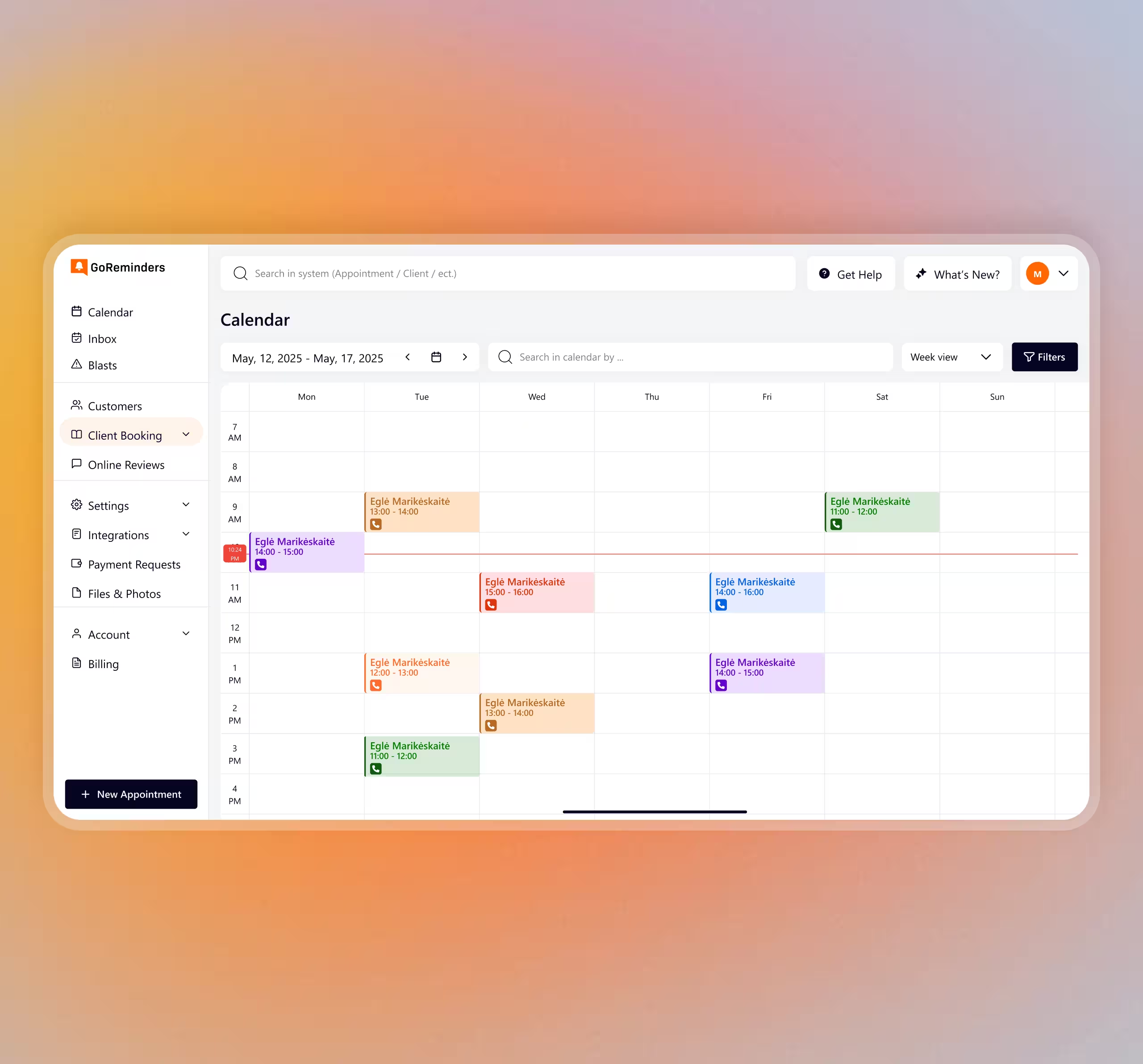
One calendar view could not serve planning
and dense scheduling equally well.
Support Month/Week/Day views with one filter model.
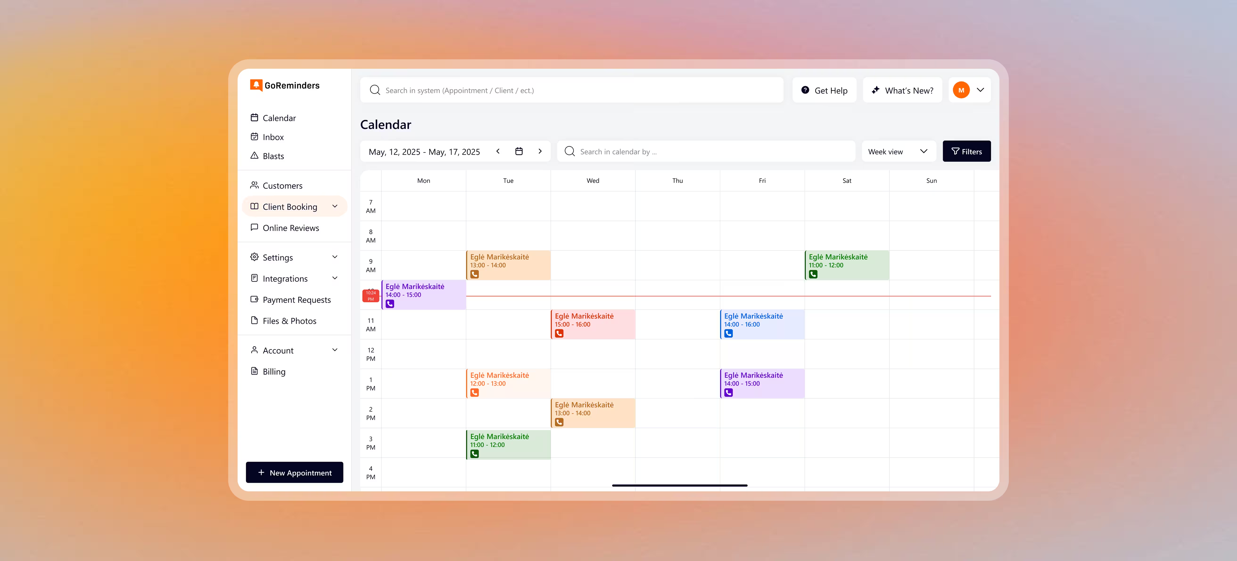
Month pairs overview with a focused list; Week/Day keep time blocks readable. Shared filters and chips narrow the view without losing context.
Faster slot selection, tracked via view/filter action sequences.
Post-create actions were scattered across status,
messaging, and payment steps.
Consolidate actions into a single appointment detail panel.
Provide primary actions (edit/status/message/payments) plus collapsible details. A reminders timeline makes follow-ups visible and auditable.
Faster post-create actions, measured by time-to-action events.
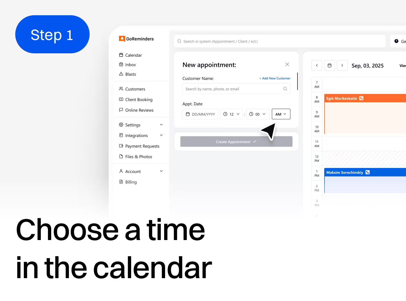
Scheduling was redesigned around the calendar so users never lose context. Quick create captures essentials in seconds, then expands into advanced fields like timezone, reminder type, repeats, and service/staff/location. This reduces avoidable errors and keeps high-frequency scheduling fast and consistent.
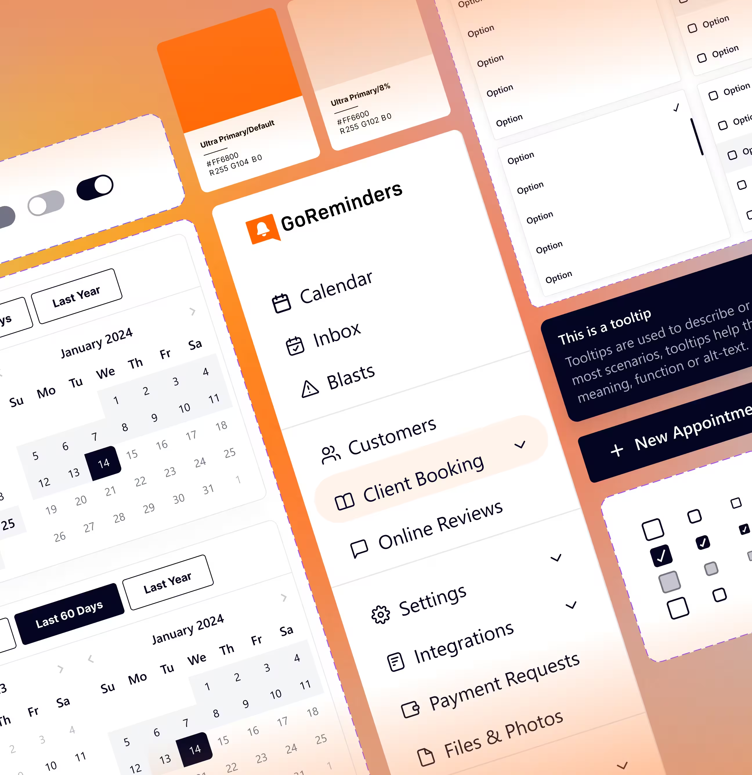
The redesign was translated into a reusable UI system: tokens, component variants, and validation states. Panels, modals, tables, and empty states follow shared rules across modules. Proof points include tokens, component variants, table/empty patterns, and overlay behavior. This reduces regressions and makes new modules cheaper to build.
The redesign prioritized the highest-frequency workflows first to reduce risk. Component states were locked early and verified under dense calendar data. Stability during implementation was maintained through responsive QA and walkthroughs focused on states, variants, and edge cases.
Edge-case checklist for scheduling and messaging.
Responsive QA across breakpoints and dense states.
Walkthrough of states,
variants, and specs.
Handoff was structured to reduce implementation ambiguity. Screens map directly to components and states, with consistent naming and interaction notes. Developer comments document edge cases and validation rules. This decreases back-and-forth and speeds delivery.
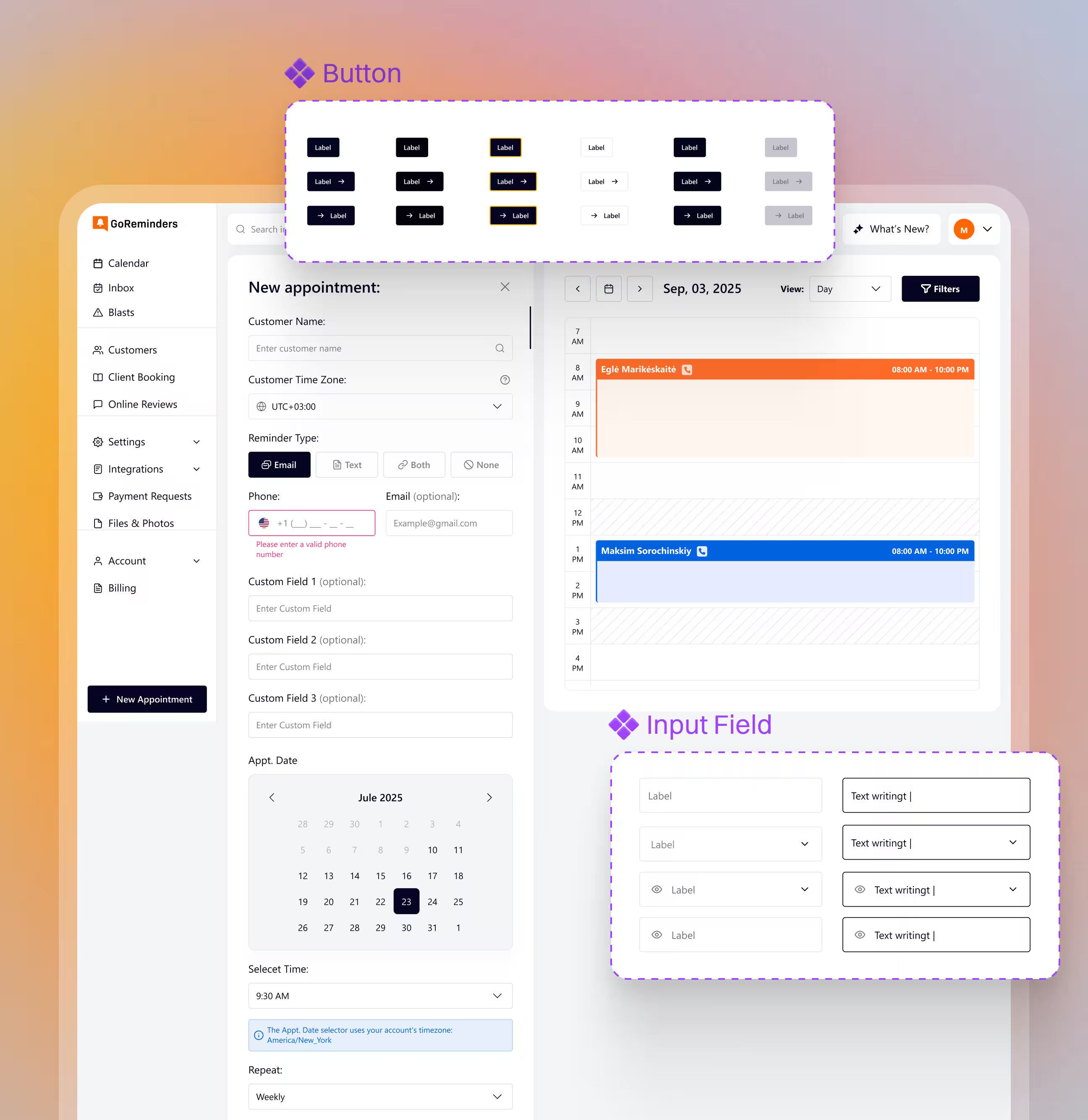
Users can schedule and manage appointments without losing calendar context. Teams spend less time correcting avoidable input mistakes and more time on real work. Consistent patterns across Customers and Booking Requests reduce training load and UI fragmentation. For the business, the platform is easier to extend, lowering design and development overhead for future modules.
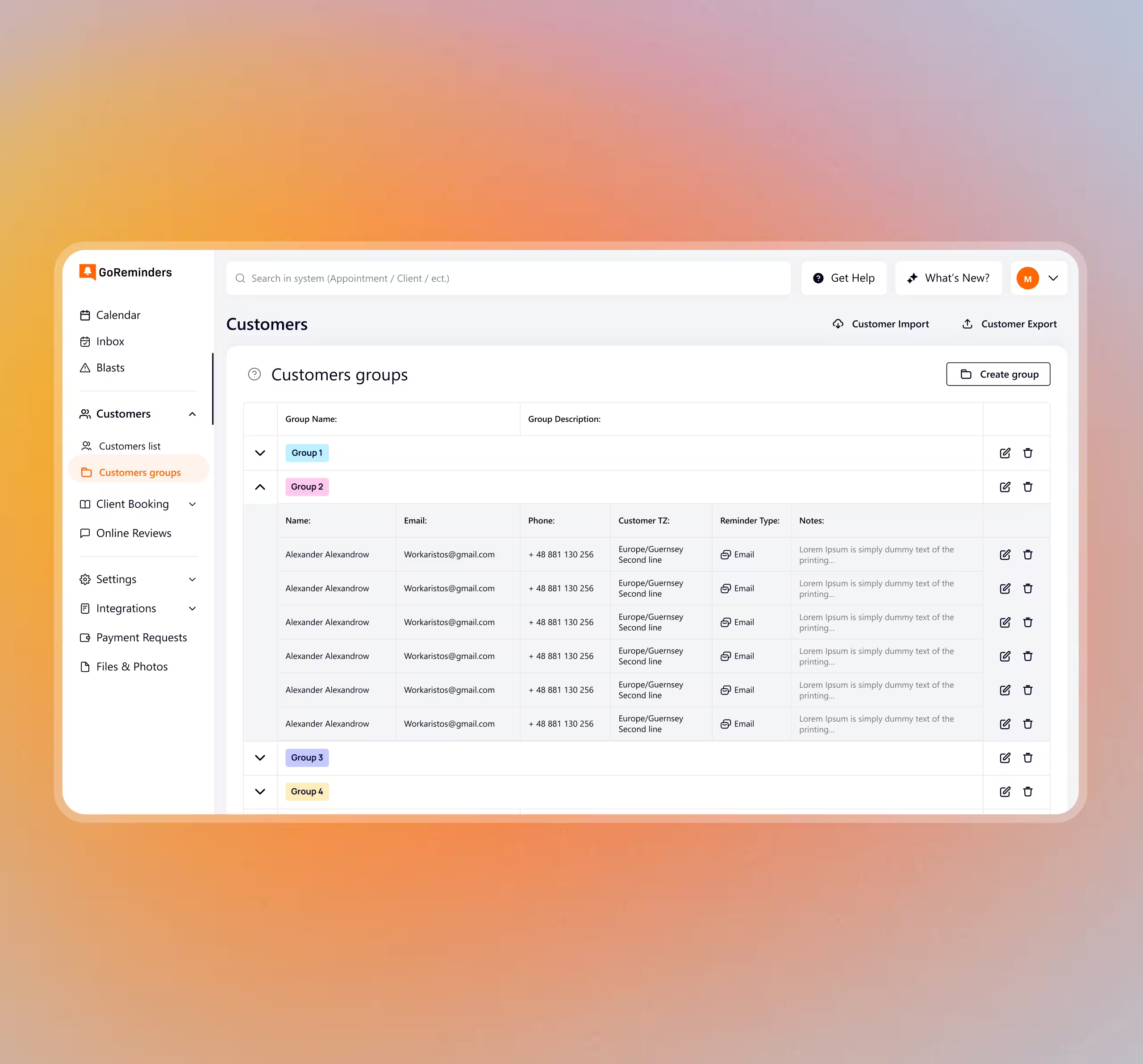
Shows how modules were clustered to reduce scanning time.
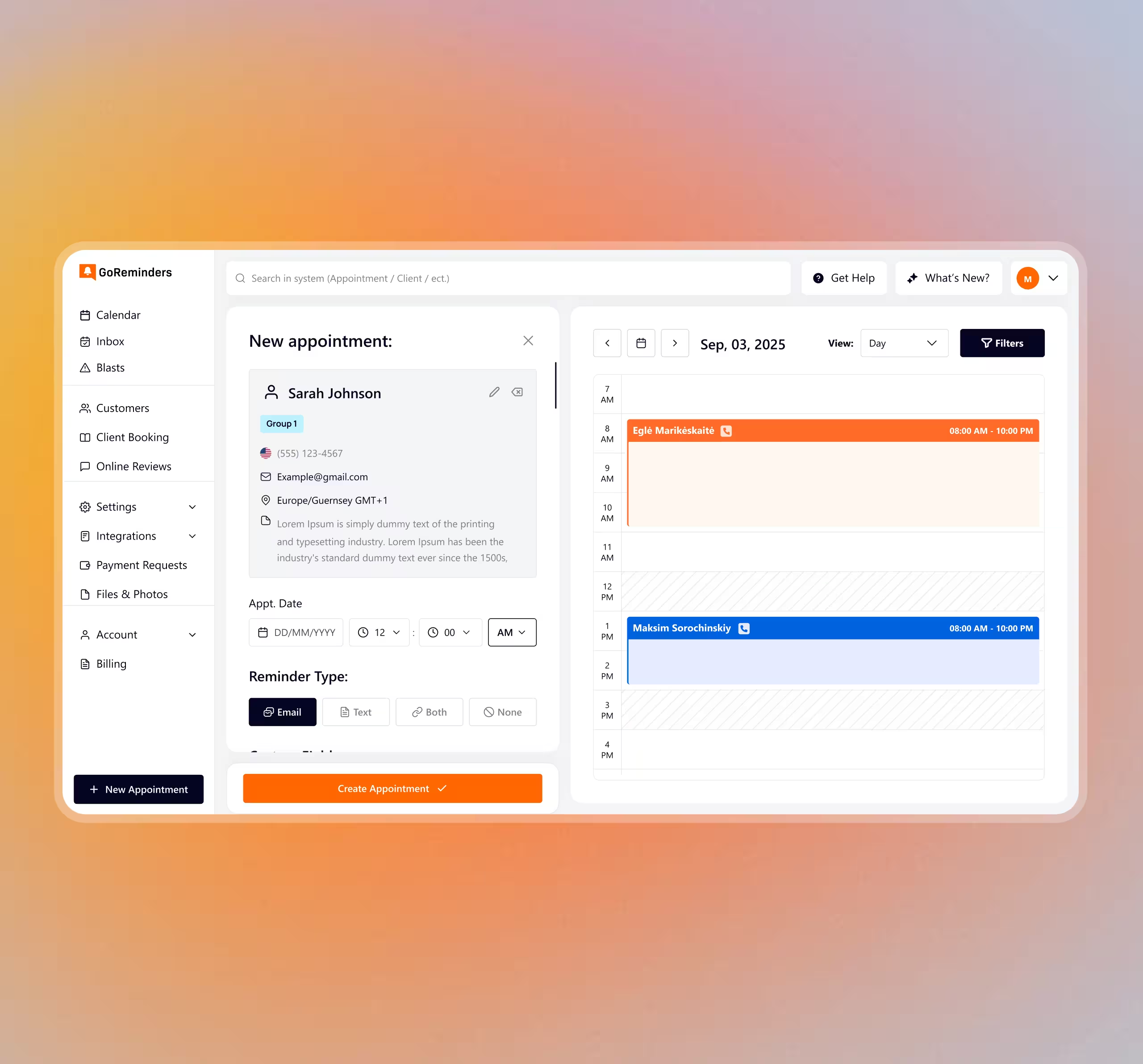
Quick full progression plus edge cases.
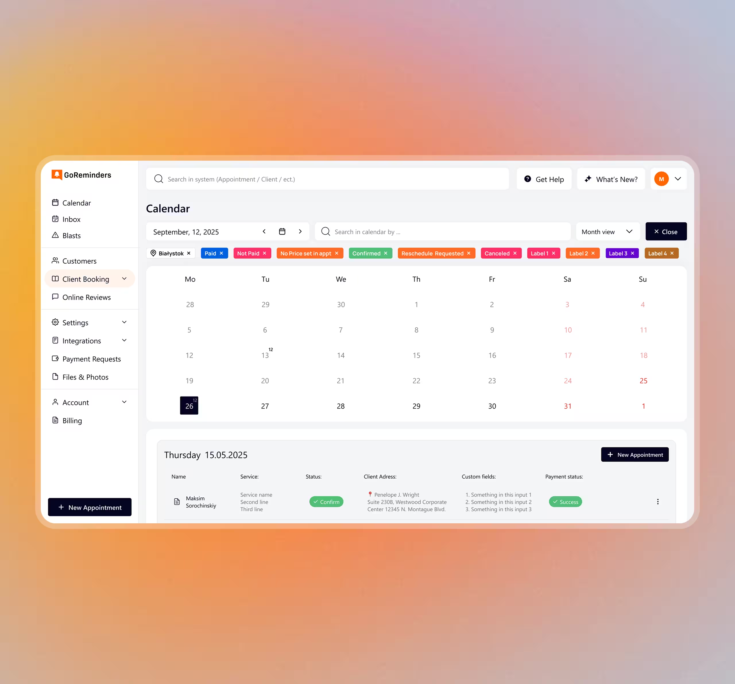
Month / Week / Day aligned to one filter model.
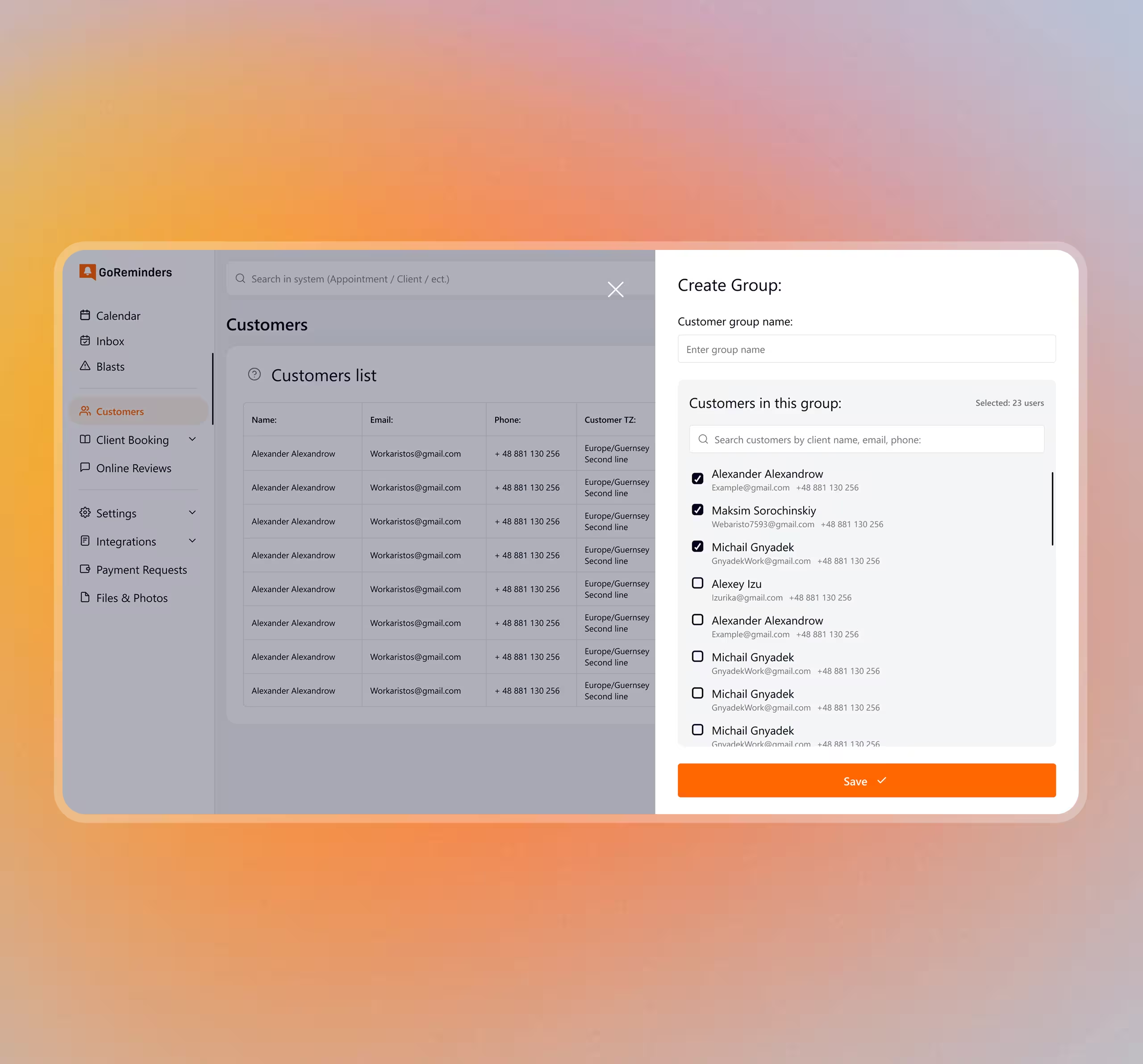
Consistent modal patterns for bulk operations.
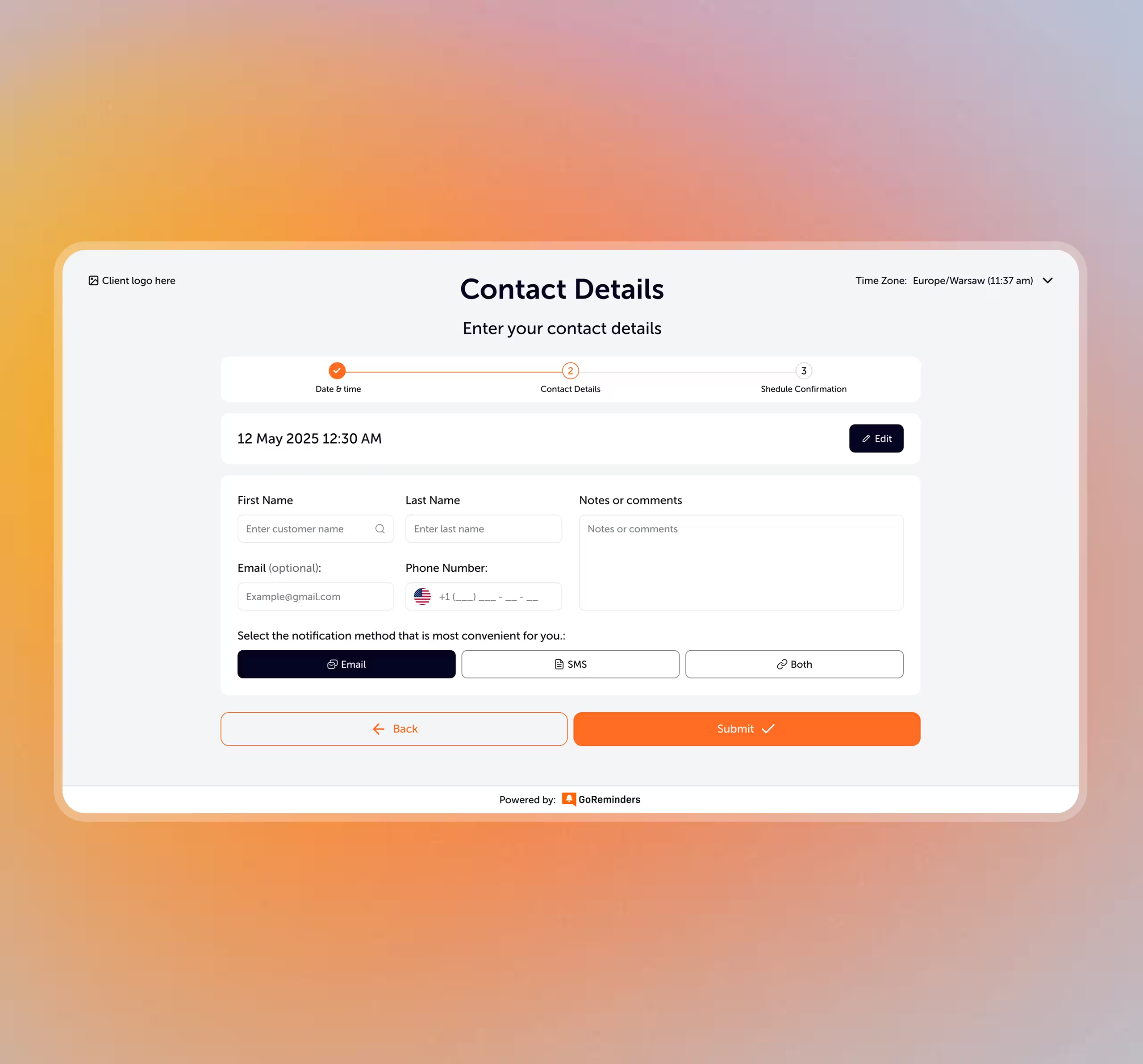
Clear progression from request to confirmation.
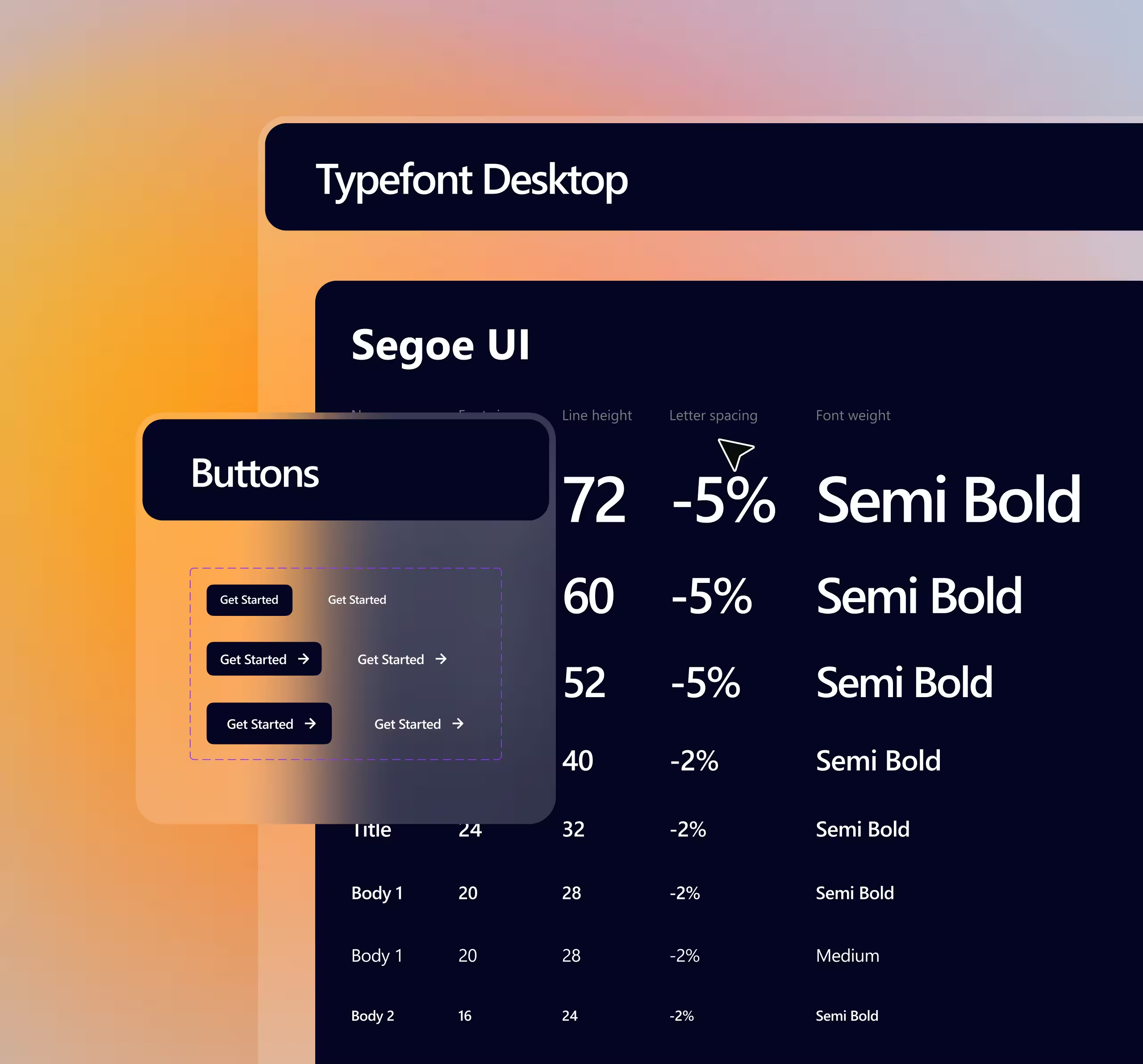
Tokens, variants, and validation states across modules.
Whether you are launching a SaaS product, redesigning an existing platform, or improving the website around it, we can help create a clearer and more scalable product experience.