Marketer World
Operator-level homepagefor Growth Mentoring.
Operator-level homepagefor Growth Mentoring.
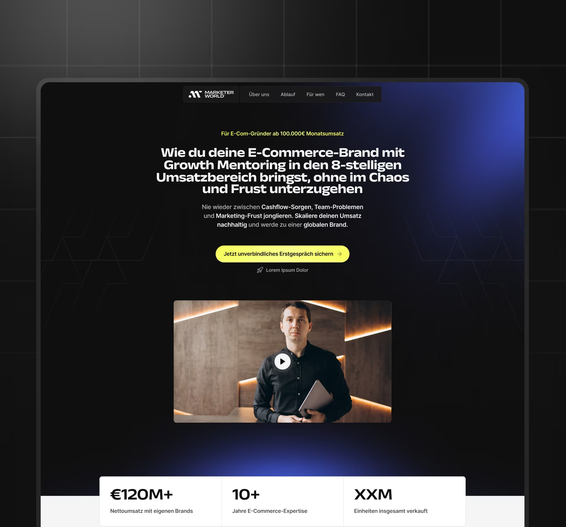
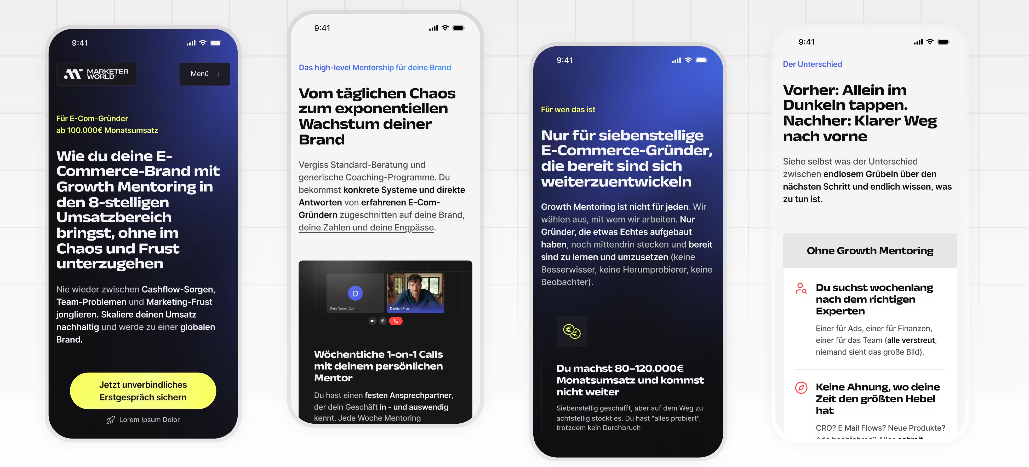
Marketer World is a premium growth and education platform for ambitious DTC and e-commerce founders. For the launch phase, the website focuses on Growth Mentoring: a high-level mentoring program that helps founders replace scattered decisions with clearer priorities, operator-level guidance, and structured growth support. Our team designed the launch homepage in Figma, created the responsive experience and full UI Kit, and prepared the work for Webflow implementation.
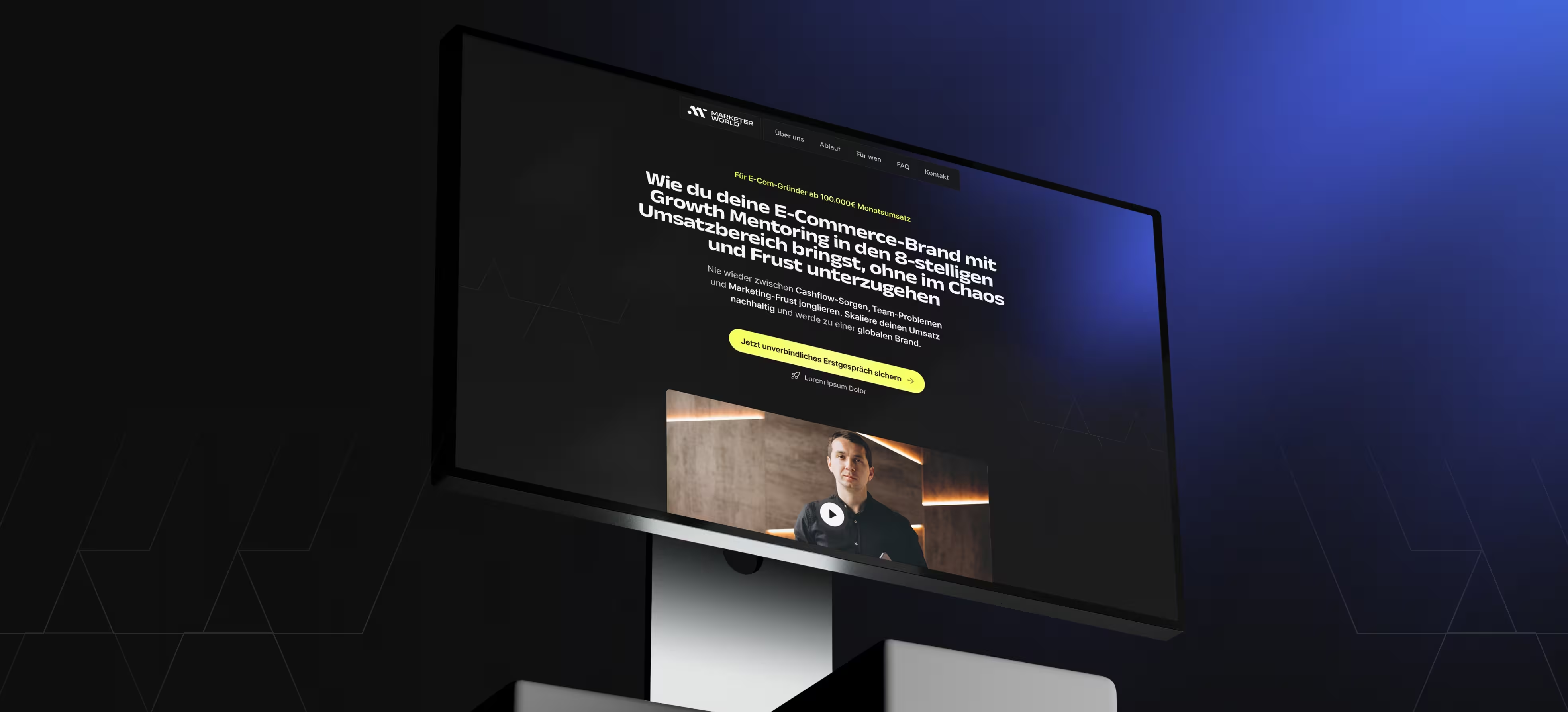
Present mentoring as serious growth infrastructure, not coaching.
Build a CEO-ready decision path around trust and fit.
Create a premium homepage with flows, visuals, responsive UI, and kit.
A Webflow-ready launch page with clearer positioning and structure.
The page is used by founders, CEOs, and Growth Leads when they are deciding whether Growth Mentoring is credible enough to explore seriously. A founder may arrive while feeling stuck between cashflow pressure, team decisions, and marketing uncertainty. A Growth Lead may use the page to understand the offer and bring it to a CEO. A CEO may scan the page to decide whether this is operator-level support or just another generic coaching offer.

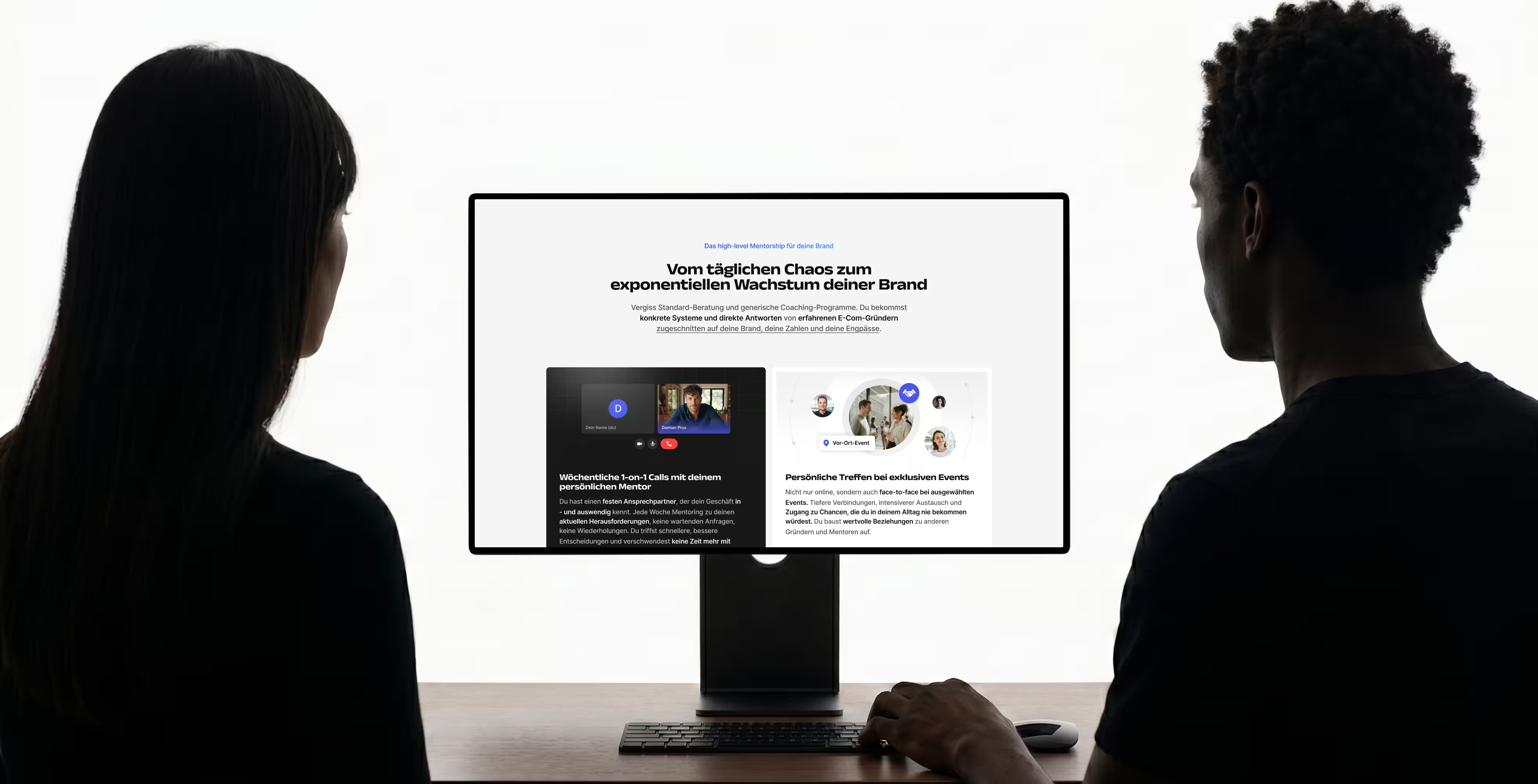
The target audience is not looking for inspiration. They are often dealing with too many high-impact decisions at once and need to know quickly whether a program can reduce complexity. If the page feels vague, motivational, or overloaded, it becomes part of the same noise the brand is trying to solve.
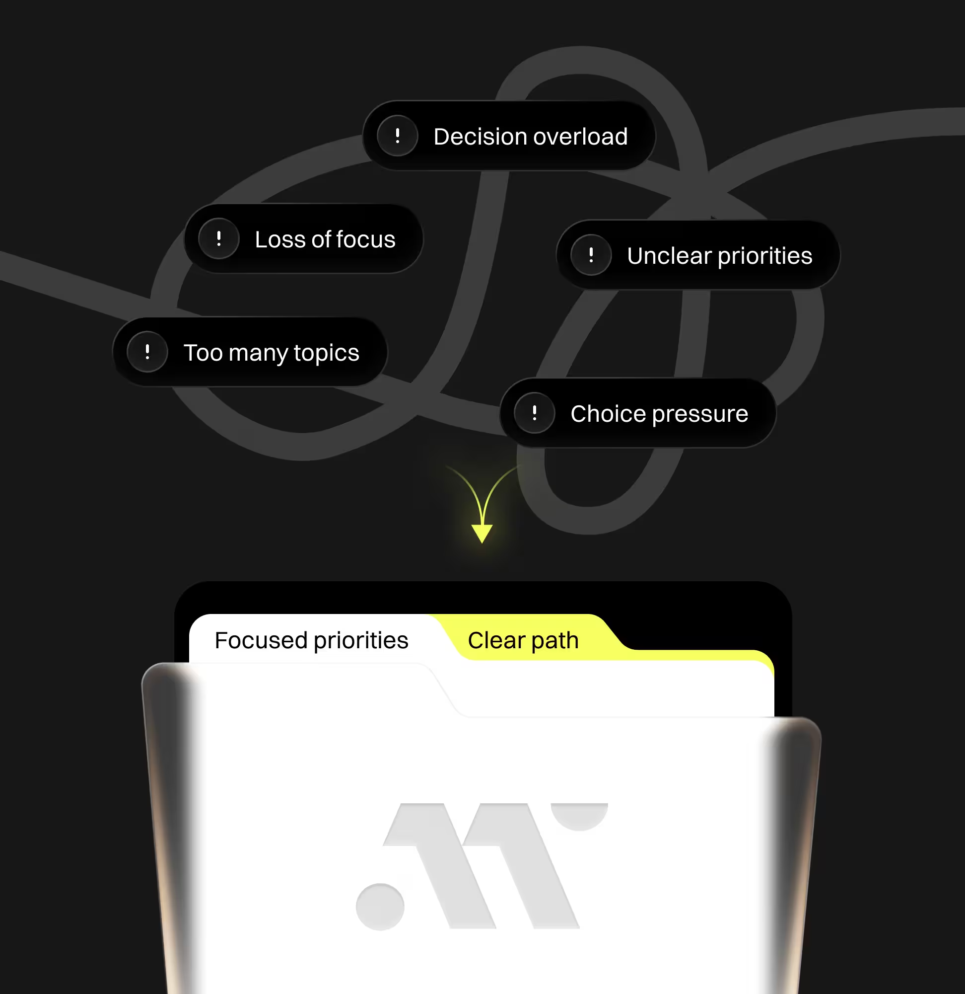
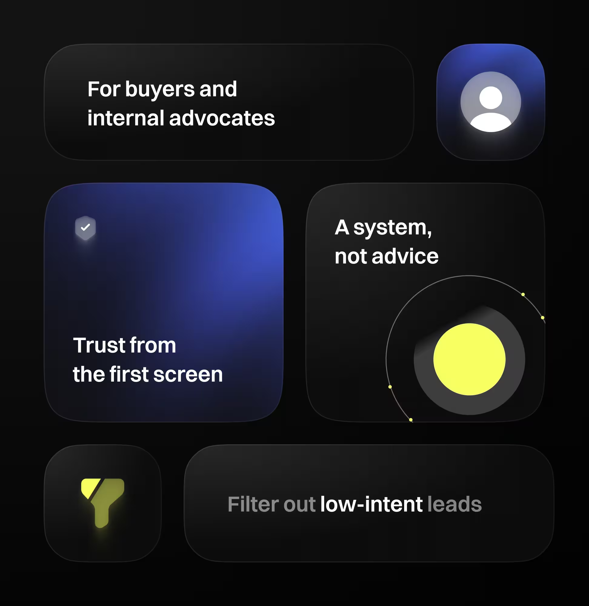
We treated the homepage as a high-trust decision page. The structure was built around fast understanding, operator credibility, a clear operating model, selective fit, and a confident application path.
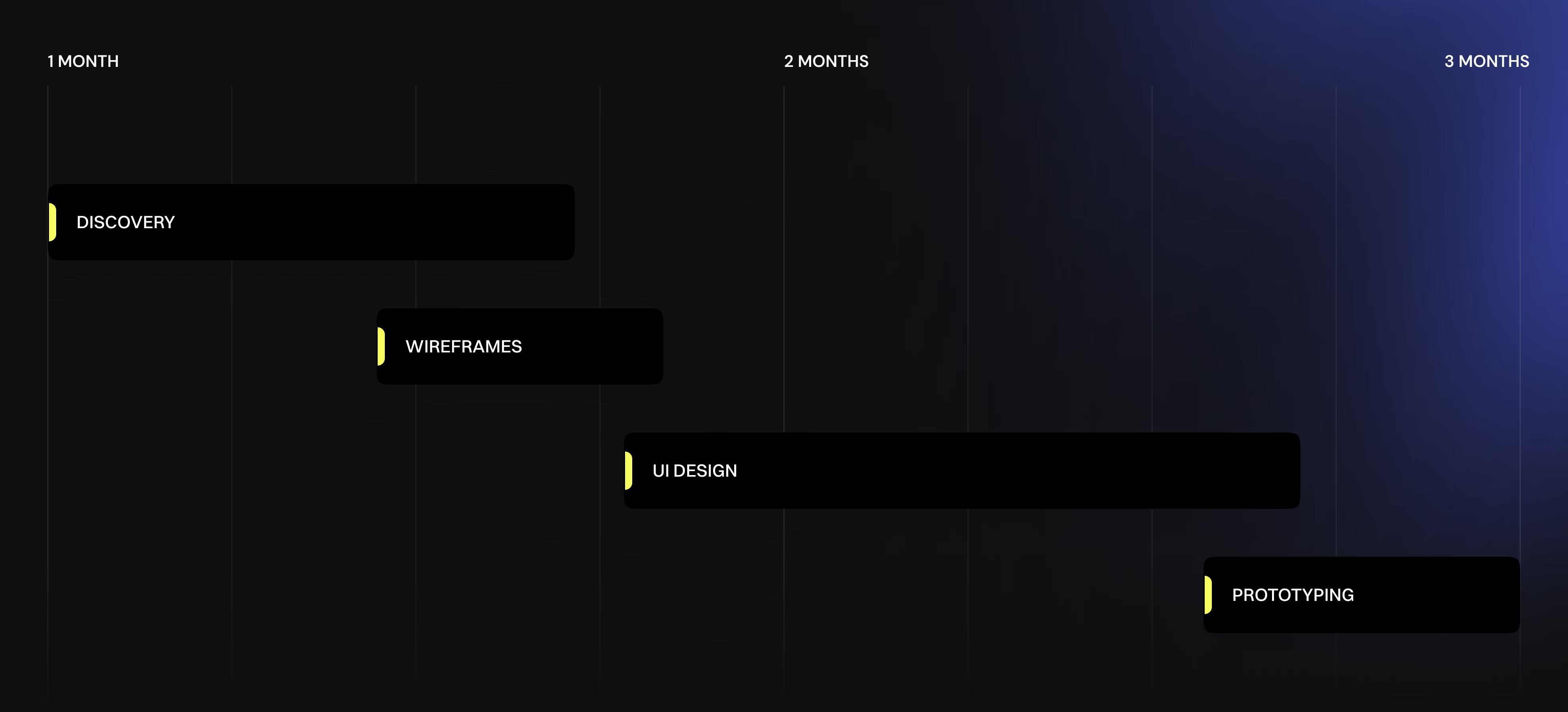
The work moved from discovery and user-flow logic into wireframes, visual concepts, final design, responsive adaptation, UI Kit preparation, and Webflow-ready handoff. Throughout the process, copy was adjusted to support scanning, hierarchy, and conversion clarity instead of becoming a long text document.
The offer could easily be mistaken for another coaching program if the page led with generic promise language.
We reframed the homepage around the way serious founders evaluate high-ticket strategic support. The page now moves from fast positioning to credibility, operating model, fit, and application, supporting both fast and trust-building conversion paths.
The page became easier to scan and easier to explain internally before applying.
The brand needed to show expertise without falling into guru-style presentation or overpromising.
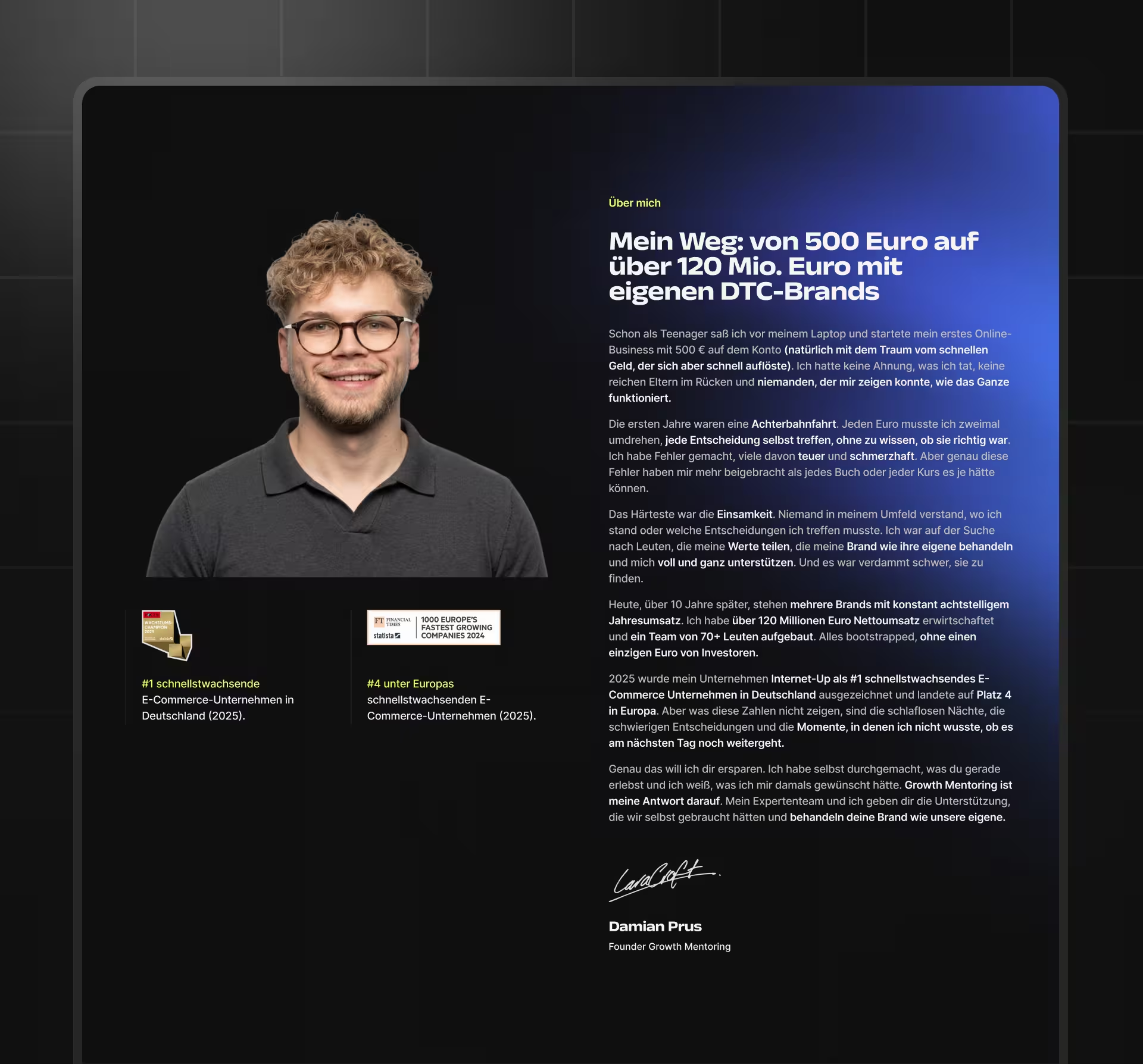
We positioned founder credibility, business context, and program mechanics as proof points. Instead of relying on motivational claims, the design language emphasizes calm confidence, strong typography, and specific operating signals.
Trust is built through evidence, structure, and restraint instead of aggressive sales pressure.
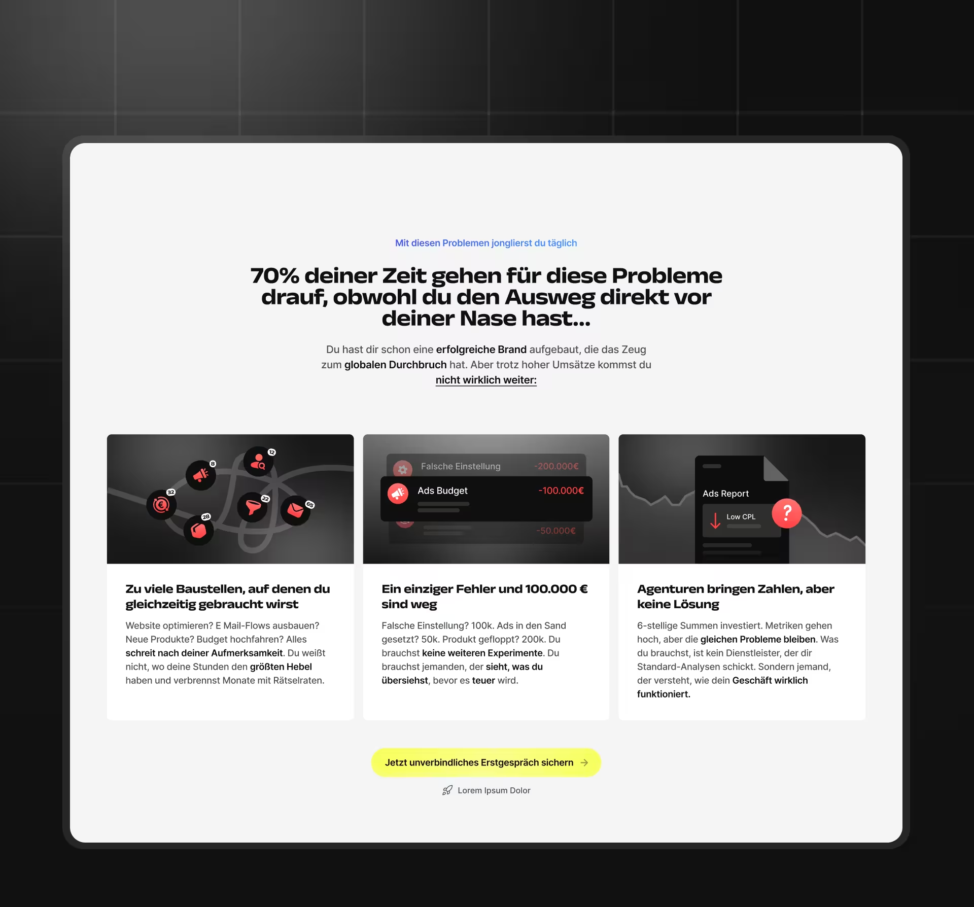
A broad lead-generation page could attract the wrong audience and weaken the sales process.
We included qualification logic throughout the page: who the program is for, what stage the founder should be in, and why the application is a fit check rather than a mass-market CTA. This makes the page selective without making it feel closed or arrogant.
The conversion path supports higher-quality applications instead of maximizing low-intent clicks.
The homepage needed to feel serious and modern while staying readable across dense strategic content.
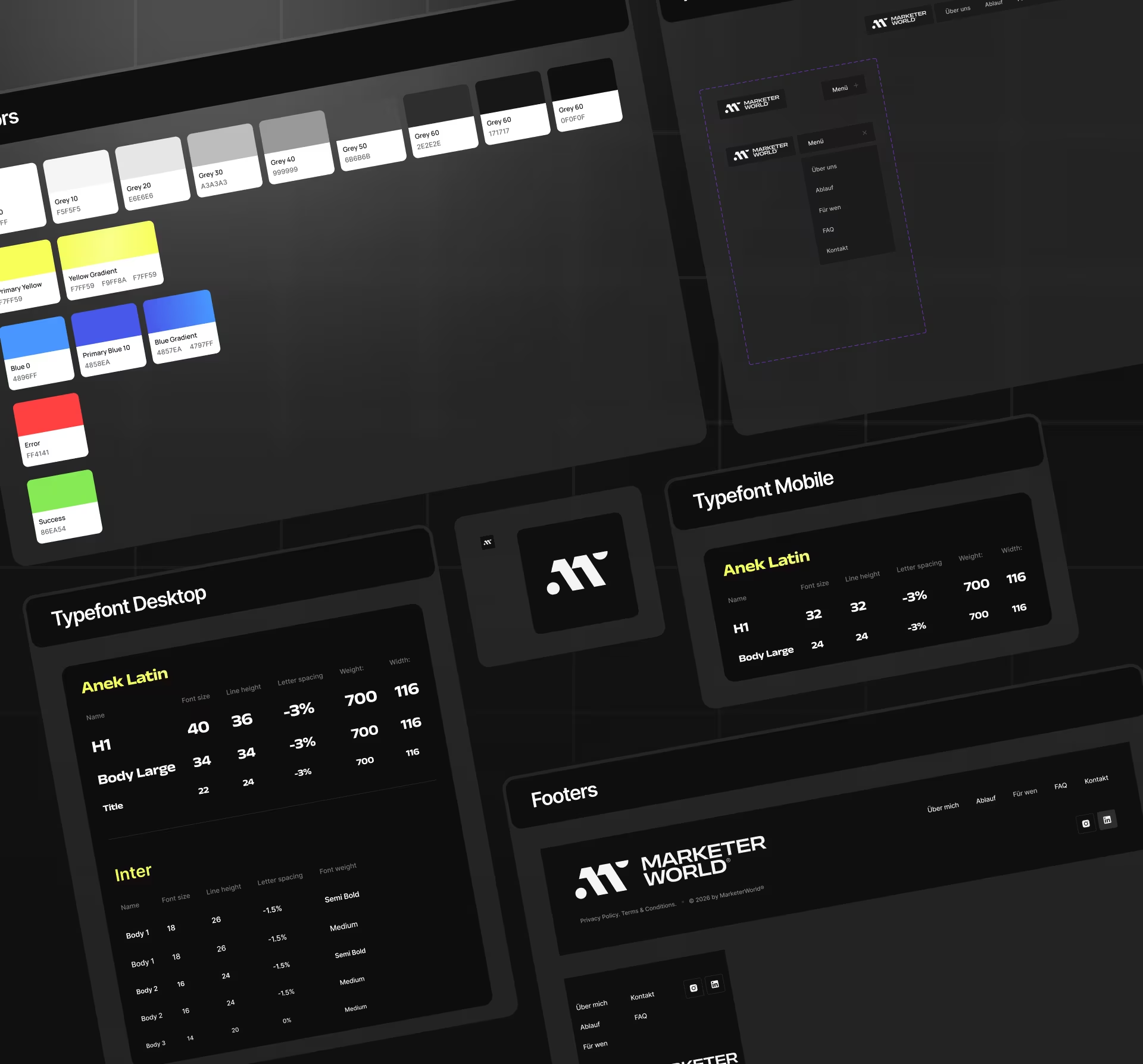
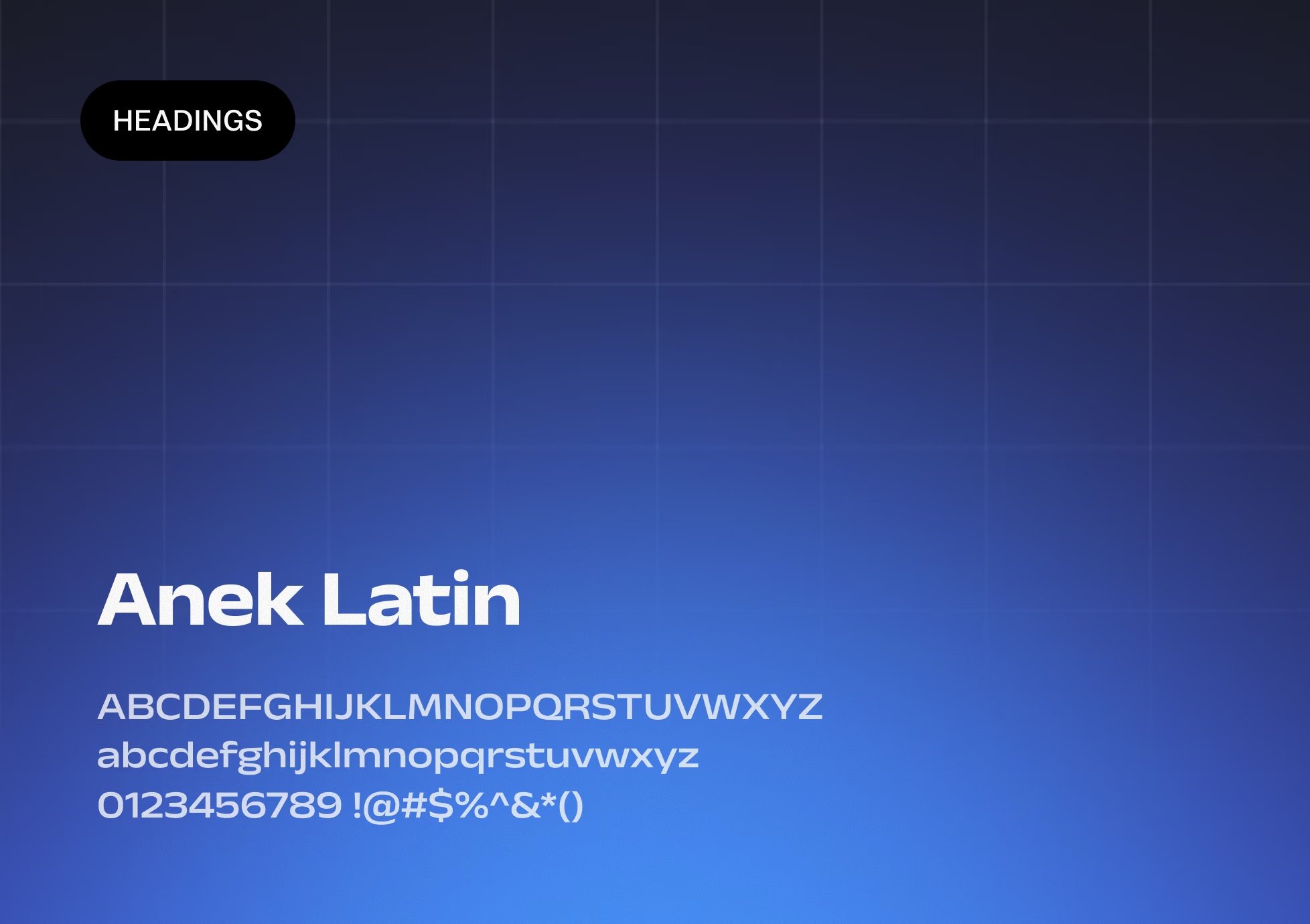
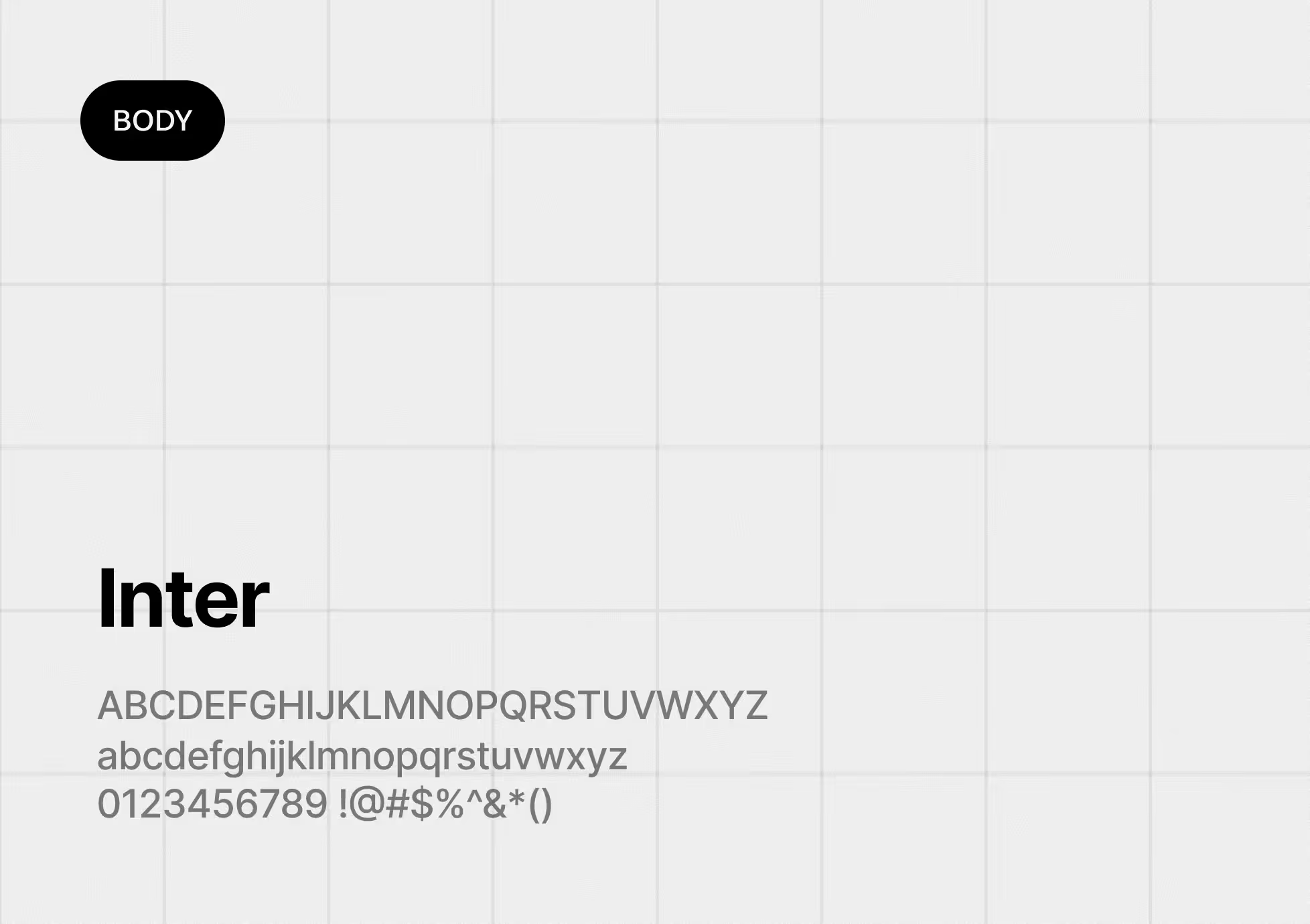
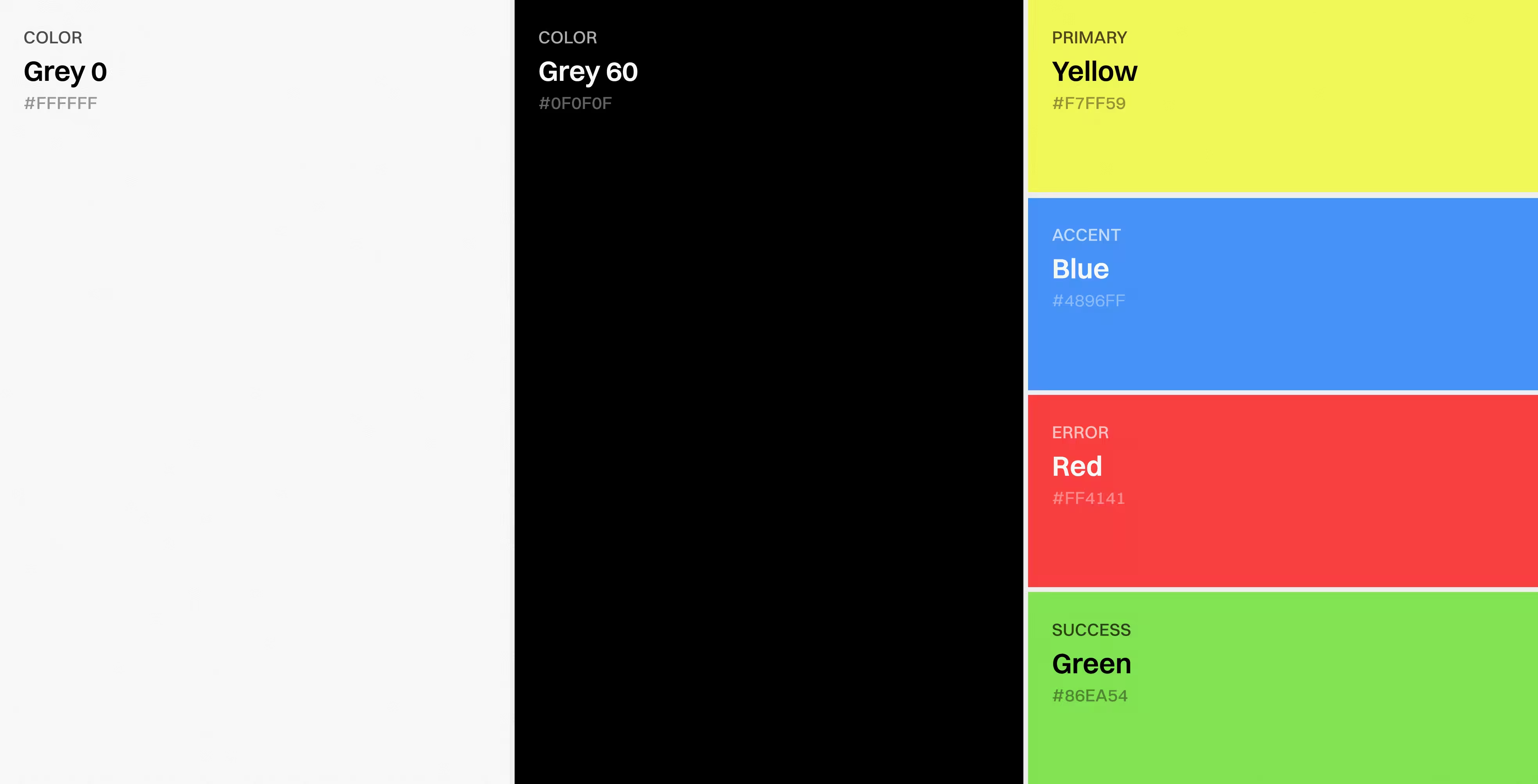
We developed a visual system with strong typography, controlled contrast, restrained accent use, structured cards, and purposeful section rhythm. The responsive adaptation and full UI Kit helped keep the page consistent across desktop and mobile.
The final design is prepared for Webflow implementation with reusable visual logic.
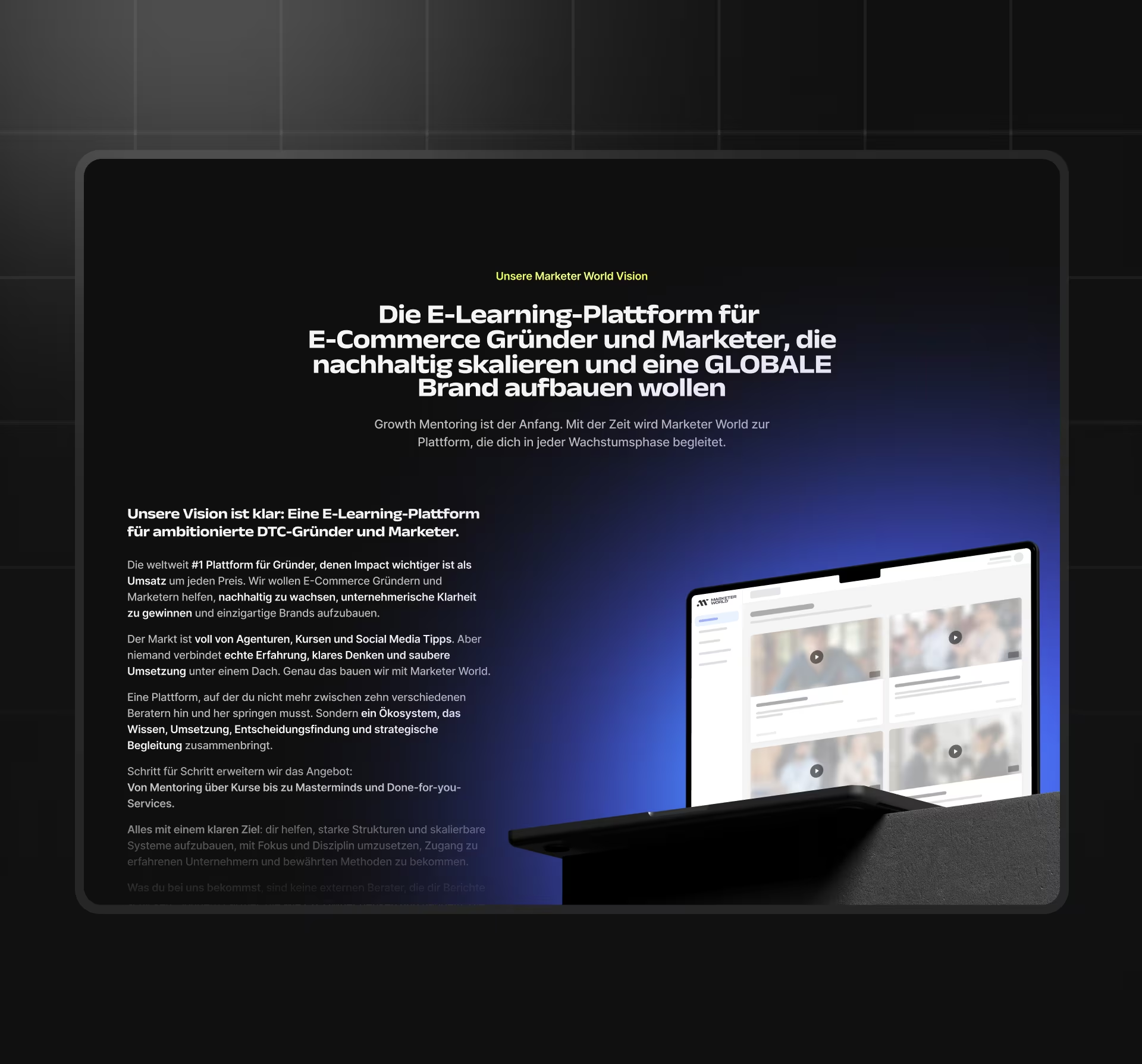
The original content contained strong ideas, but many sections were too long for a premium landing experience.
We reduced and reshaped copy where needed so that the design could communicate faster. Long explanations were turned into concise blocks, clear headings, and sections that support decision-making instead of overwhelming the visitor.
The page communicates complex positioning without feeling like a text-heavy document.
The strongest workflow is the path from first impression to serious application. A founder or Growth Lead can understand the offer quickly, validate operator credibility, see how the mentoring model works, check whether the program fits, and take the next step without pressure. This makes the homepage useful both as a conversion page and as internal decision material for CEO review.
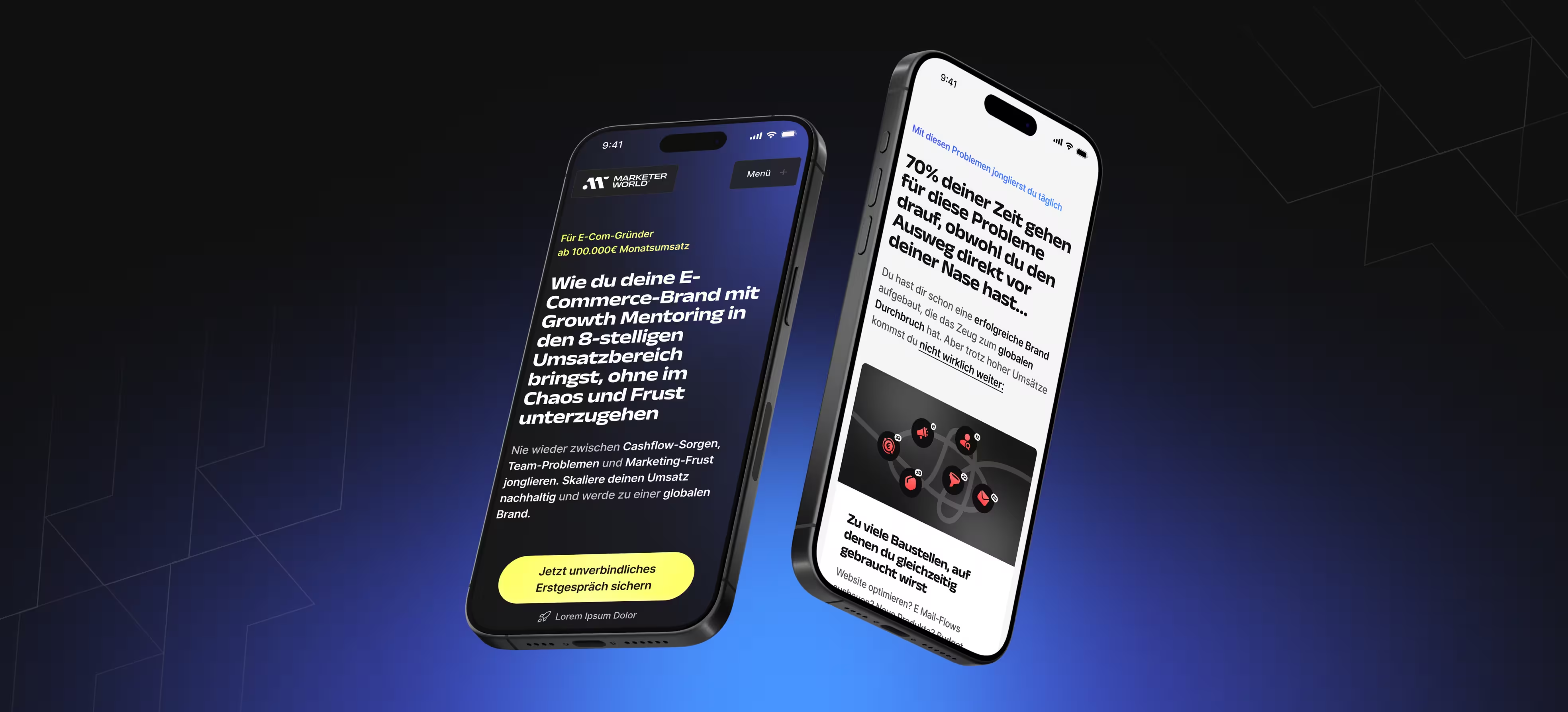
The page structure was shaped around a clear reading order rather than a list of disconnected sales sections. Each section has a defined role: establish trust, explain the model, qualify the audience, reduce objections, and support application. This makes the homepage more predictable for scanning visitors and more useful for longer consideration.
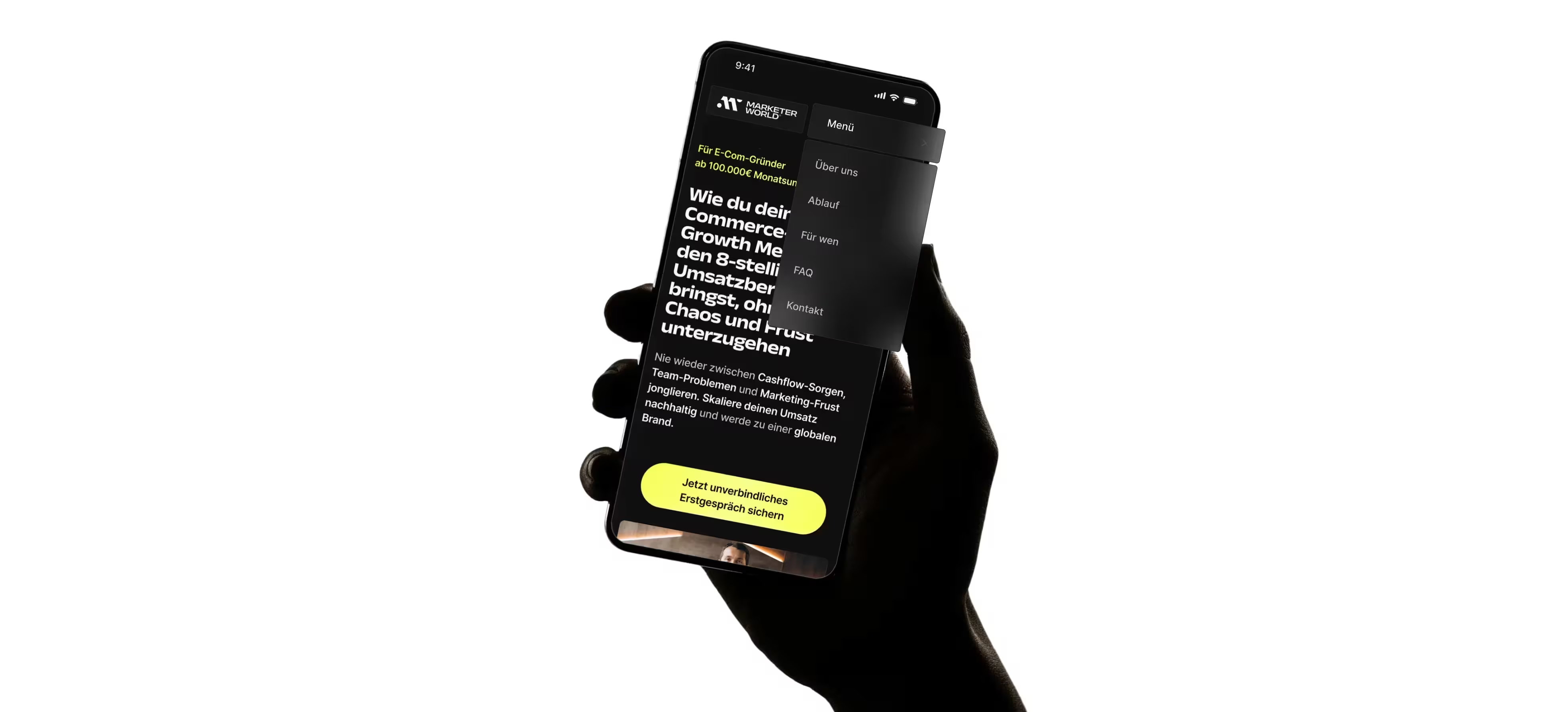
The operational logic is conversion without pressure. CTAs should feel fit-based, the application path should stay high-signal, and the page should help visitors self-qualify before submitting. The same logic supports both the founder who applies directly and the Growth Lead who shares the page with a CEO.
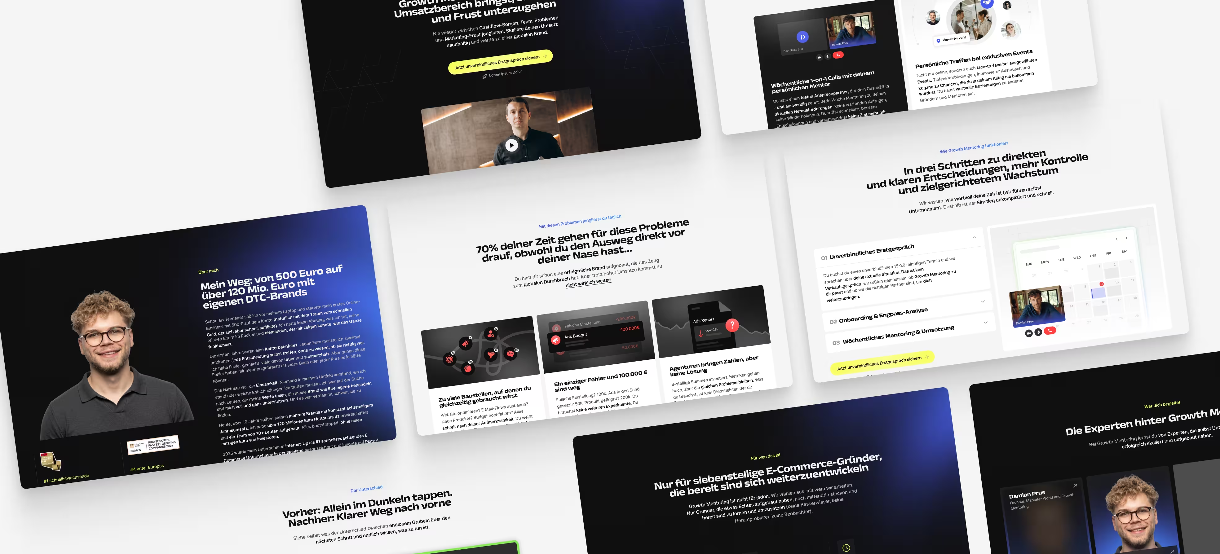
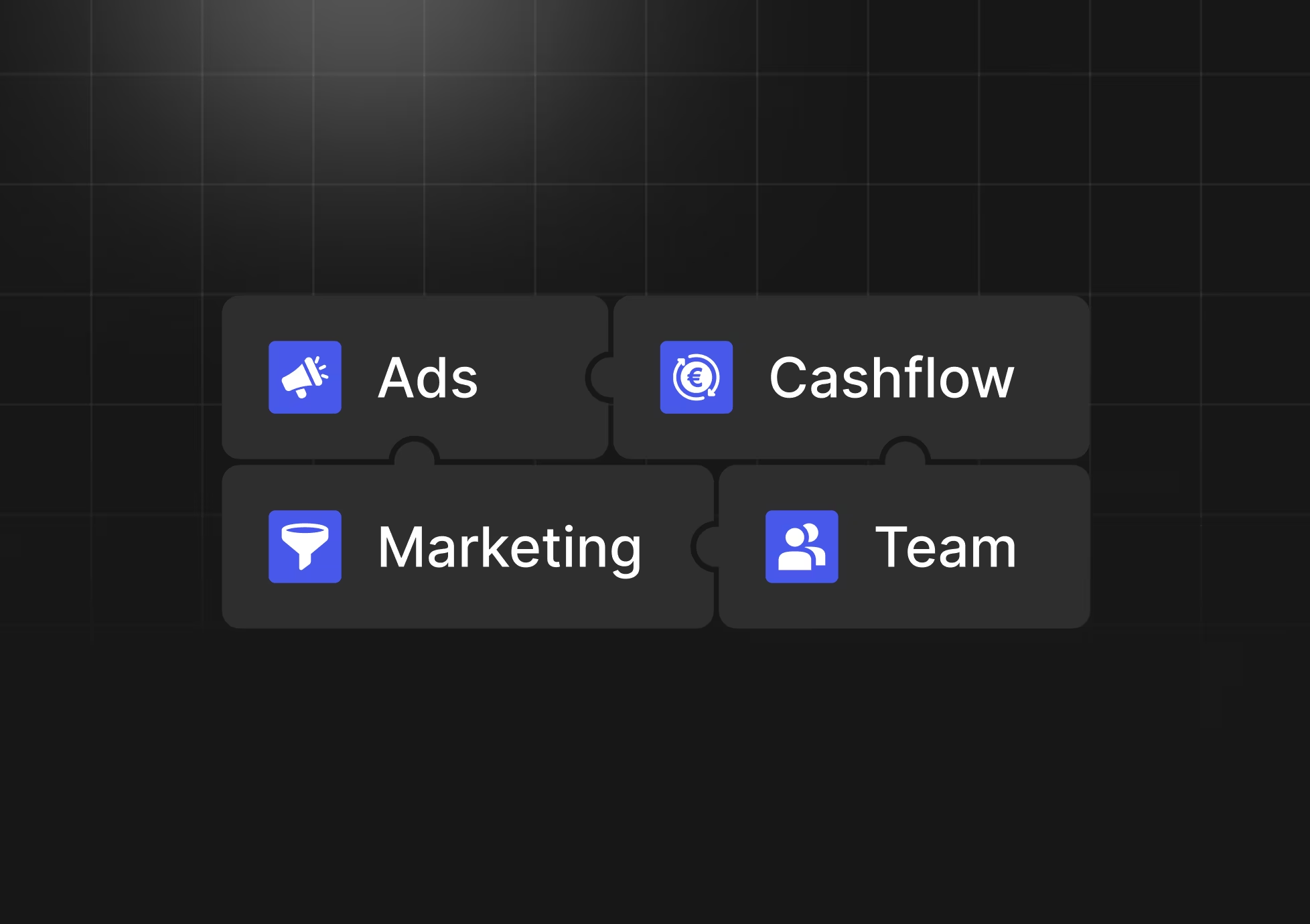
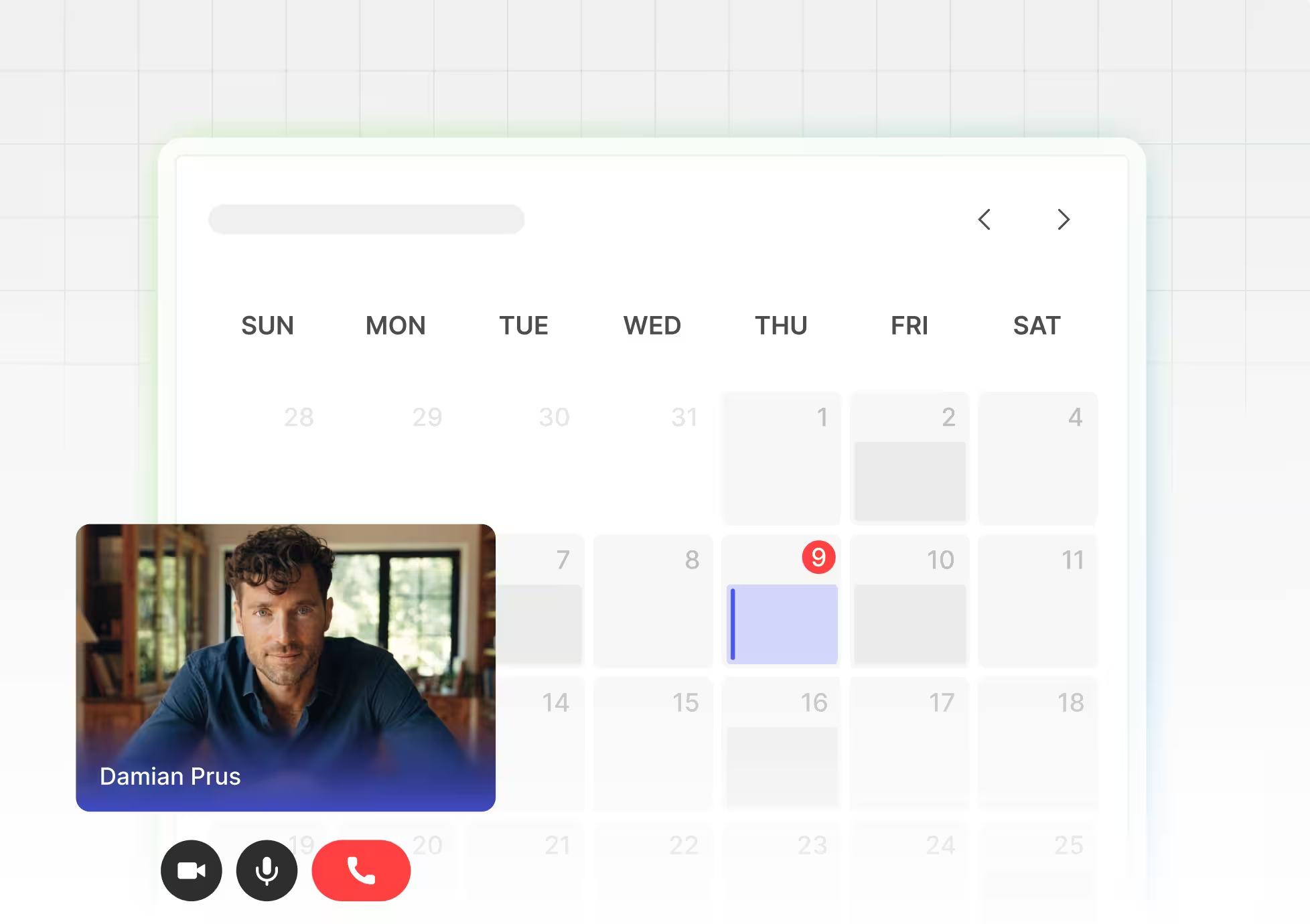
The project was supported by a structured design system rather than one-off page styling. The UI Kit, responsive rules, repeated card patterns, CTA logic, and content hierarchy help keep the page coherent during Webflow implementation and future edits.
Risk was reduced by testing the page logic before final UI decisions. User flows, wireframes, visual concepts, and client-side feedback helped clarify what the audience needed to understand first. The team also checked copy density and section purpose so the final page would not become overly long or generic.
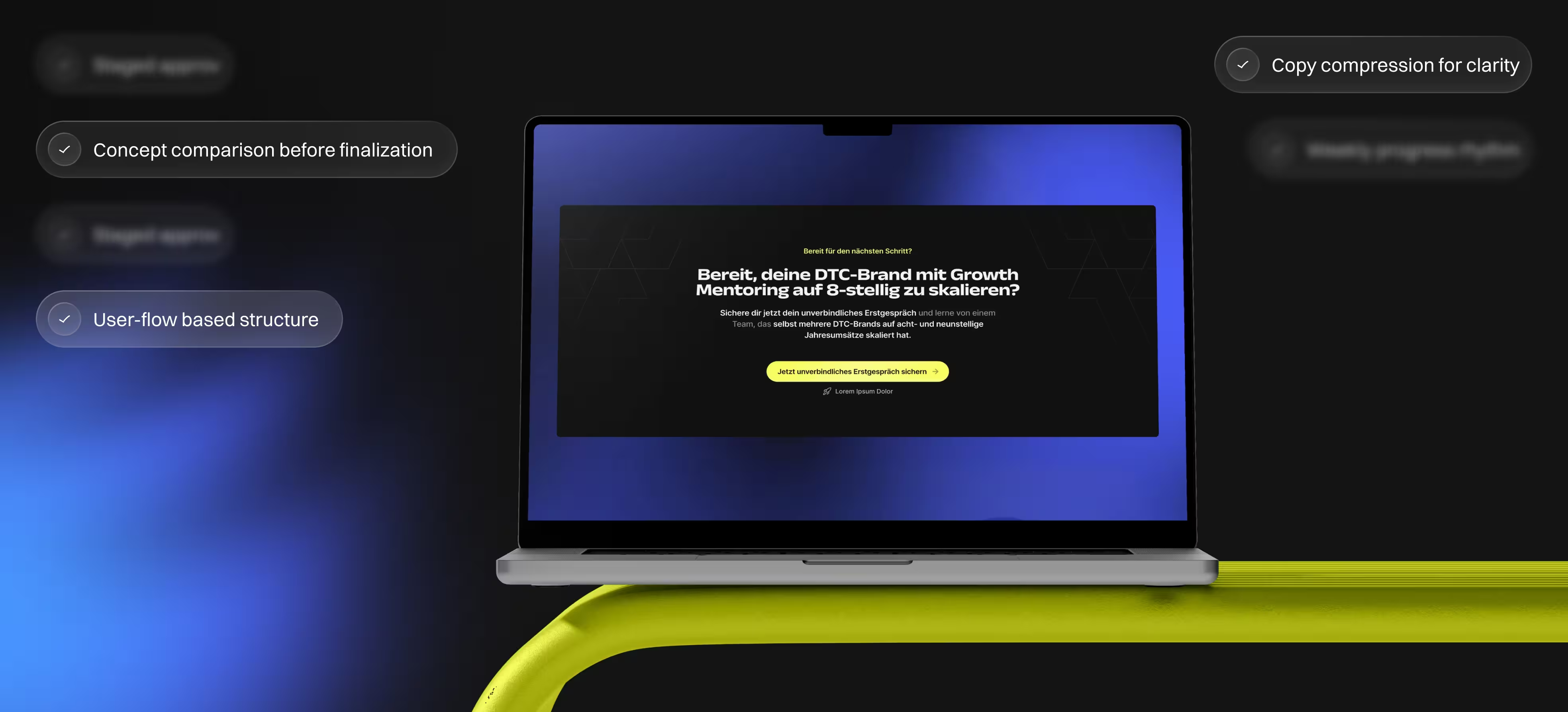
The final work was prepared so the page could move into Webflow with less ambiguity. Responsive layouts, component logic, visual states, and a complete UI Kit gave implementation a clear structure. Because the page was not confirmed as live at the time of handoff, the case should describe the result as prepared for Webflow implementation.


Basic text &
blocks animation

Loom Video / Call where we tell you how to use Webflow & manage the site yourself

SEO optimization (basic)
Edits on the work done & support of the site within 30 days after the delivery
Growth Mentoring became easier to understand quickly.
The page gained a premium, operator-level visual language.
The conversion path became more selective and credible.
The design system made implementation more structured.
Whether you are launching a SaaS product, redesigning an existing platform, or improving the website around it, we can help create a clearer and more scalable product experience.