No items found.
About project
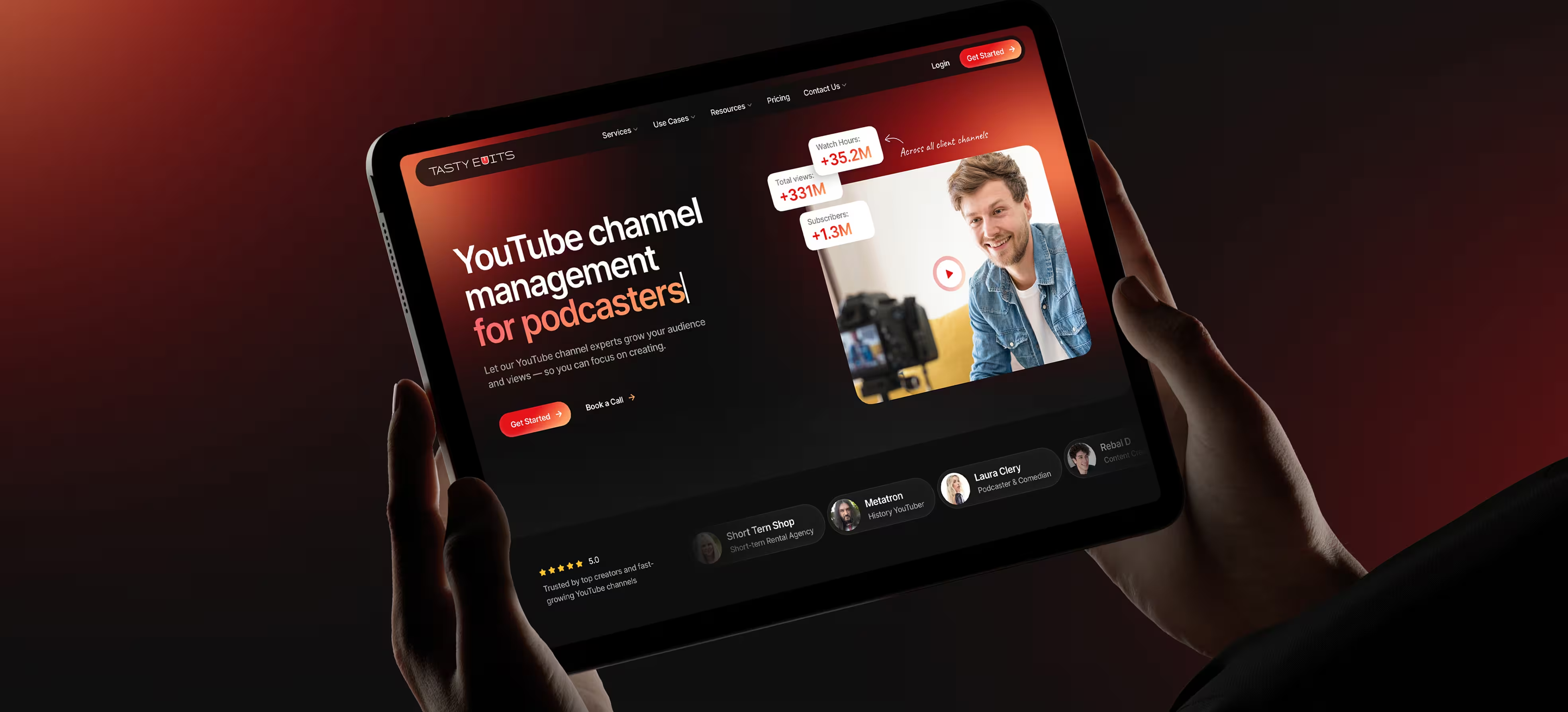
TastyEdits is a creator-focused video production service that also offers YouTube Channel Management as a premium, tech-enabled partnership. This document defines the case-page narrative and implementation-ready content blocks for the YouTube Channel Management redesign direction. Use it as the single source for copy structure, visual slots, and dev handoff expectations.

TL;DR
01
Challenge
Dark mode comfort without losing
brand punch and recognizability.
02
Approach
Audit, concept iterations, proof-first
hierarchy, Webflow-ready patterns.
03
Solution
Modern section system, tiered pricing,
VOMA story, motion plan.
04
Outcome
Approved direction and build-ready
page narrative with next steps.
The product in real life
Visitors arrive looking for a reliable partner to run and grow a YouTube channel. They scan for proof, then check what is included and how the service works. If it feels credible, they compare tiers and choose between booking a call or starting an order. The story is reinforced by VOMA, the internal hub that makes delivery and reporting feel structured.


When work starts
to feel heavy
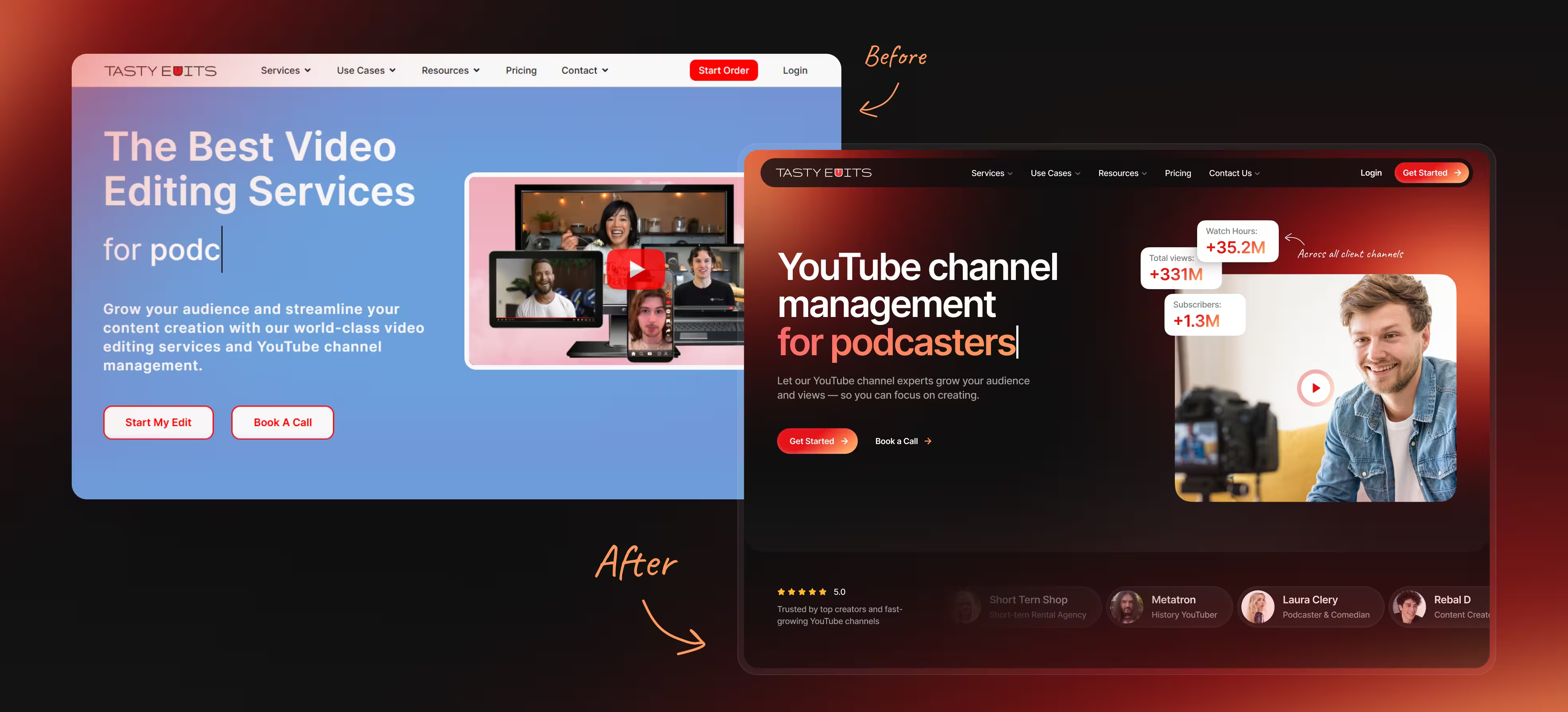
The old page carried too much text weight and too little visual proof. Dark mode concepts competed with readability, especially at smaller viewing scales. Generic imagery reduced trust and made the service feel interchangeable.
Pain behaviors
- Skim, fail to understand the service quickly.
- Hunt for proof, then abandon the page.
- Struggle to compare what tiers include.
- Distrust generic images and generic claims.
What we
noticed early
Insights
People decide trust first, so proof must appear immediately after the hero.

Insights
A dark palette needs controlled contrast to stay readable at common zoom levels.
Insights
Pricing must show tiers and a full breakdown without extra clicks.
Insights
Images work only when they reinforce credibility through real creators.
Our approach
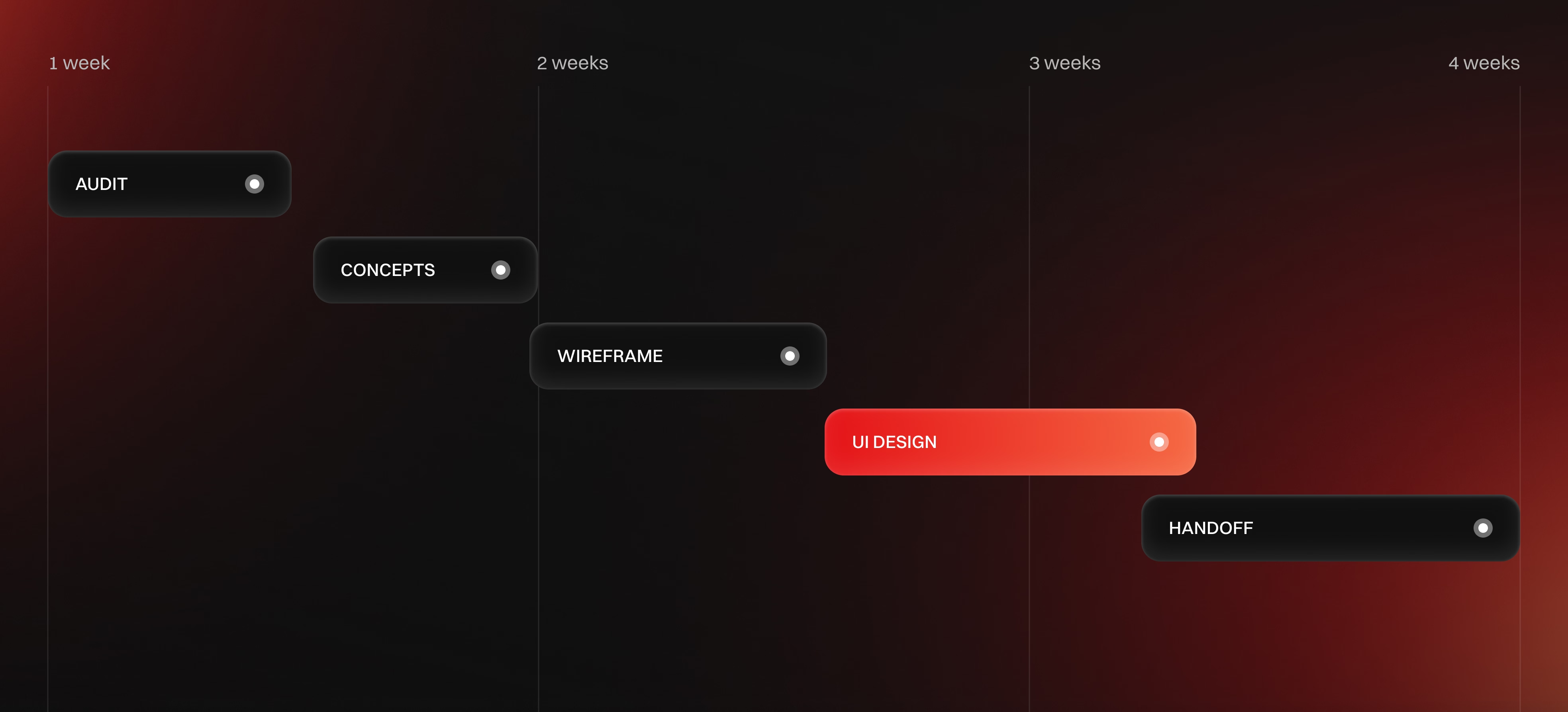
Start with a UX audit and content inventory, then define IA and a visual direction. Use moodboarding to align on art direction, then build 2–3 style concepts and iterate quickly. Move into wireframes to lock hierarchy, then deliver hi-fi UI with systemized components.
Work runs in short loops: Figma drafts, annotated comments, and async Loom feedback. Each iteration closes one risk: hierarchy, readability, component feasibility, then polish. Handoff includes responsive notes and edge cases to keep build predictable.
Key improvements

Dark mode with identity
01
Situation
Dark mode was required, but it risked looking generic.
02
Change
Controlled accents and section contrast balanced comfort and recognizability. Typography weight and glow/contrast rules were tuned for readability.
03
Result
A cohesive direction approved for the redesign.
Proof-first page hierarchy
01
Situation
Trust signals were buried or diluted.
02
Change
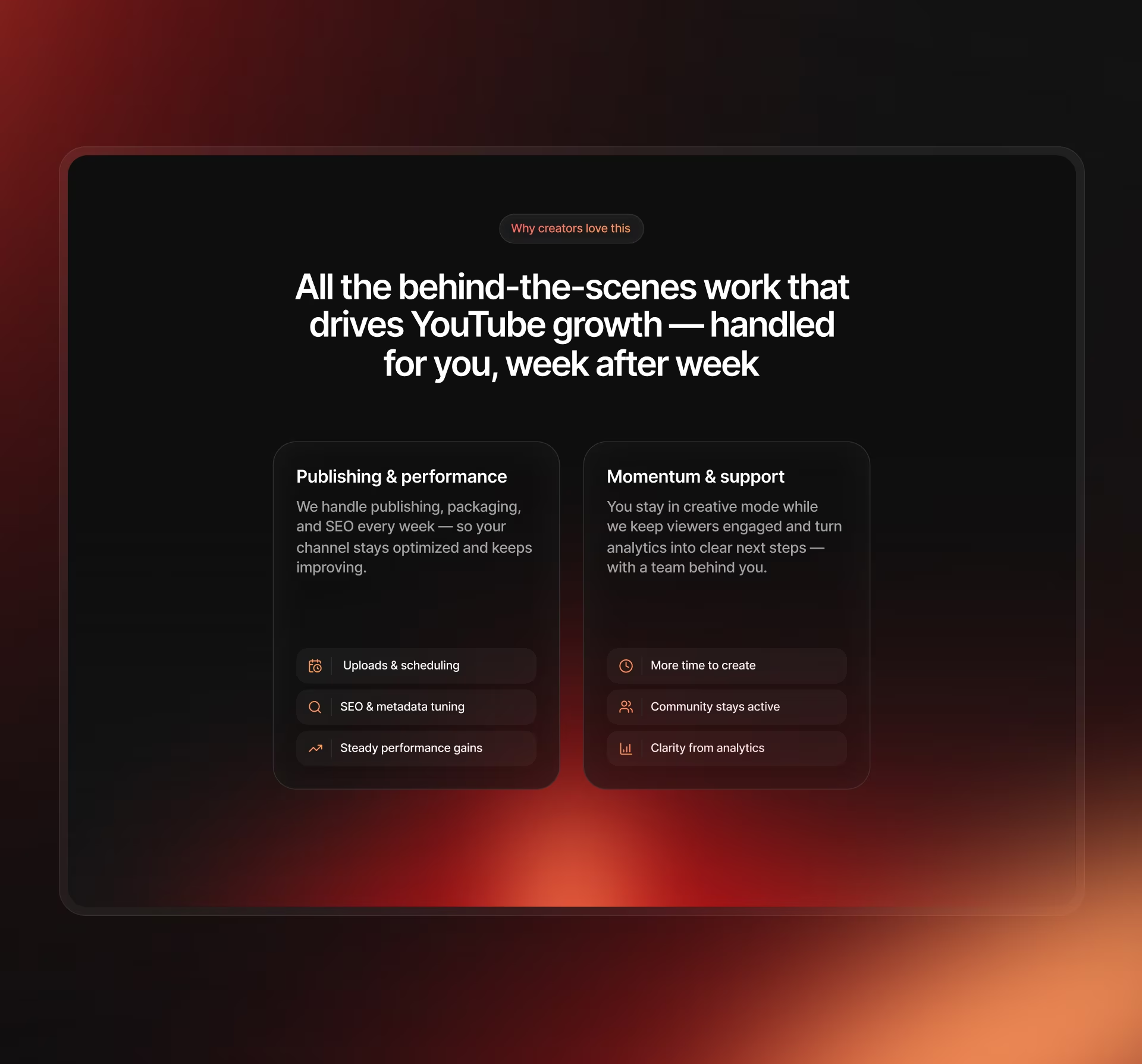
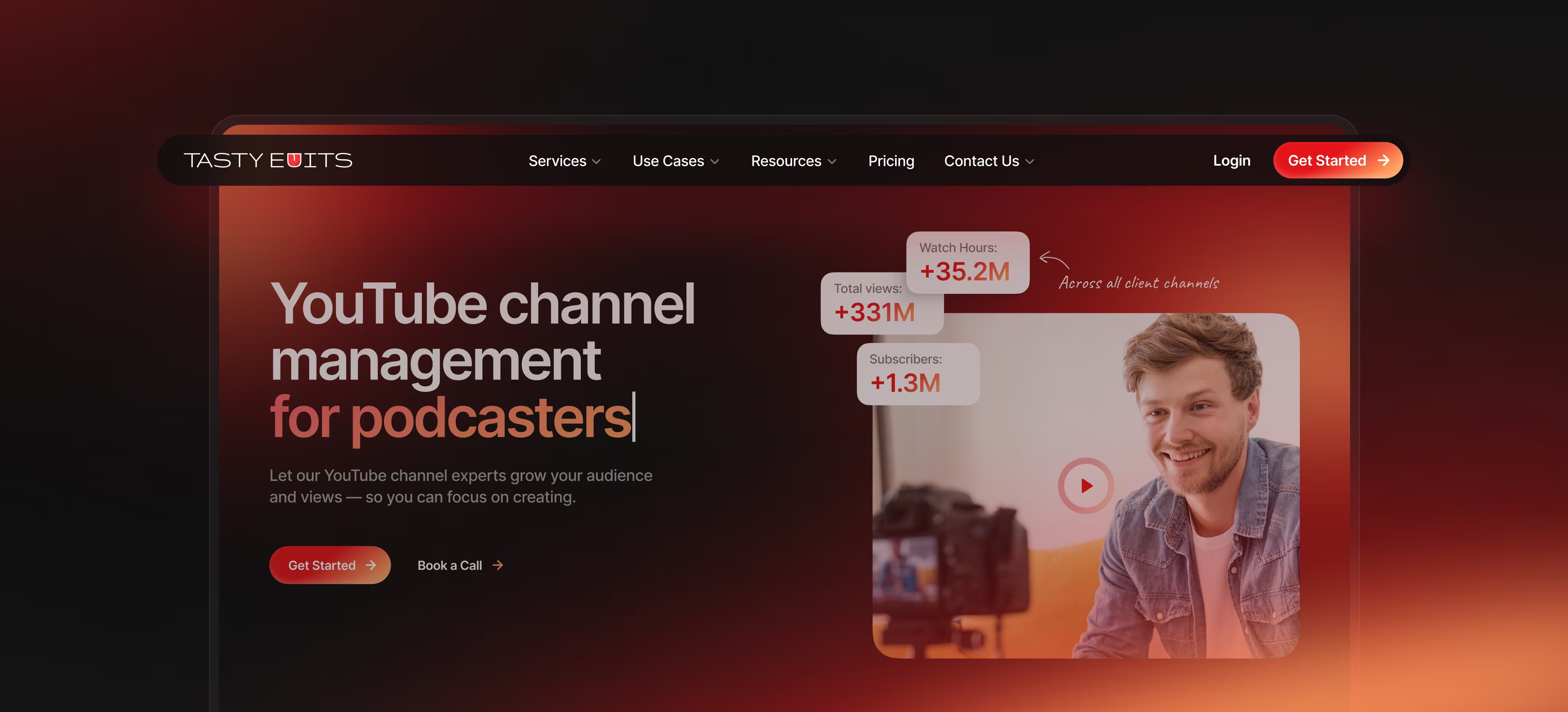
Proof moved immediately after the hero and avoids slider-first patterns. Proof becomes scannable cards that preview outcomes and context.
03
Result
Credibility is earned within the first scroll.
Pricing that explains itself
01
Situation
Tiered channel management pricing made
old pricing UI insufficient.
02
Change
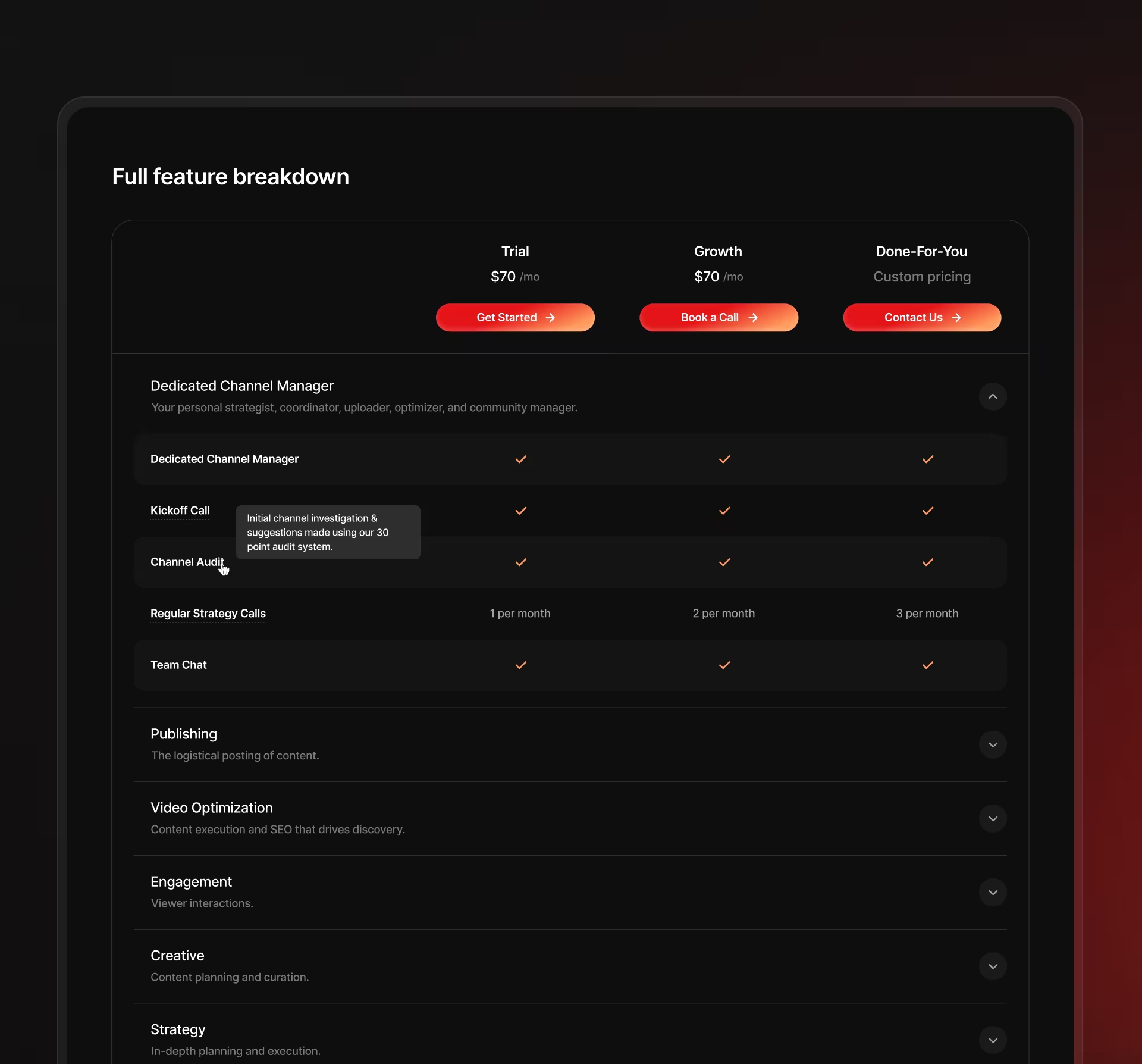
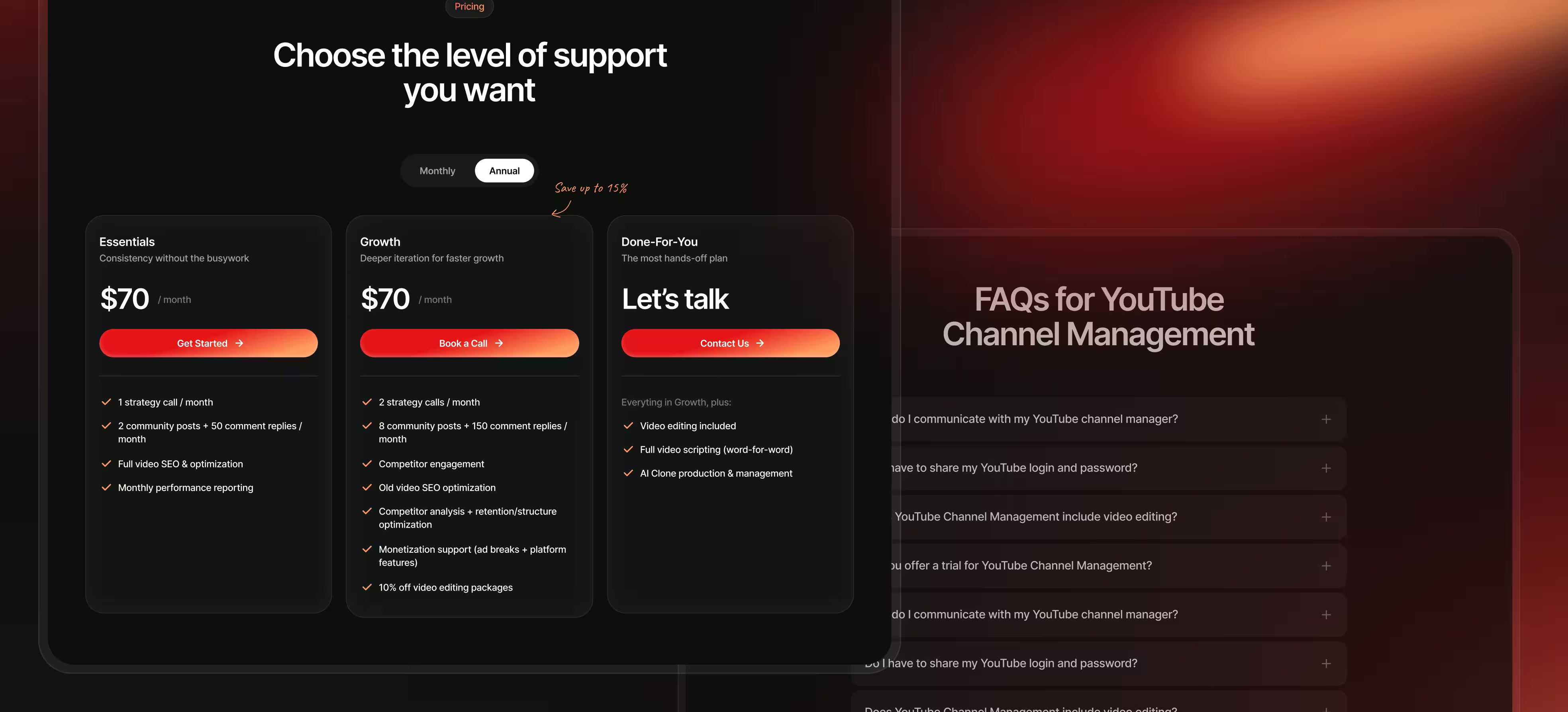
Tier selector paired with a visible detailed breakdown, no extra clicks. Comparison stays clear even with complex inclusions.
03
Result
Pricing becomes a decision tool, not a wall of text.
Tech-enabled service storytelling
01
Situation
Channel management can feel like
an opaque manual service.
02
Change
VOMA introduced as the operational backbone with a mini-demo animation plan. The narrative shows tasks, collaboration, and reporting as a system.
03
Result
The service reads like a productized partnership.
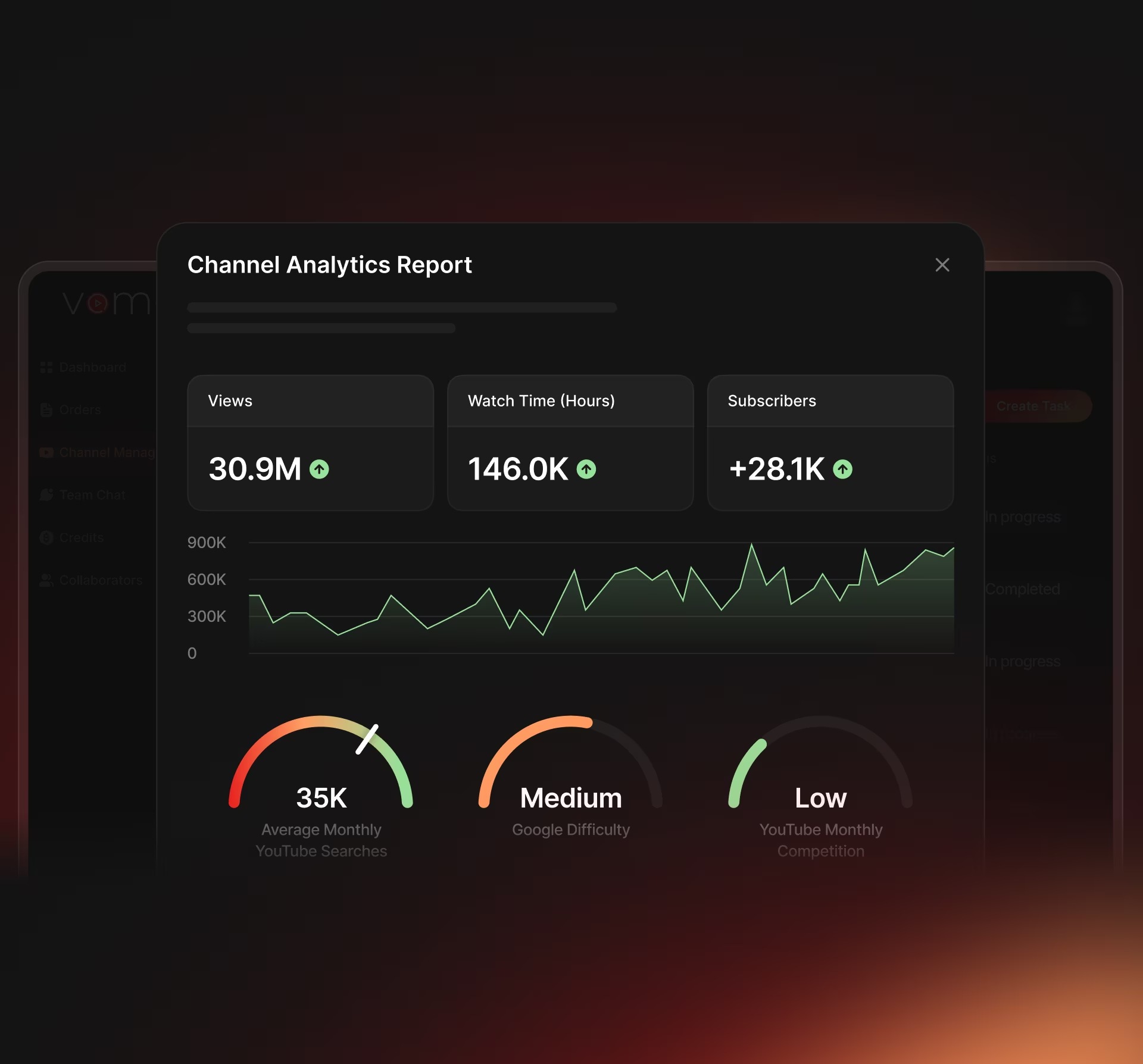
Proof to pricing
in one flow
The page guides users from a clear hero into proof cards that build trust fast. Next, it introduces tiered pricing with a detailed breakdown already on the page. Only after the decision frame is clear do we expand into process steps and the VOMA mini-demo. This keeps the first scroll conversion-focused while still supporting SEO copy blocks.
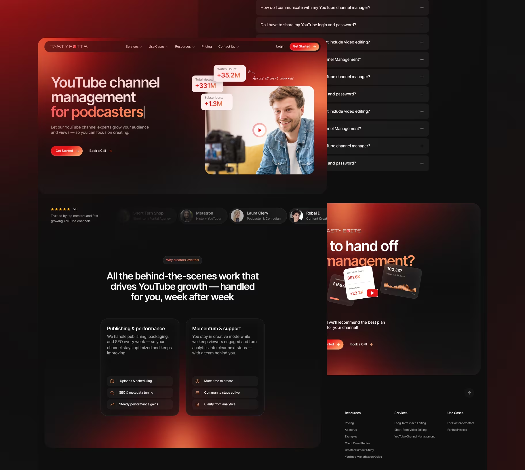
01
Hero
02
Proof
03
Tiers
04
Breakdown
05
Process
06
CTA
Navigation &
information shape
The redesign treats service pages as a system, not standalone one-offs. Global navigation and templates create predictable paths for creators and businesses. Key actions stay consistent: Start Order, Schedule a Call, and Login. This keeps the site scalable as services and resources expand.
Settings.
Rules that run the day
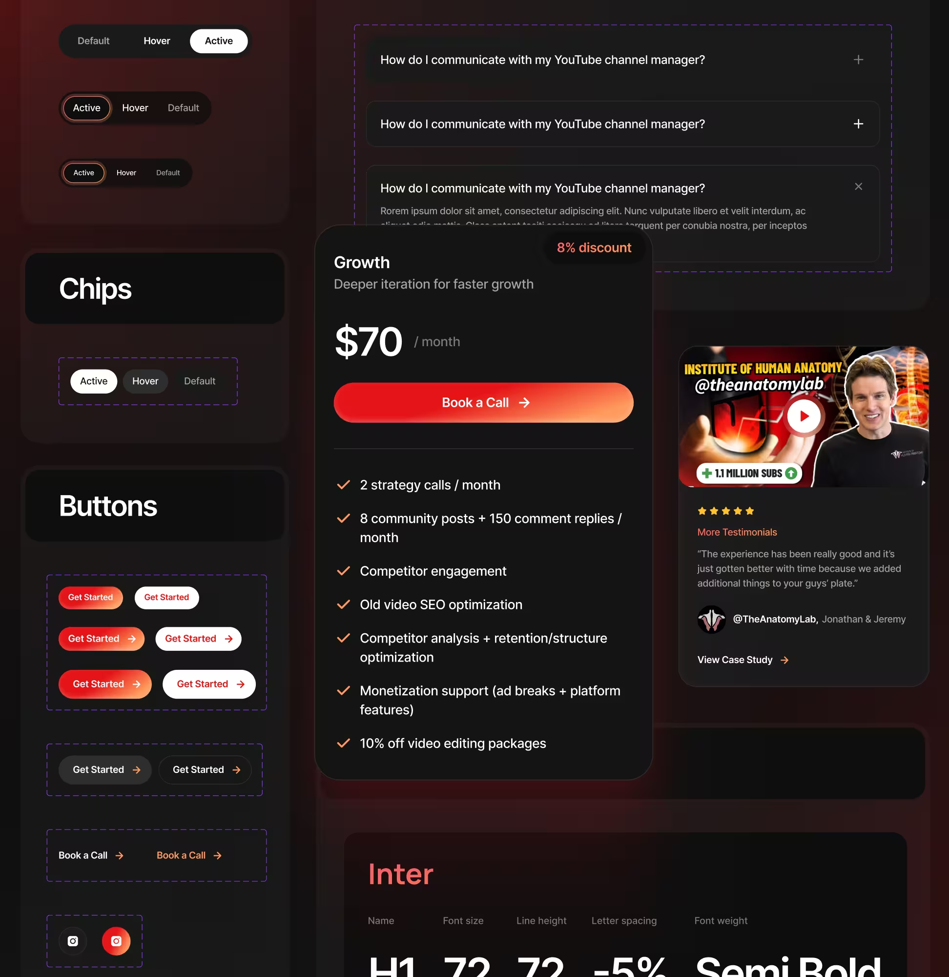
The page includes a pricing configuration pattern that users understand instantly: a plan duration selector paired with tier selection and a visible breakdown below. FAQ uses a consistent accordion pattern to avoid layout gaps when the list grows. Micro-animations are limited to subtle background motion and small emphasis transitions.
The system behind the screens
A component system keeps the redesign consistent across pages and reduces regressions during build. Cards, grids, typography, and CTA modules follow repeatable spacing and state rules. This allows fast adaptation of the service template without re-inventing layouts per page.
Proof points
- Reusable proof cards
- Pricing tiers + breakdown
- Contrast rules
- Shared header/footer
Validation & risk
control
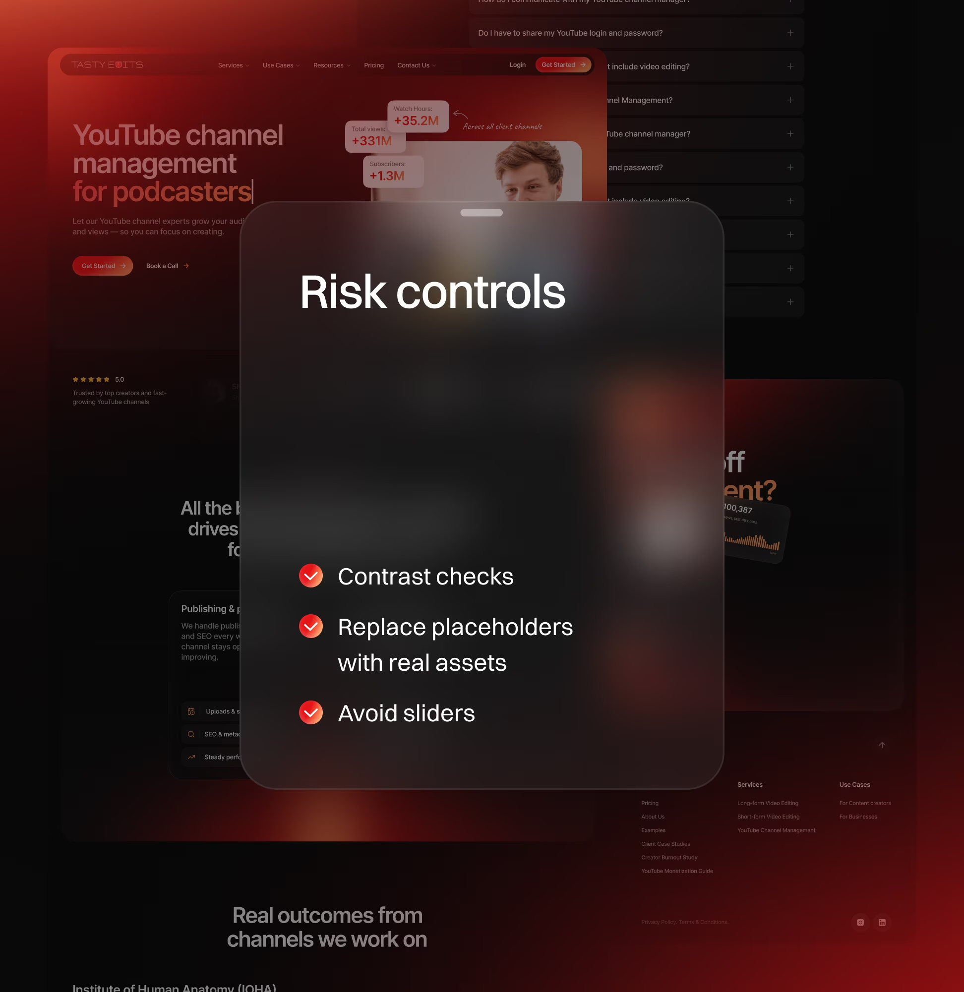
Each iteration reduced one concrete risk before polish. Readability was reviewed under realistic viewing conditions and common zoom levels. Interaction patterns were shaped to match Webflow feasibility and avoid fragile mechanics.
Risk controls
- Contrast checks
- Replace placeholders with real assets
- Avoid sliders
Handoff &
implementation
Handoff focuses on reducing ambiguity for Webflow implementation. Files are organized by pages, components, and states, with clear naming. Notes specify responsive behavior, hover/focus states, and animation callouts.
01
Webflow-ready layouts
02
Styles and
naming
03
State
notes
04
Animation
callouts
What changed
01
Cohesive dark-mode direction that
stays readable and distinctive.
02
Proof moved earlier to earn
trust before details.
03
Tiered pricing explained with
a visible breakdown.
04
Motion plan created to show
process and VOMA value.
Got a project in mind?
Let’s make it happen!
- We review your request right away
- We’ll share case studies relevant to your industry
- If we’re the right match, you’ll get a custom proposal
- Then, we’ll start with a 3-day trial to get the ball rolling