XtraMile
Enterprise-focused website redesign for a modern LMS platform.
Enterprise-focused website redesign for a modern LMS platform.
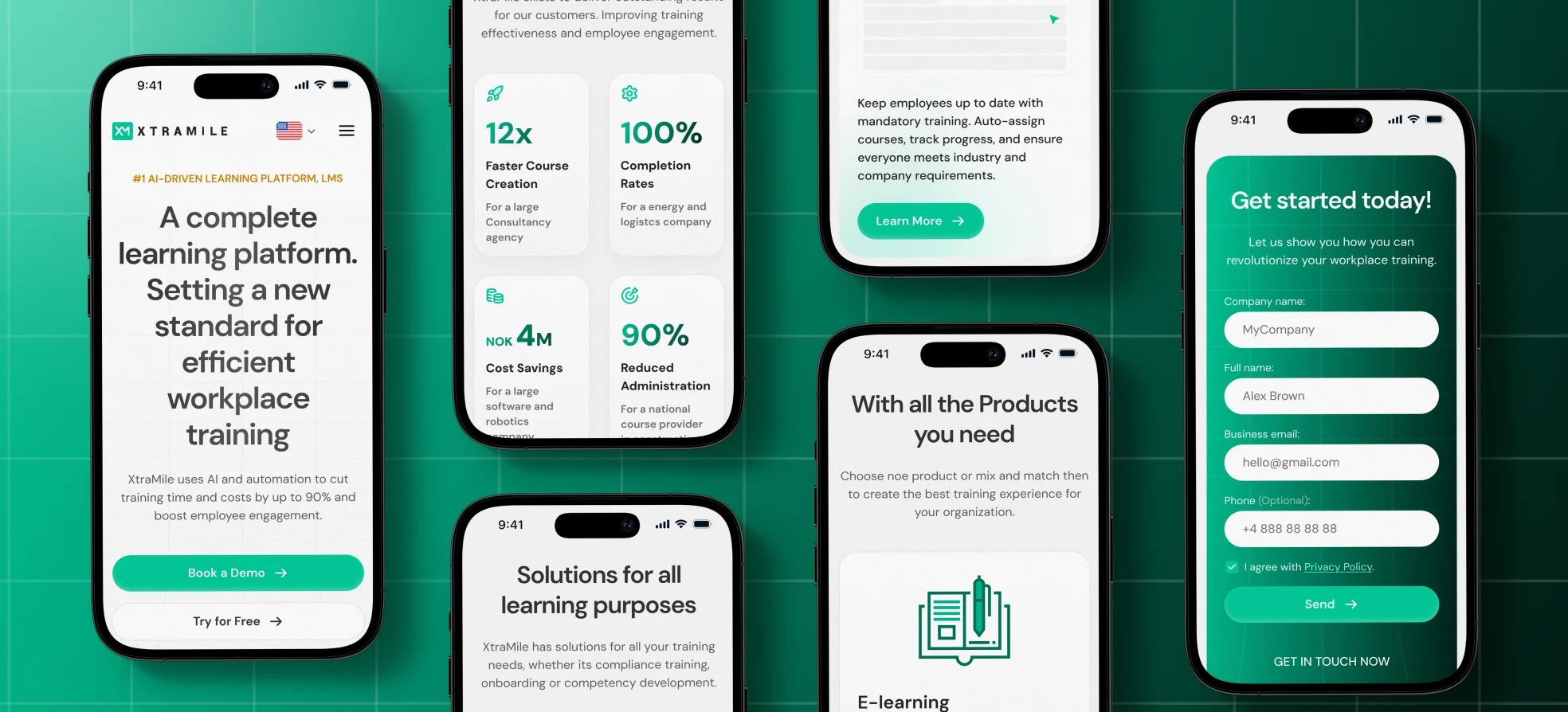
XtraMile is a complete learning platform that helps organizations create, automate, deliver, and track workplace training. It is used for onboarding, compliance, cybersecurity, and broader learning programs across modern teams. The redesign focused on the homepage and supporting pages, with the goal of making the website feel more premium, enterprise-ready, and visually aligned with the updated product experience.
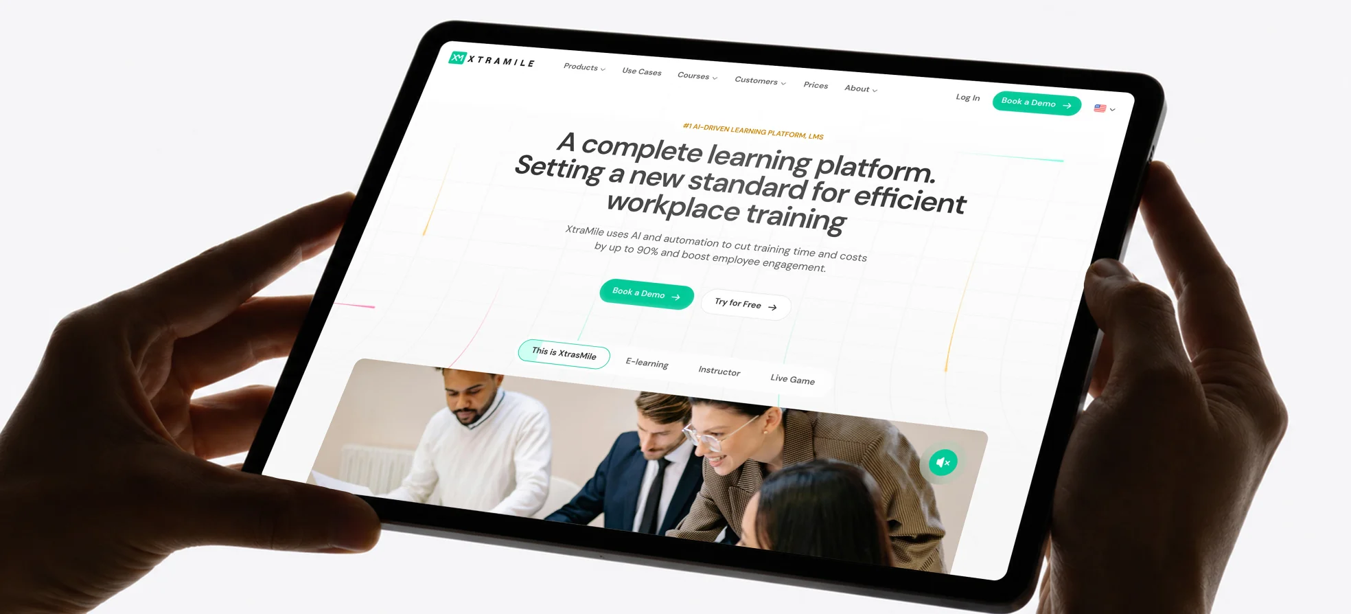
The website no longer matched the product's maturity and ambition.
Align the site with the app and simplify product storytelling.
Designed a premium homepage with clearer structure, proof, and product flow.
Delivered an approved homepage direction with handoff-ready materials.
XtraMile is used by teams responsible for training people at scale: onboarding new hires, assigning compliance programs, launching internal learning, and tracking completion across the organization. A typical working moment starts with building or updating a course, then scheduling its rollout, automating reminders and follow-ups, and checking progress in the analytics view. The product matters because training is not a one-time event - it is an ongoing operational process that needs to stay clear, measurable, and easy to manage.
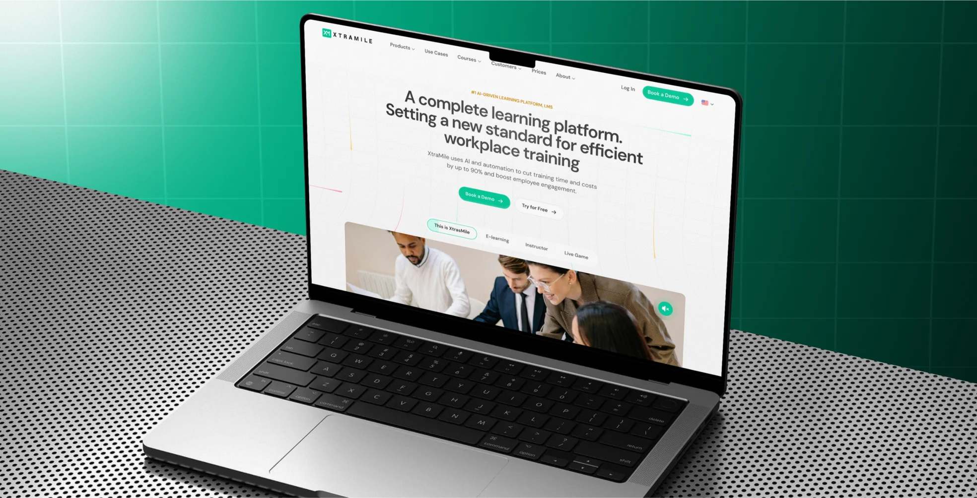
For a product like XtraMile, the website has to explain scale, trust, and practical value very quickly. When that story feels fragmented, buyers need extra effort to understand what the platform does, how mature it is, and why it is different. That slows trust, weakens differentiation, and makes larger sales conversations harder than they should be.
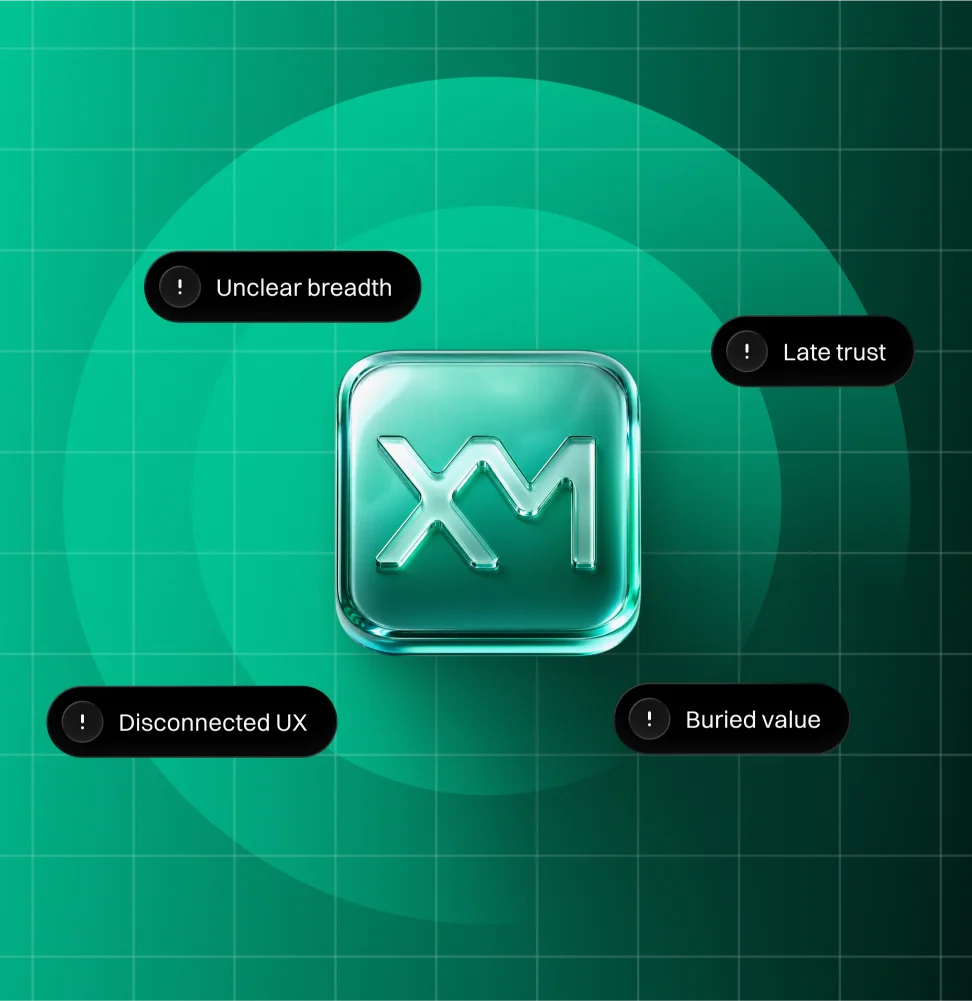
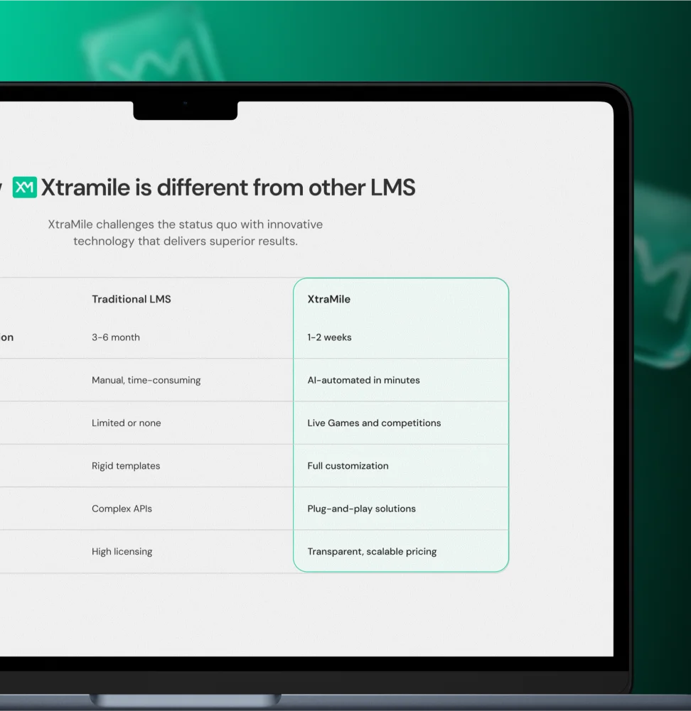
We approached the redesign as a positioning and clarity problem, not only a visual refresh. The goal was to make XtraMile feel closer to the quality of its product, while giving the homepage a clearer structure for trust, product understanding, and conversion.
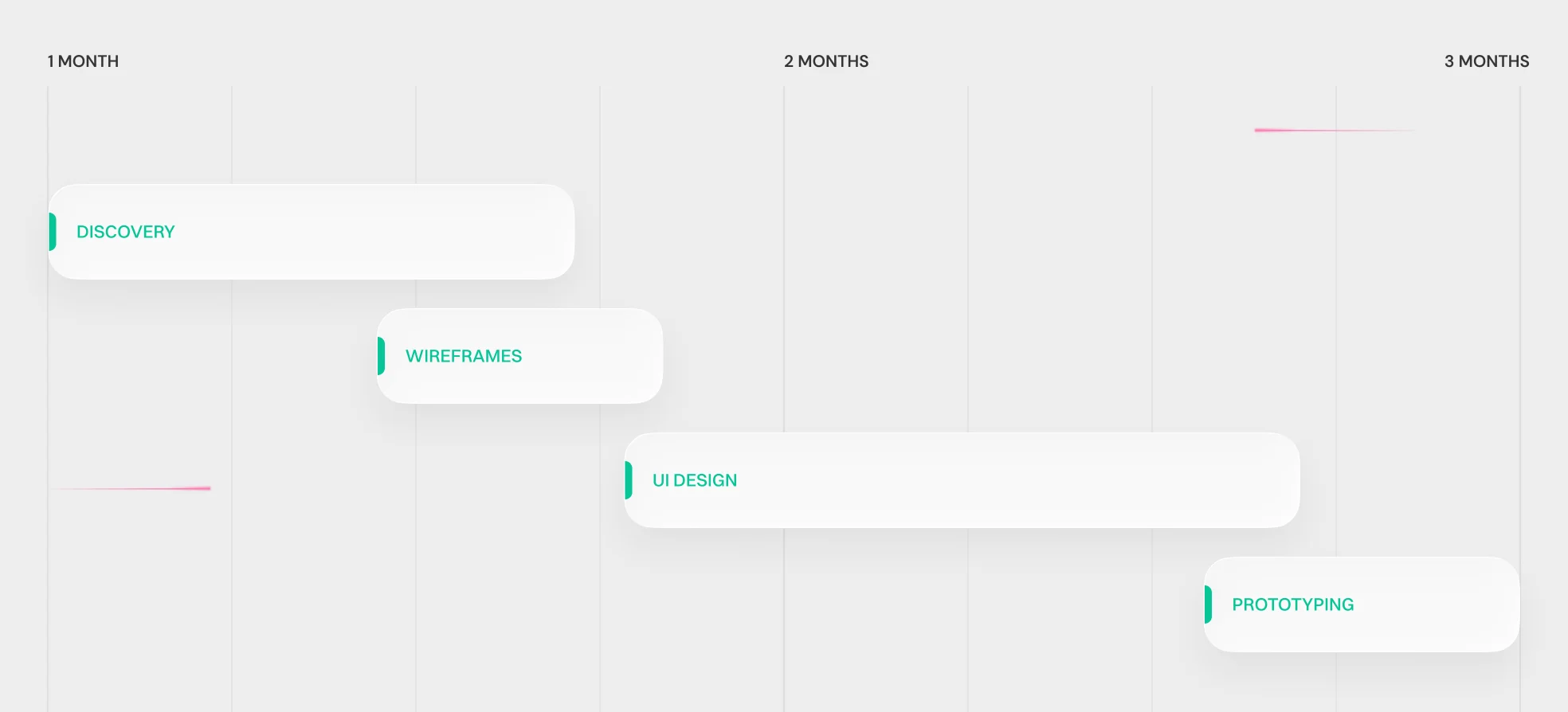
The work moved from moodboard and concept exploration into an approved direction, then into the full homepage design and a supporting News & Blog page. This rhythm kept decisions visible, reduced risk early, and made the next production steps easier to align.
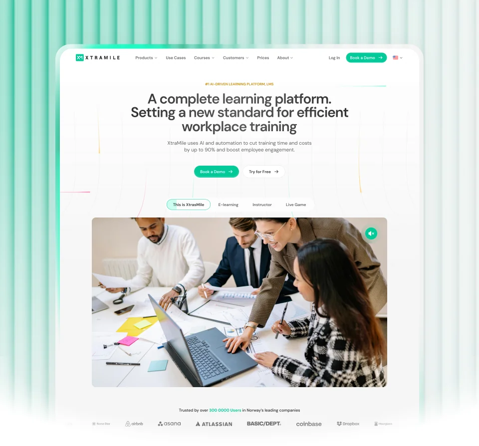
One visual language.
The website needed to feel more consistent with the updated product. Without that link, the brand experience felt split between marketing and product.
We built the homepage direction around the same visual logic already present in the platform: a cleaner system, stronger contrast, clear hierarchy, and a more confident SaaS tone. This made the site feel like part of the same ecosystem instead of a separate layer.
Faster product understanding.
XtraMile covers multiple learning scenarios, so the homepage had to explain breadth without overwhelming the reader.
We structured the page around clearer product storytelling: what the platform is, where it creates impact, which learning needs it covers, and how it works in practice. The strongest product flow became a visible narrative thread instead of a buried detail.
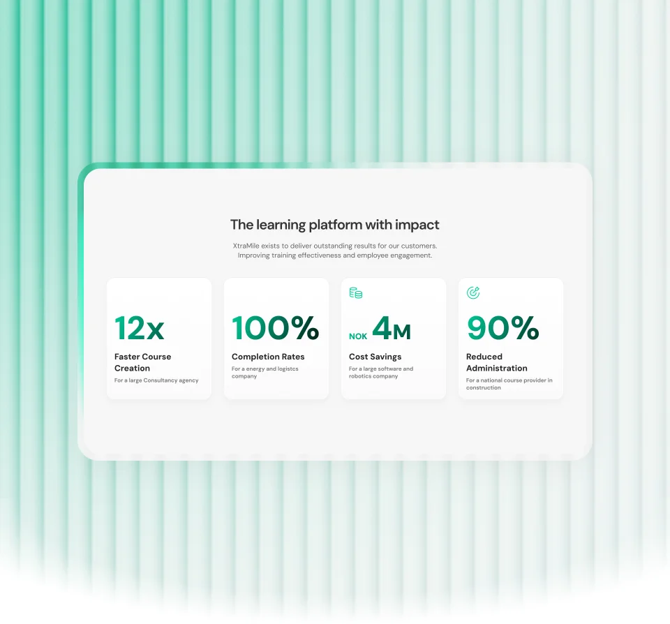
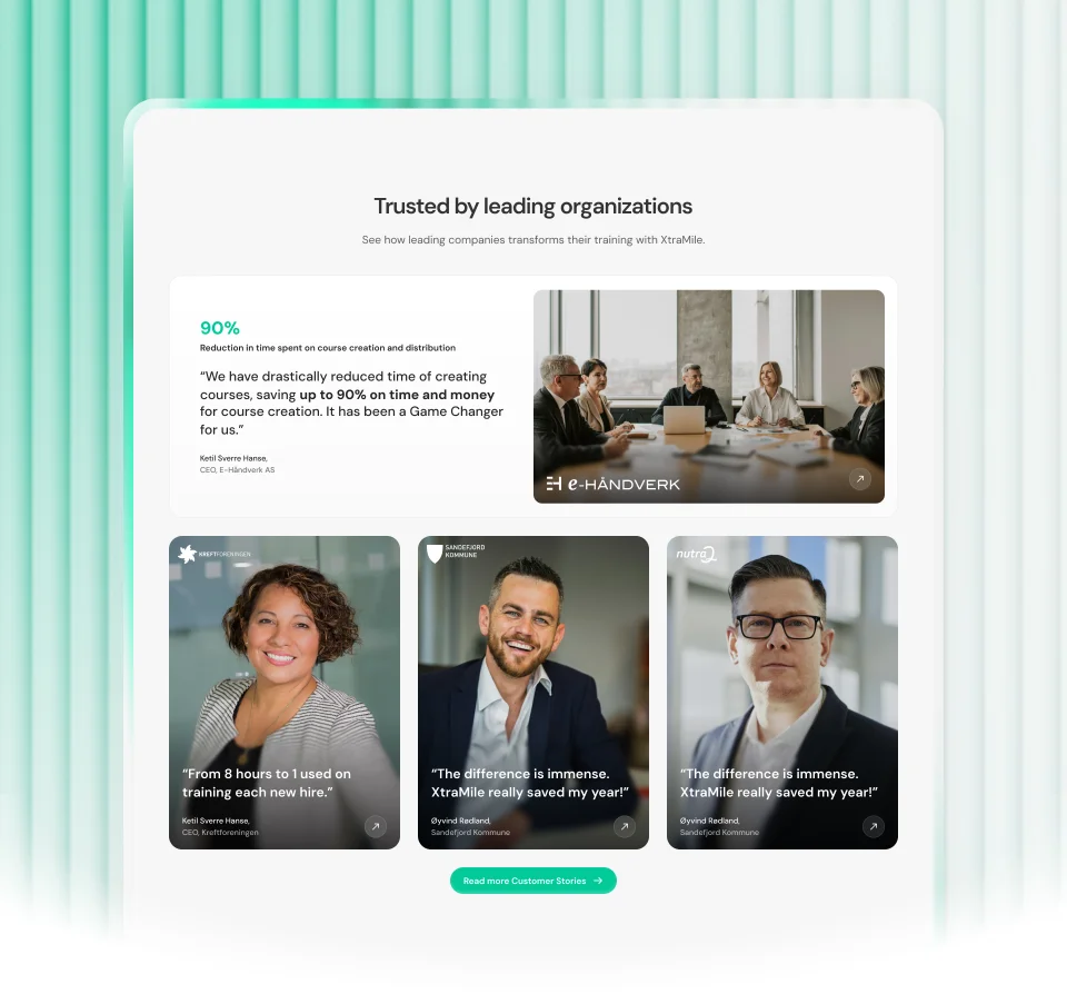
Trust closer to action.
For larger contracts, trust could not rely on branding alone. Buyers needed proof early, near the key decision points.
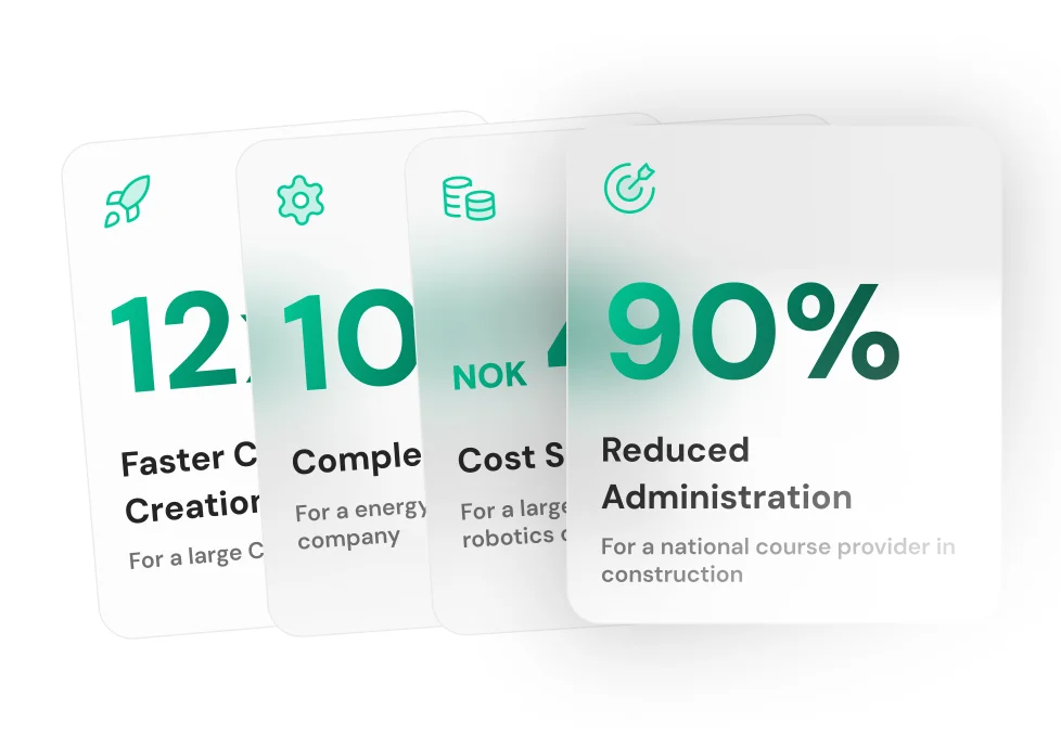
We strengthened the relationship between hero messaging, CTAs, client proof, and results-oriented blocks. Social proof and impact cues were treated as part of the main story, not as supporting leftovers.
A stronger premium stance.
The category is crowded, and many LMS sites look either generic or overly technical.
We pushed the direction toward a more premium, high-tech visual identity while keeping the page readable and controlled. The result balanced professionalism, memorability, and a clear enterprise signal without drifting into decoration for its own sake.
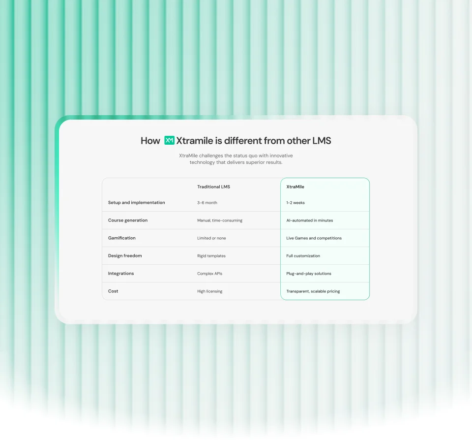
The strongest product story on the page was the flow from course creation to scheduling, automation, and reporting. It turned the platform from a list of capabilities into a practical operating model. That made the product feel more real, more useful, and easier to trust in a business context.
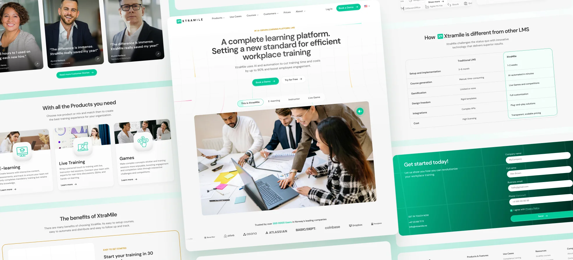
The homepage structure became more predictable by moving from broad claims into proof, use cases, product logic, and conversion. This reduced the amount of interpretation required from the reader. Instead of asking visitors to assemble the product story themselves, the page now guides them through it in a cleaner order.
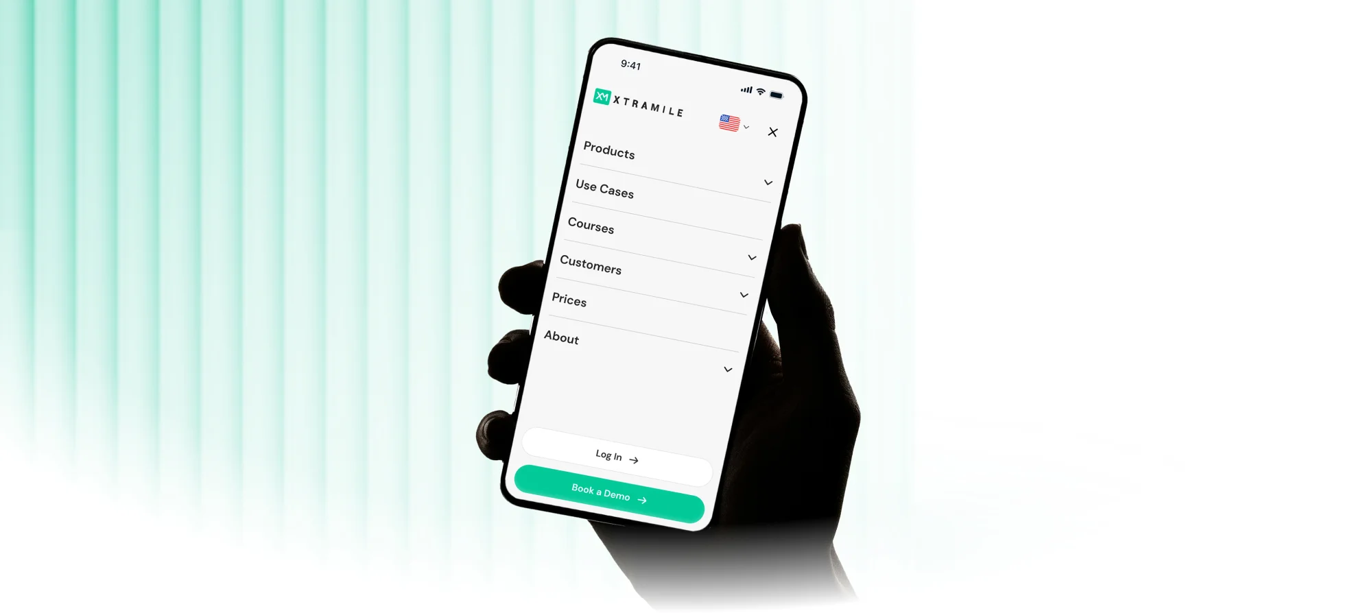
The page logic was built around short decision loops: understand the product, see proof, explore the right use case, and move toward contact. Repeated CTA patterns and predictable section behavior reduced cognitive load. Interactive elements such as tabs, comparisons, and product previews helped compress complexity without hiding the product behind generic marketing language.
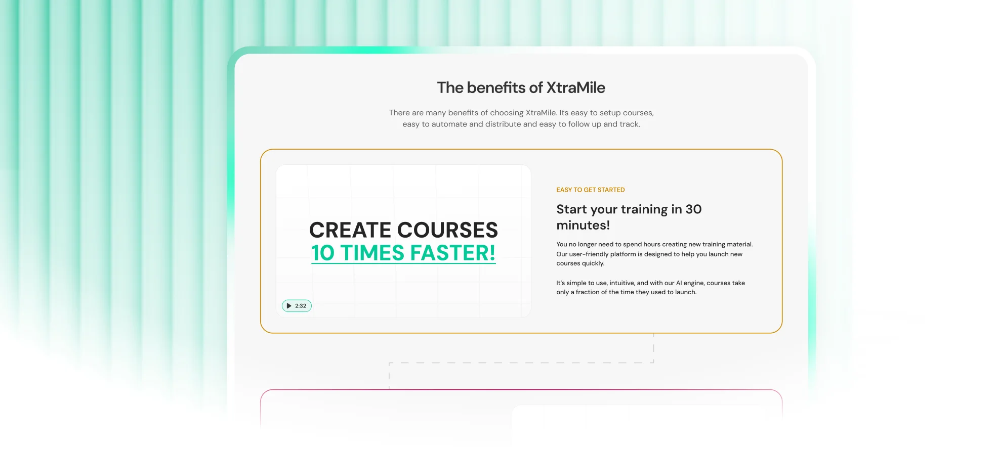
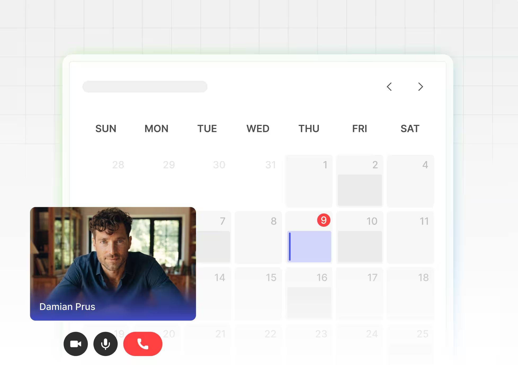
The redesign was not only about visual polish. It introduced a clearer system for how the site should communicate the product across sections and future pages. That system made the website easier to extend while keeping the tone, hierarchy, and product logic consistent.
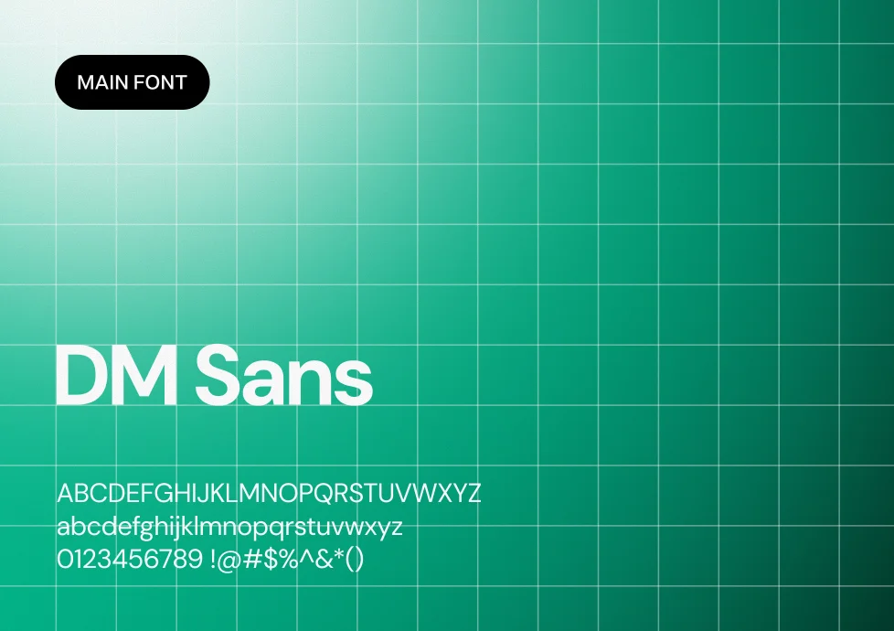

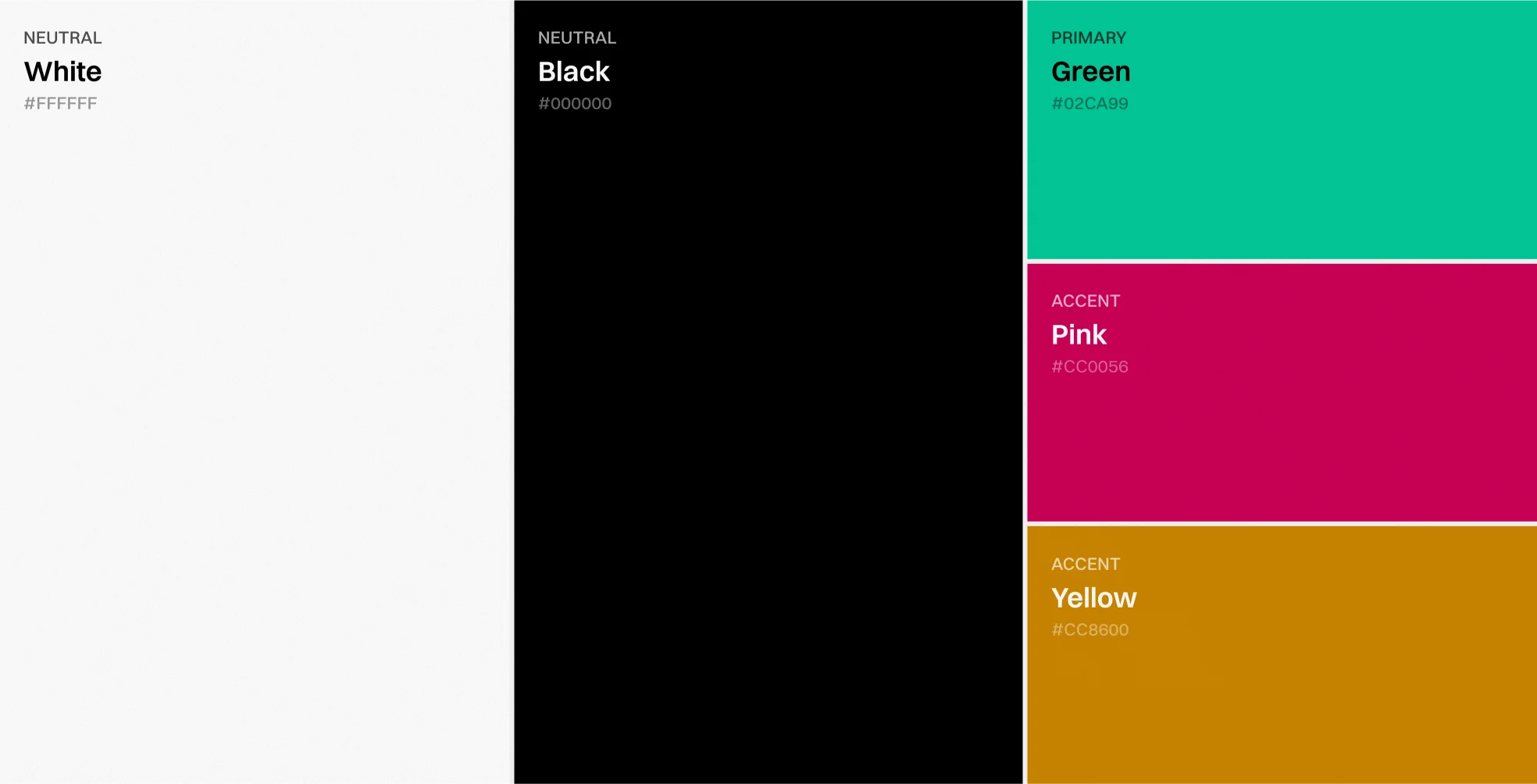
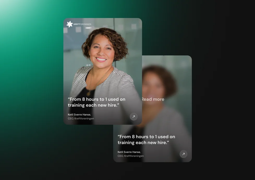
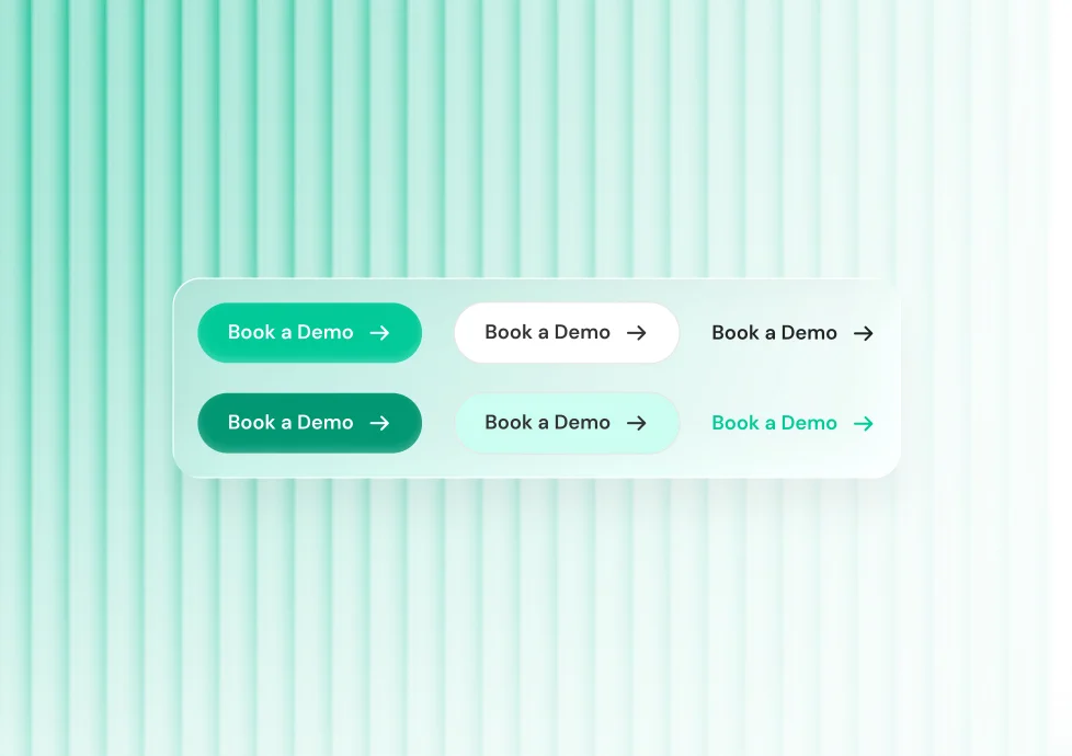
Risk was reduced by validating the direction before expanding the full design. The project moved through concept exploration, approval, and then complete homepage production, which kept major decisions visible at the right time. This made the final design easier to approve and easier to move into implementation.
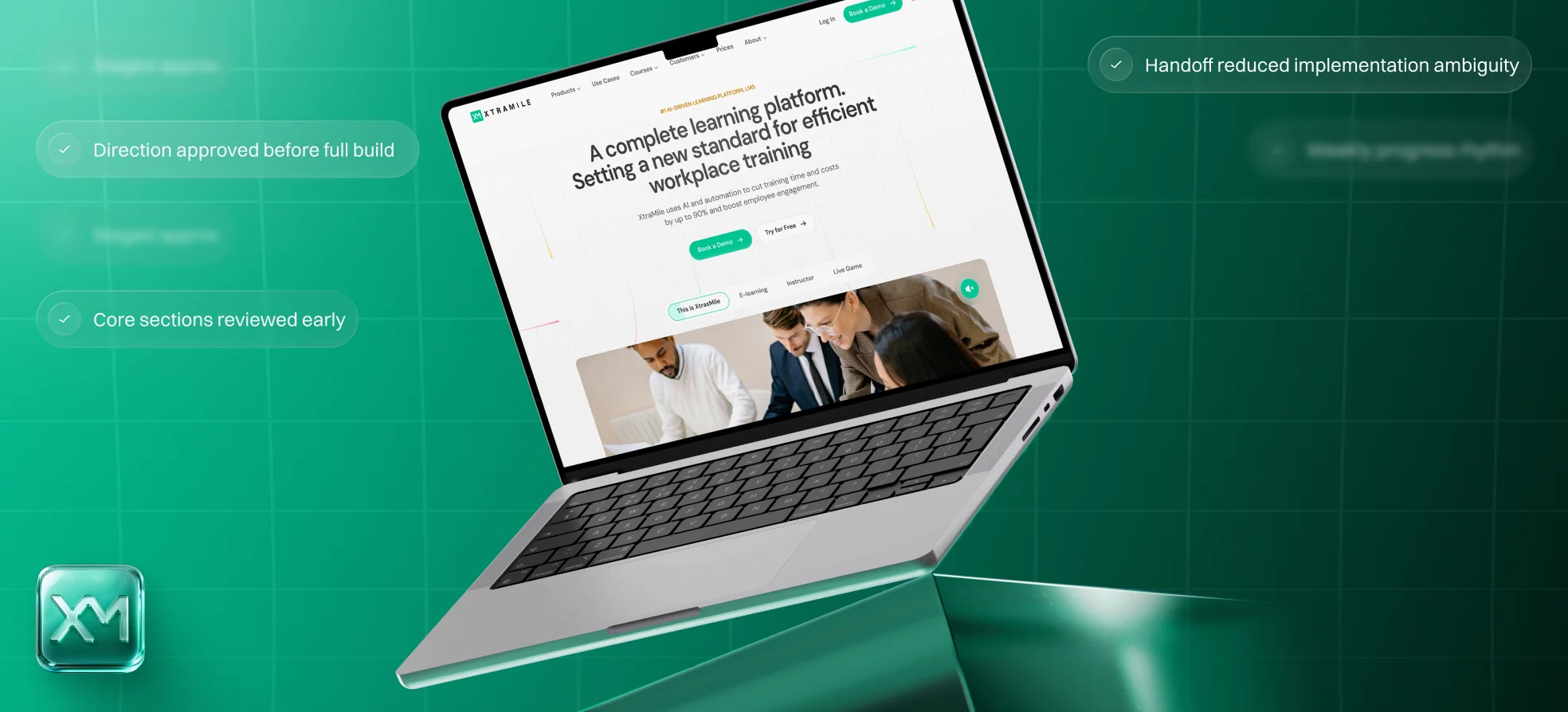
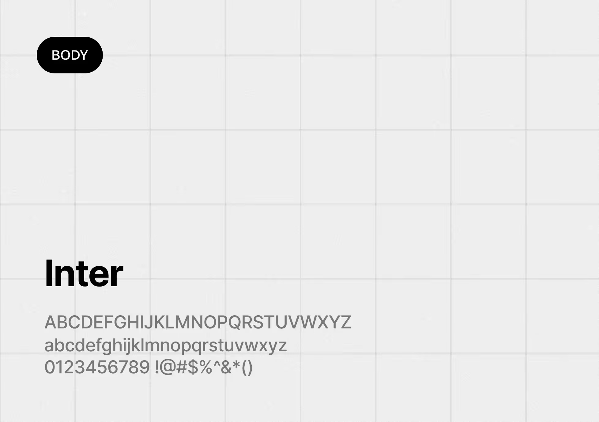
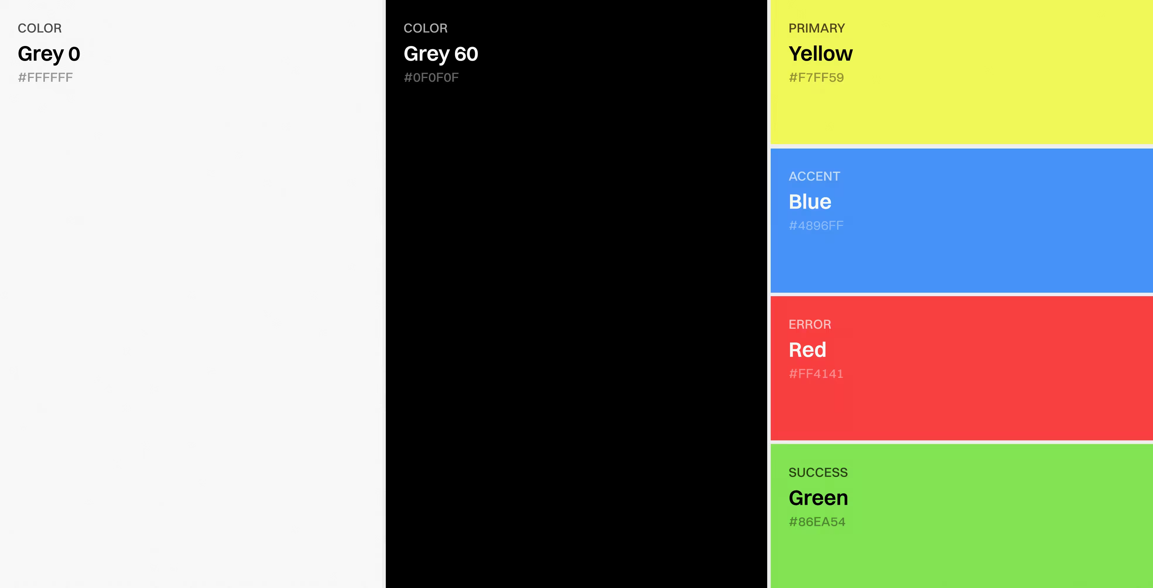
The final delivery was prepared for real use, not just presentation. Alongside the Figma design files, the team delivered a UI kit, responsive versions, and a completed Webflow front-end implementation. This reduced ambiguity at handoff and kept the project moving smoothly from design into launch preparation.
The website started to feel closer to the product.
The homepage explained value faster and more clearly.
Trust signals became part of the main story.
The direction became scalable for more pages.
Whether you are launching a SaaS product, redesigning an existing platform, or improving the website around it, we can help create a clearer and more scalable product experience.